
![[]](/image/rectangle.png)

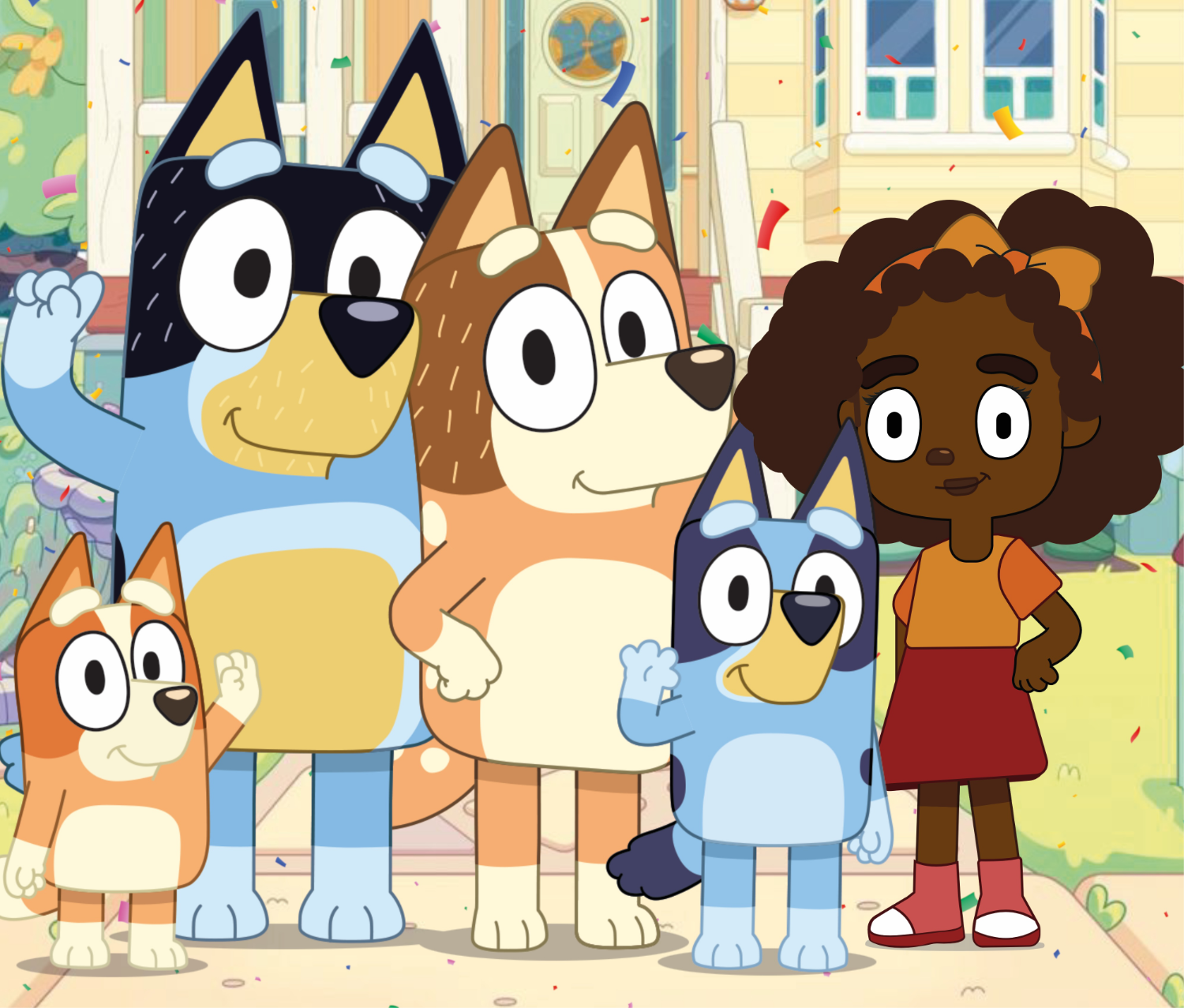


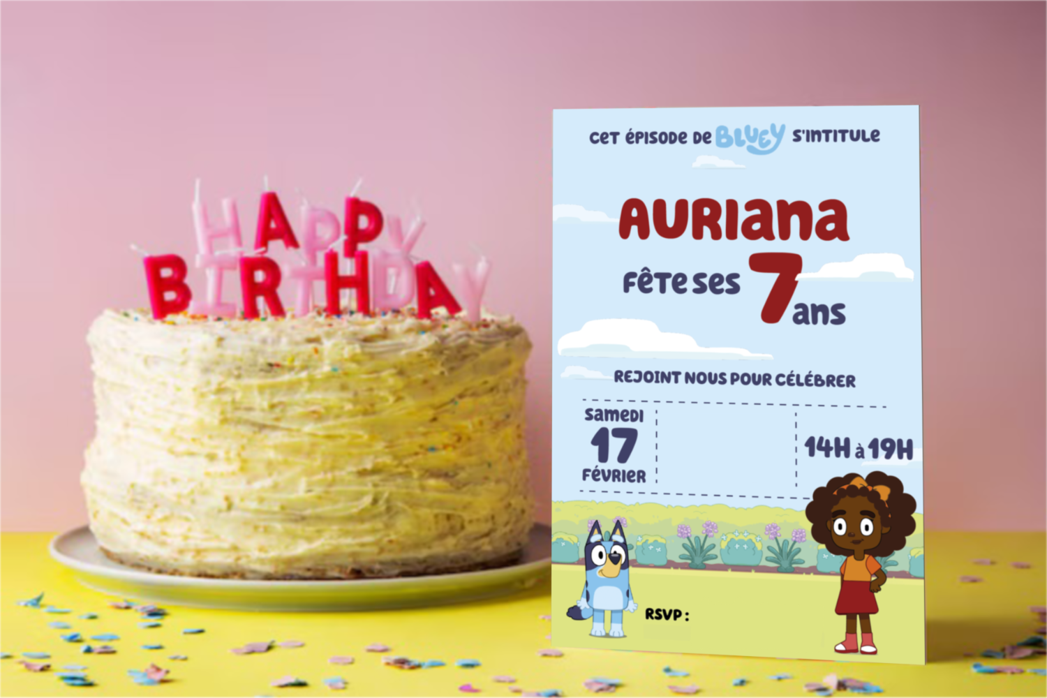
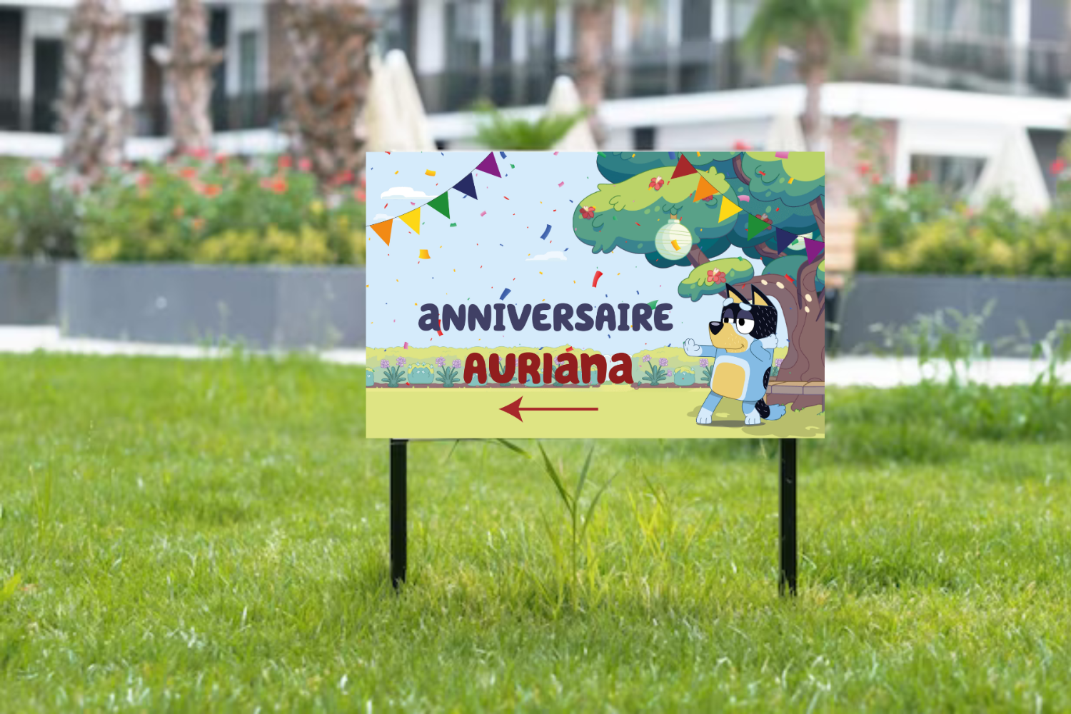
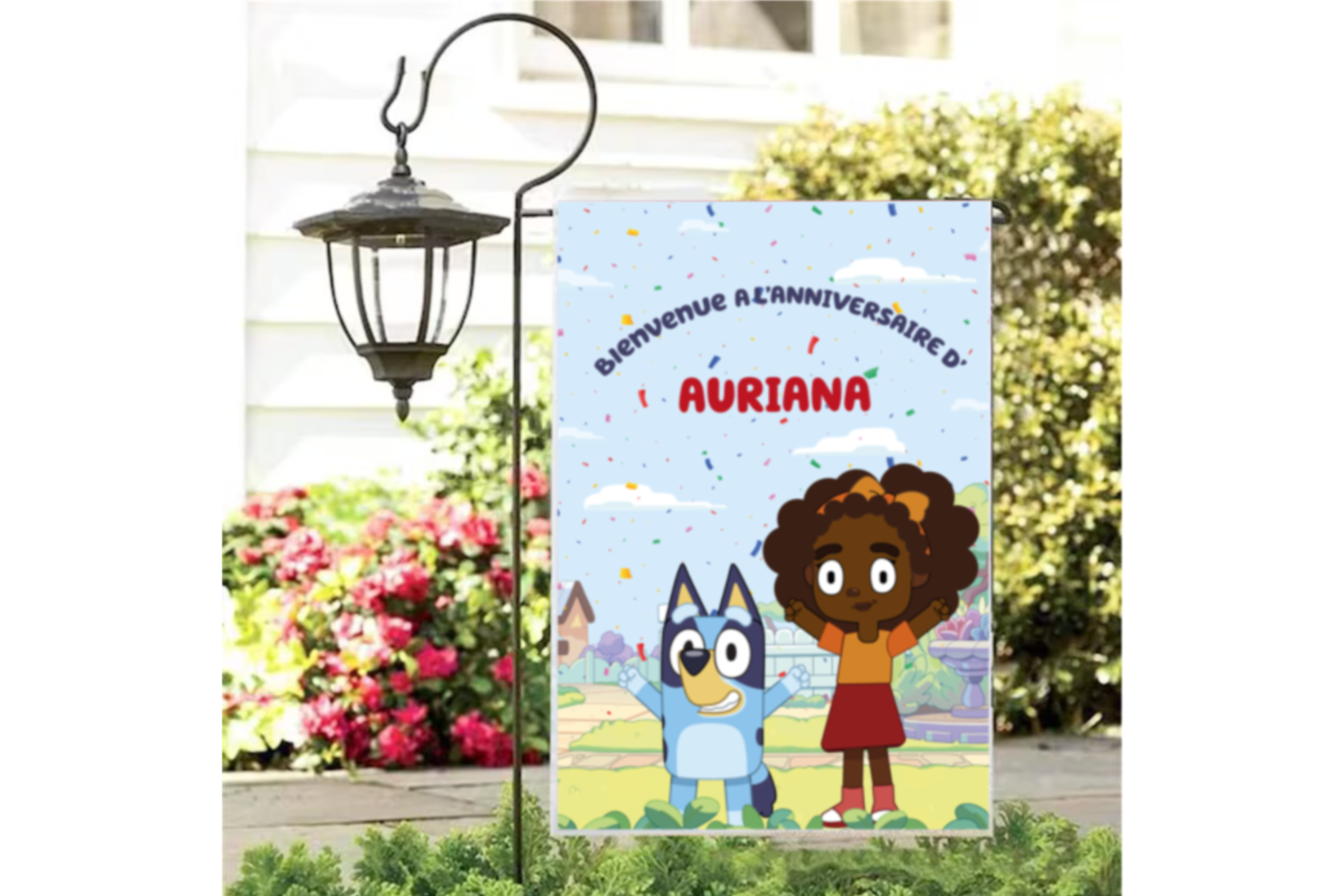
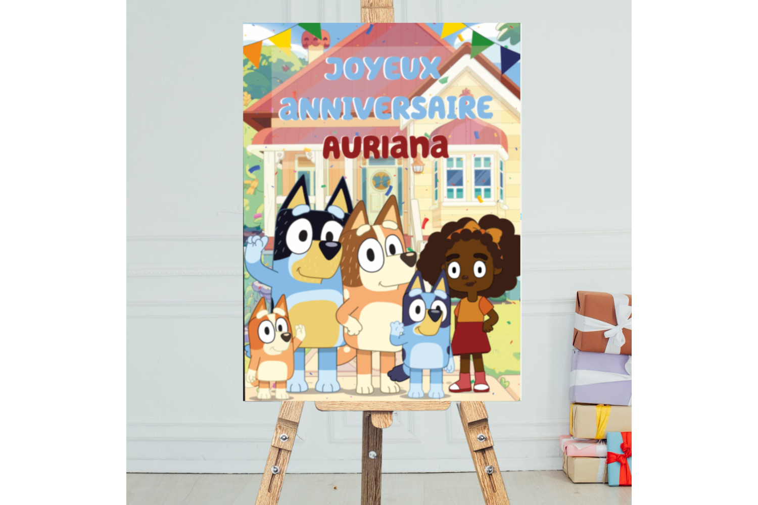
I had the joy of working on a one-of-a-kind birthday celebration, designing a personalized card and signage inspired by Bluey, the much-loved children’s series.
What made this project truly special was the opportunity to create an original character — a fun and heartfelt illustration of the birthday child — fully styled in the Bluey universe.
From capturing the show's playful aesthetic to blending in the child’s personality, every detail was carefully crafted to make the birthday experience magical and personal.
Illustrator & Designer
In this project, my role encompassed several key responsibilities:
Worked closely with the client to understand the child’s personality, interests, and the desired tone for the celebration.
Illustrated a custom character in the Bluey art style, ensuring it blended seamlessly with the show’s visual identity.
Designed layouts that brought the new character to life across multiple formats, balancing playfulness with visual harmony.
The end result was a set of joyful, fully personalized birthday materials that left a lasting impression. The family loved how the character captured the essence of their child while staying true to the charm of Bluey.
The project was praised for its creativity, attention to detail, and ability to transform a simple party into a truly memorable experience.
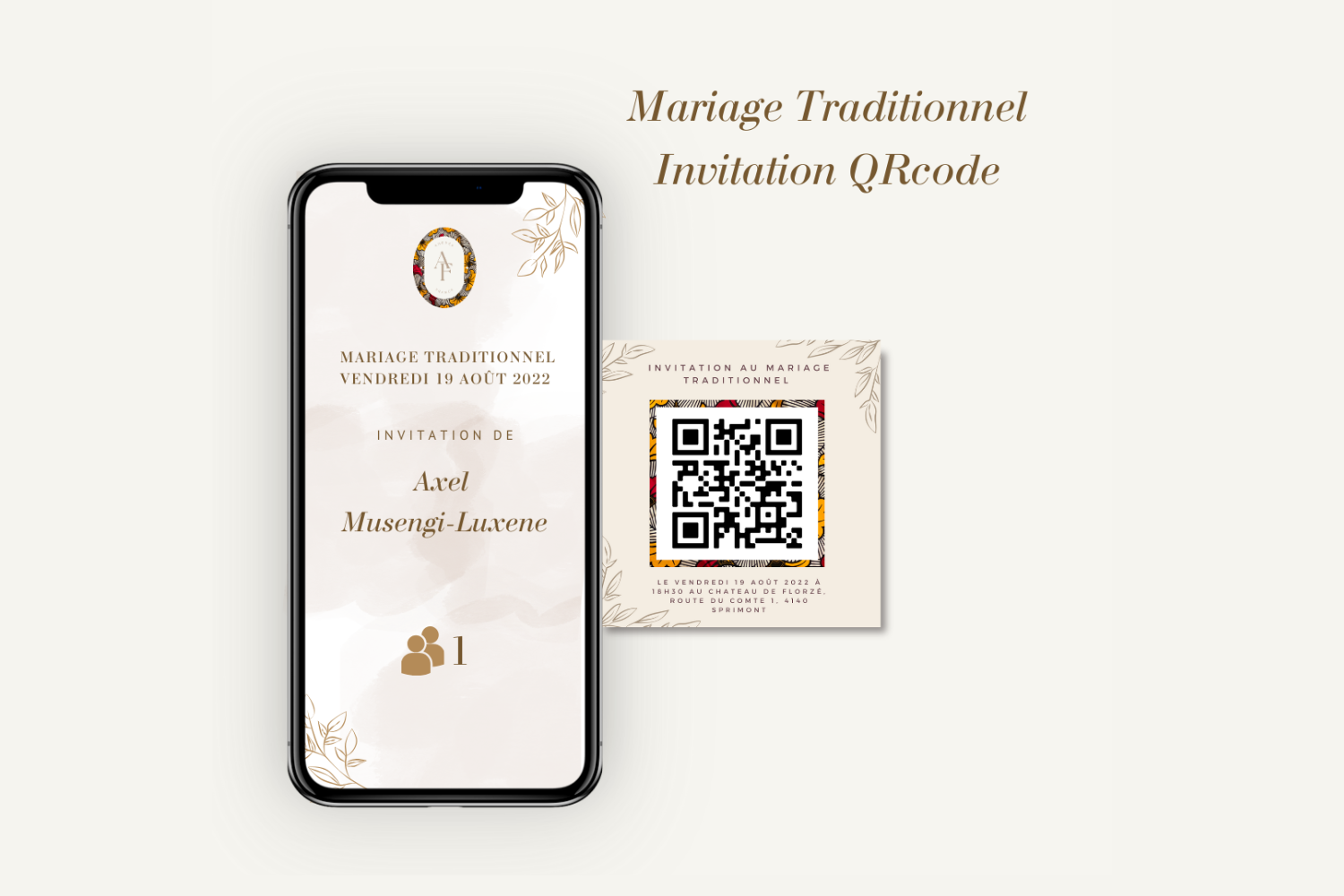
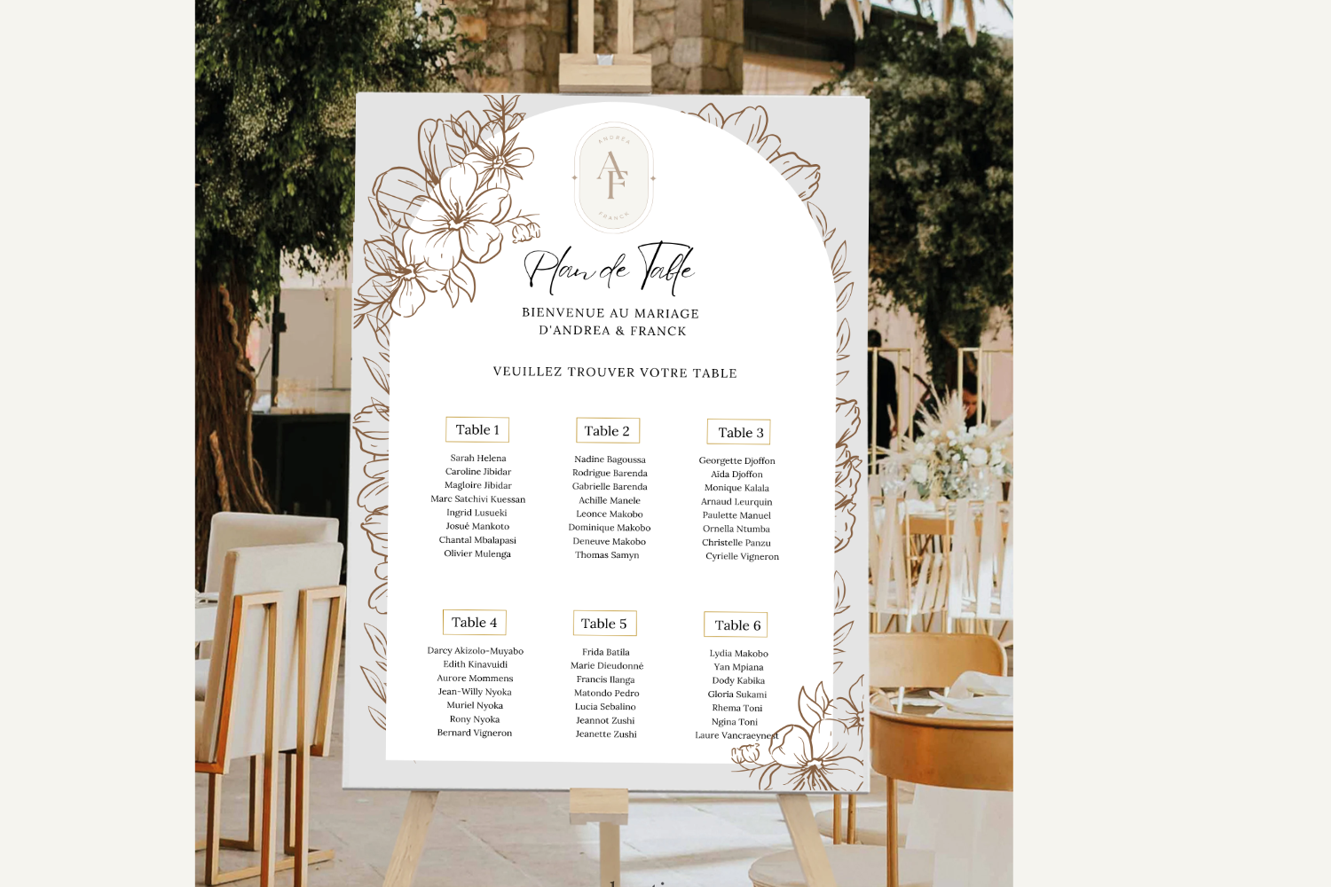
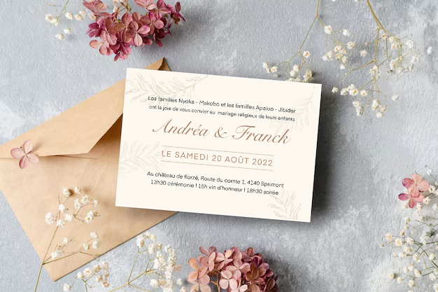
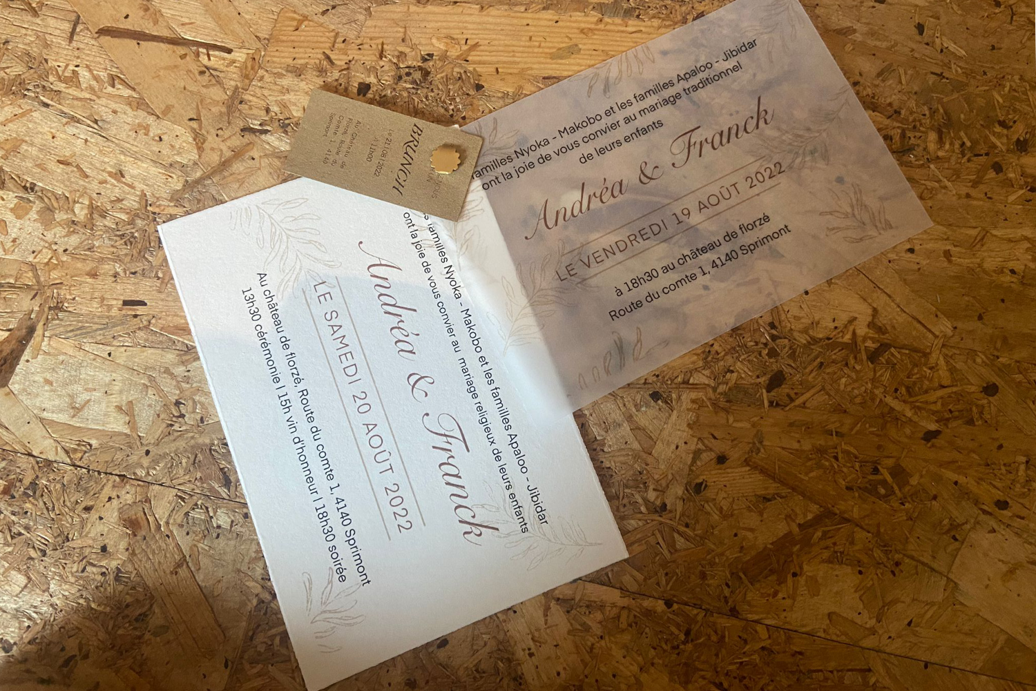
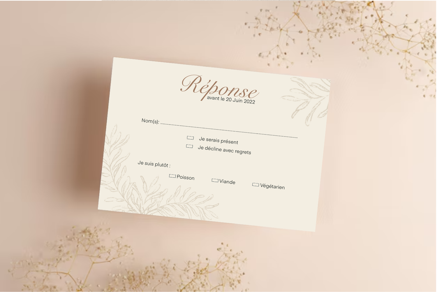
I had the joy of designing a bespoke suite of wedding invitations for an extraordinary three-day celebration held in a breathtaking castle. Each piece was crafted to reflect the couple’s unique personality and wedding theme — a warm, earthy, bohemian aesthetic with a refined, elegant twist.
From handpicked paper textures to the selection of typography and layout, every detail was designed to create a sensory and emotional experience for each guest — a balance of visual elegance and functional beauty.
The results of this project brought together elegant design and smart functionality — a perfect balance of beauty and purpose.
Here’s a closer look at the key elements we created to bring the vision to life:
Elegant modern typography paired with high-quality paper stocks brought sophistication and warmth to the suite. The tactile experience matched the castle ambiance and left a lasting impression.
A large-format chart placed at the venue entrance helped guests find their assigned seats effortlessly, ensuring smooth flow and minimal confusion.
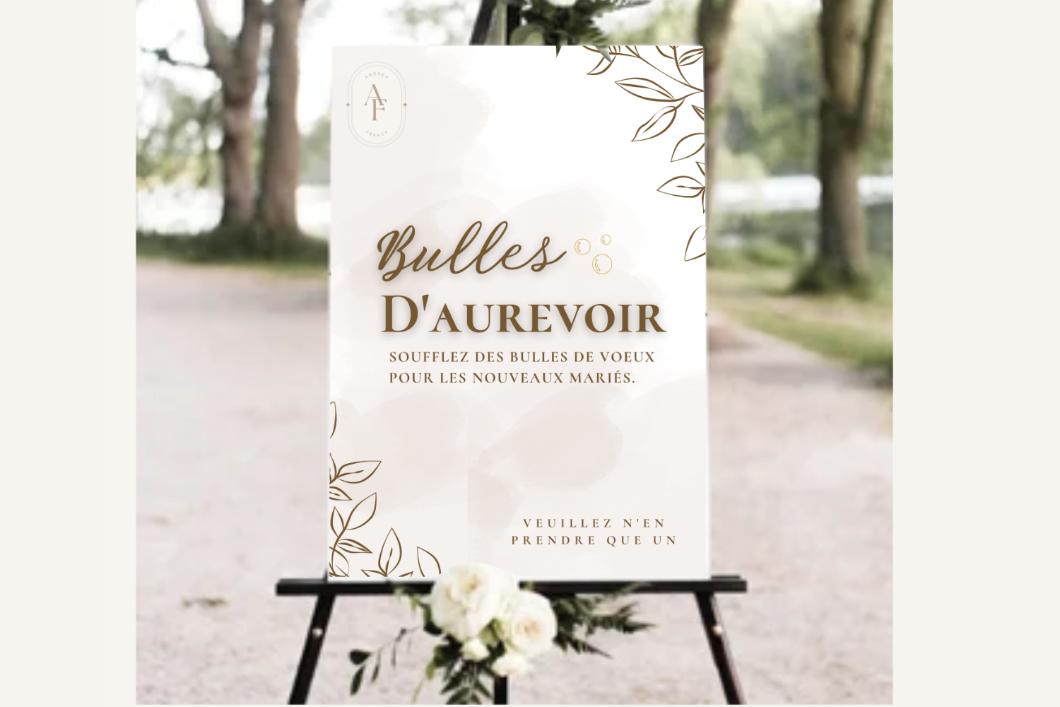
A joyful touch! Guests were prompted to blow bubbles as the newlyweds exited — a playful, photogenic, and heartfelt moment beautifully choreographed through design.
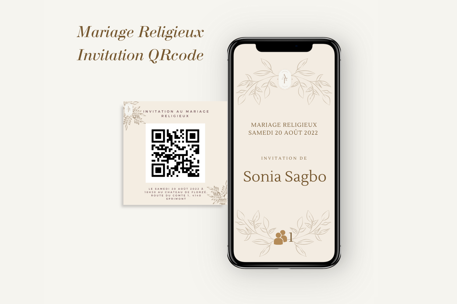
Invitations included scannable QR codes shared digitally in advance. They gave guests immediate access to wedding details and enabled the venue to manage check-ins securely — blending design with innovation and efficiency.
Designing for love stories is always special, but this one was particularly meaningful.
It wasn’t just about paper and ink — it was about shaping a beautiful, organized experience that celebrated love and helped everything flow seamlessly.
Congratulations to the couple on their extraordinary day!
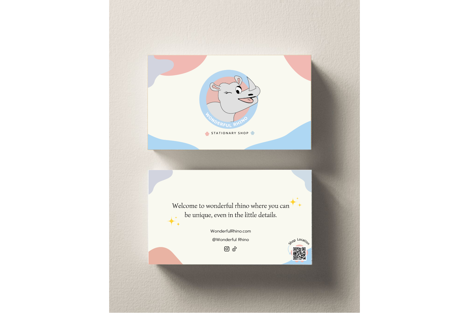
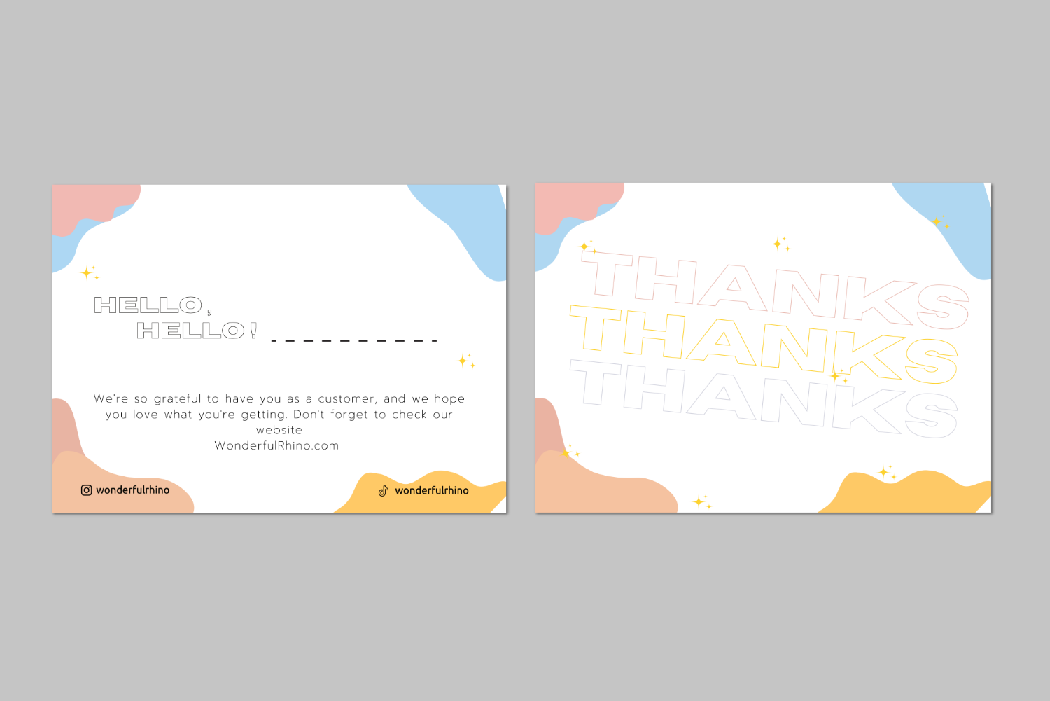
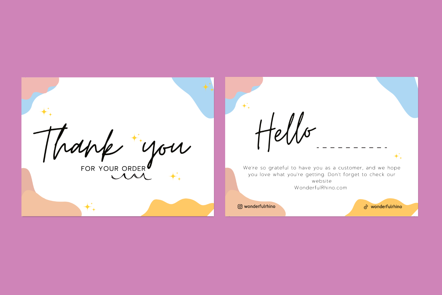
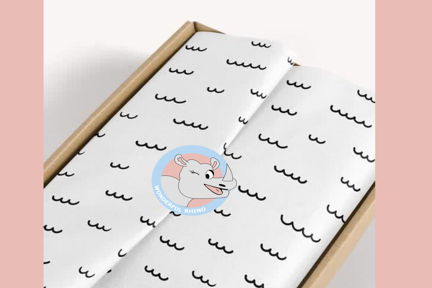
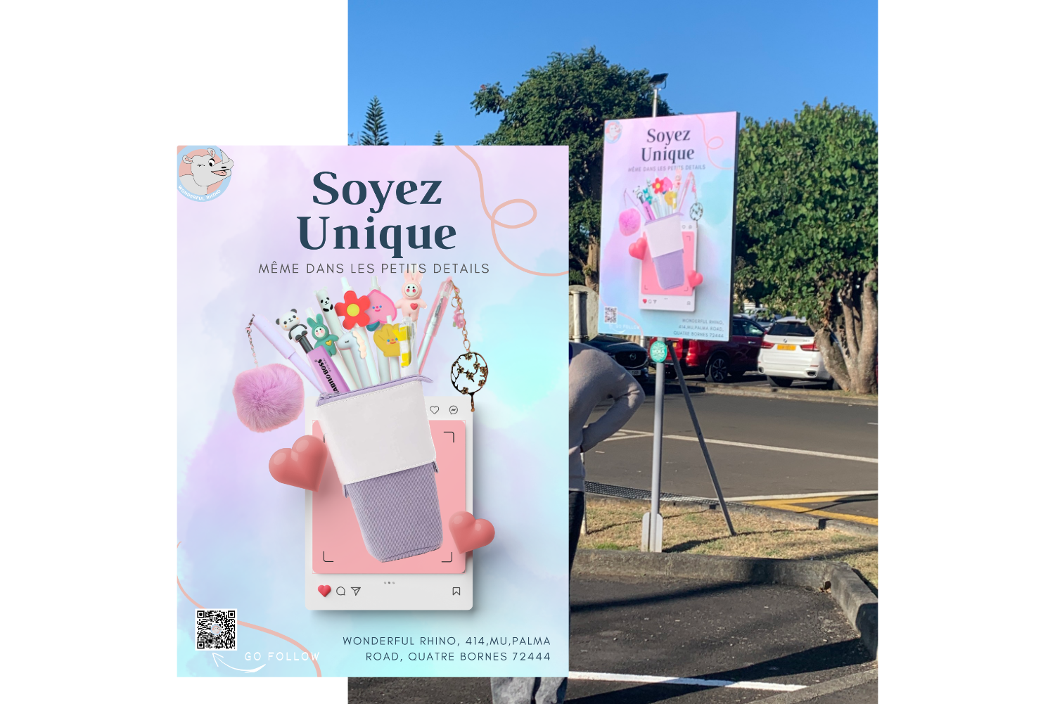
I had the joy of collaborating with Wonderful Rhio, a charming stationery shop known for its playful, cute, and practical paper goods.
My mission was to bring their warm and cheerful brand identity to life through a personalized set of print materials and packaging assets.
From stickers to business cards and thank you notes, each element was carefully designed to reflect the shop’s delightful personality — adding a sense of joy, care, and creativity to every customer experience.
The project encompassed a diverse range of elements, each thoughtfully crafted to resonate with Wonderful Rhio's identity:
Bright and playful stickers were created for two purposes: to securely seal packages and to add a pop of fun to wrapping paper — turning each unboxing into a joyful moment.
I reworked the original logo into clean vector format, ensuring it was scalable and consistent across all mediums — from packaging to social media.
A refined yet fun business card design captured the brand’s dual essence of professionalism and charm, making a lasting impression on partners and clients.
Two original thank you card designs added a personal and heartfelt touch to customer orders, helping strengthen brand loyalty with every delivery.
A vibrant print ad placed near schools showcased Wonderful Rhio’s adorable and useful stationery products, grabbing the attention of both students and parents.
This project was a celebration of small details making a big difference. Every design decision was made to enhance the customer journey — turning everyday stationery into an experience full of personality and care.
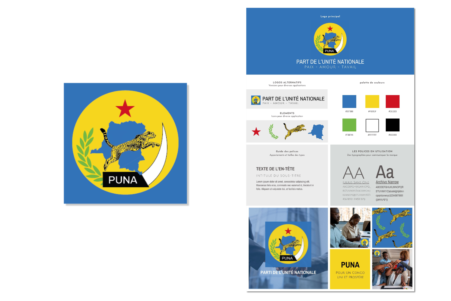
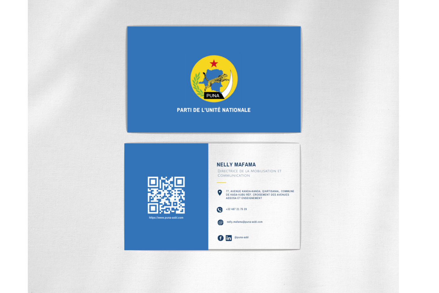
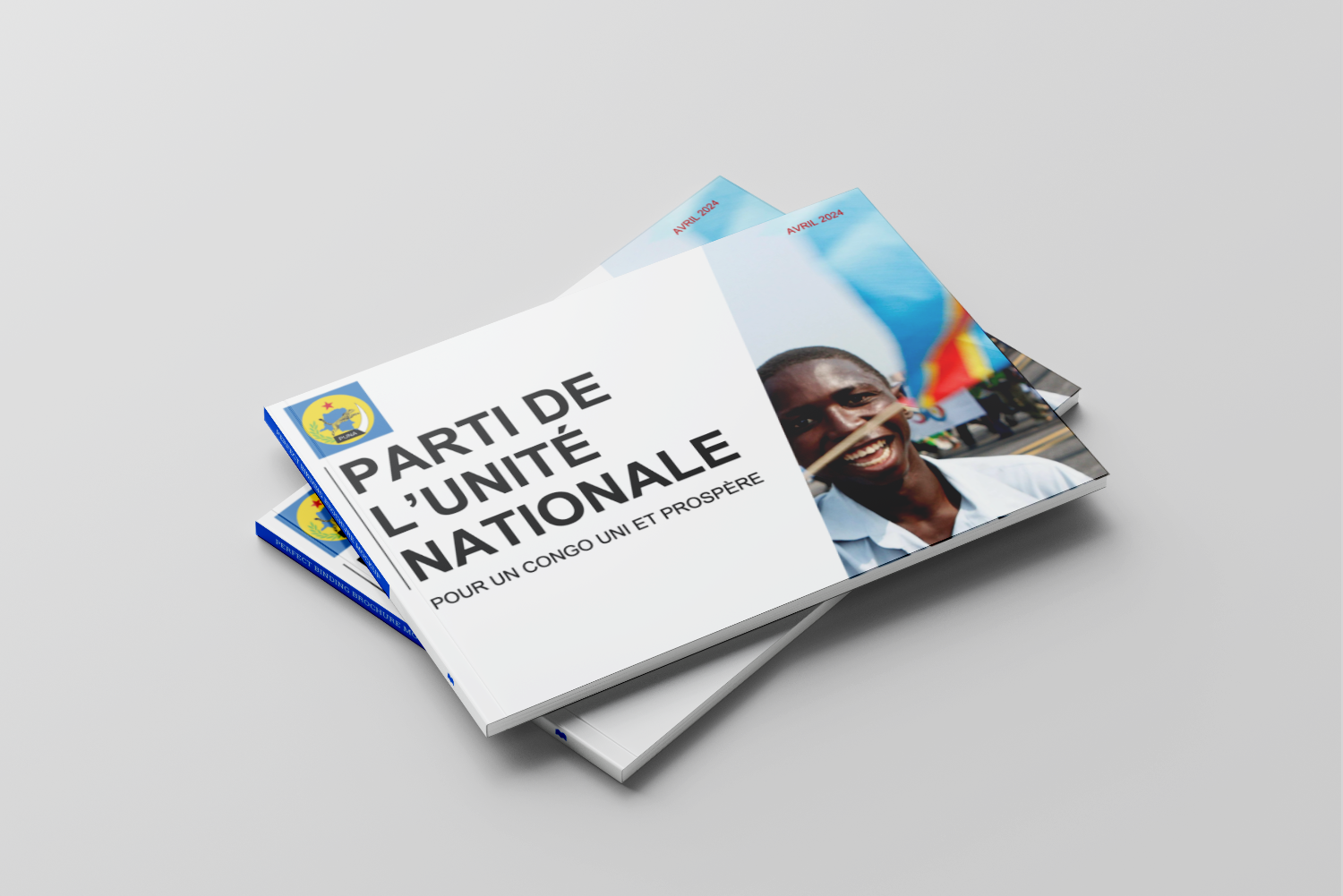
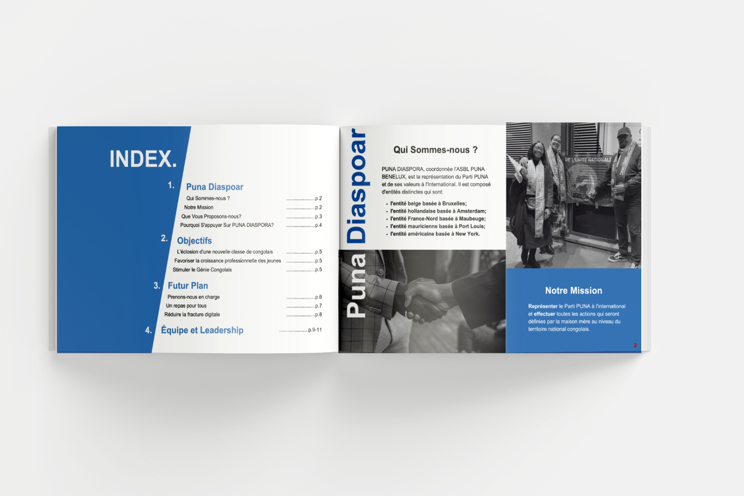
I had the privilege of leading a full brand development initiative for PUNA, a patriotic and reform-minded Congolese political organization.
This project focused not just on visuals, but on building trust and recognition through thoughtful communication tools and consistent design — ensuring the public could connect with PUNA’s message on a deeper level.
The goal: to amplify their public presence and craft a unified brand message that clearly reflects their mission, values, and vision for change.
Designed personalized business cards for 18 team members, maintaining brand consistency and providing print-ready files in multiple formats for ease of production.
Rebuilt the existing logo in vector format to ensure scalability and cross-platform versatility.
Created a comprehensive kit featuring logo variations, color palette, typography, and brand patterns — giving PUNA a professional, consistent visual language.
Designed an engaging slide deck to convey PUNA’s mission and values. This included refined copywriting, curated imagery, and dynamic animations for impactful storytelling.
Wrote and designed an introductory booklet aimed at recruiting new members and partners. The content and layout reflected PUNA’s vision while making their platform accessible and compelling.
With their upgraded brand tools, PUNA was able to present a consistent and credible image to audiences both locally and internationally. Their message reached farther, and their mission became clearer — supported by thoughtful design and unified communication.
This project reaffirmed my belief that strategic design can do more than look good — it can build influence, inspire action, and help causes gain real momentum.
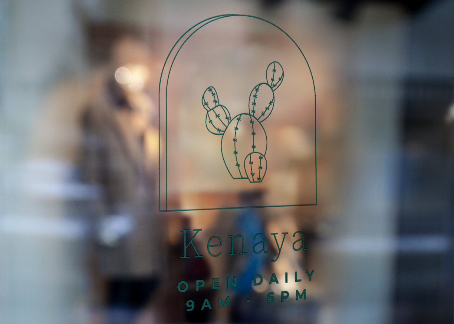
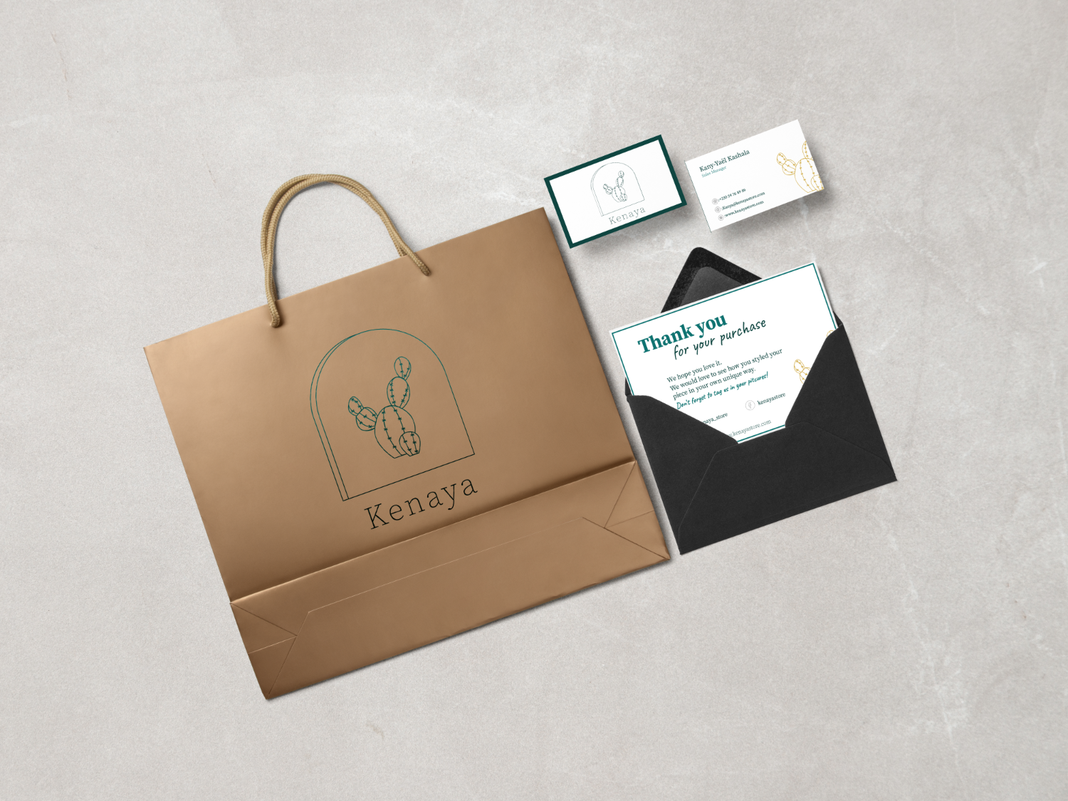
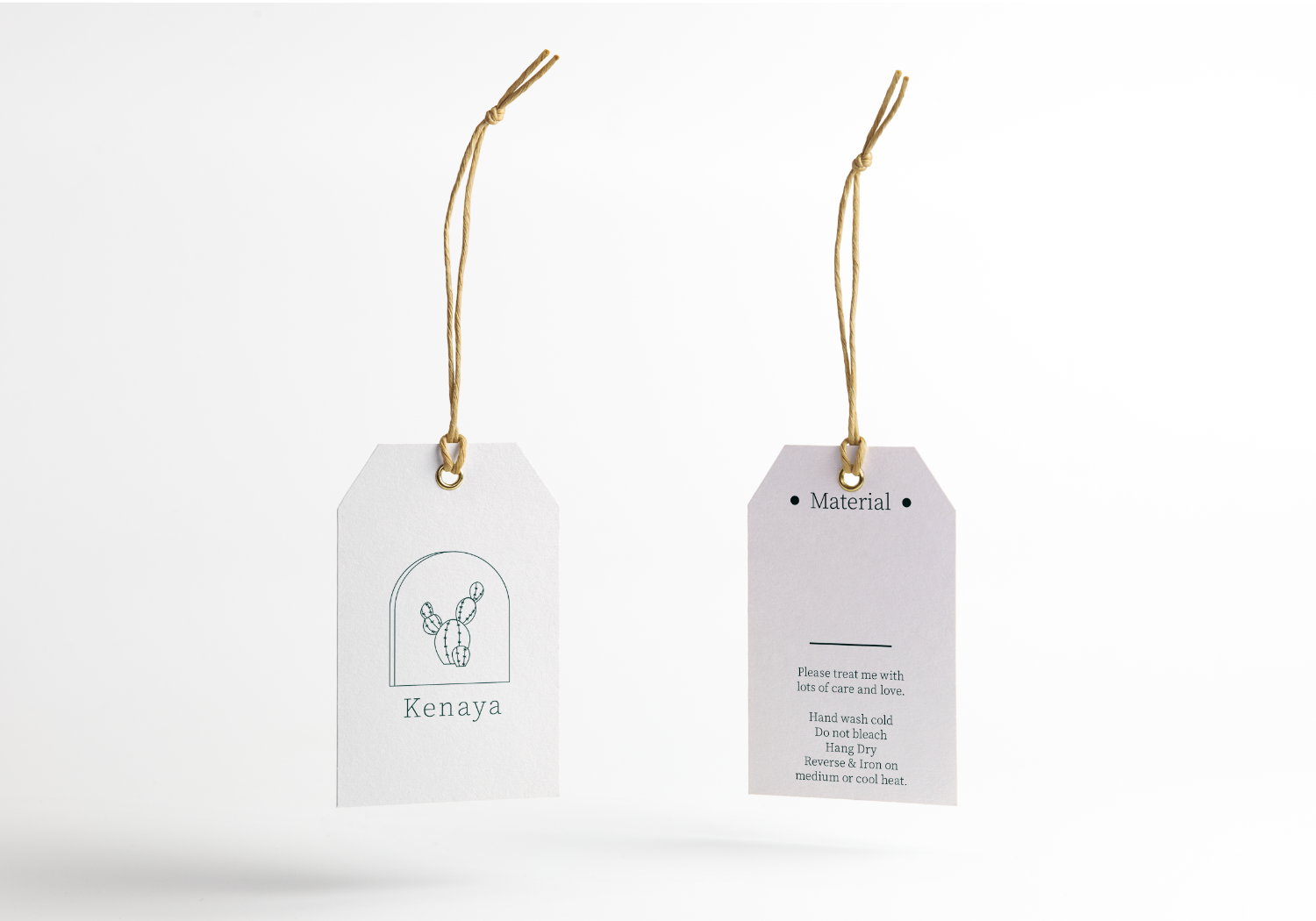
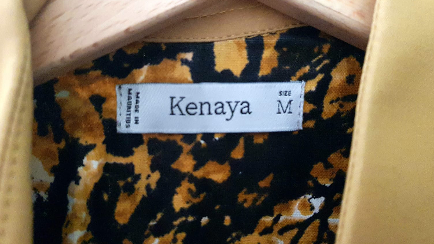
Kenaya, a fashion label rooted in sustainability and slow fashion values. The brand focuses on micro-collections to reduce overproduction and exclusively uses certified organic materials — a mission I was proud to support through thoughtful, purpose-driven design.
The creative brief called for a modern yet meaningful logo featuring a cactus, along with a cohesive set of printed assets that would reflect the brand’s values: sustainability, authenticity, and individual expression.
The cactus, enclosed within a soft arc, symbolized resilience, growth, and protection — aligning perfectly with Kenaya’s vision of empowering individuals through ethical everyday wear.
Designed with minimalism and clarity in mind, these labels were easy to read and matched the brand’s refined, eco-conscious aesthetic.
Clean and consistent, these cards featured the iconic cactus mark, modern typography, and an earthy palette — reinforcing brand identity with professionalism.
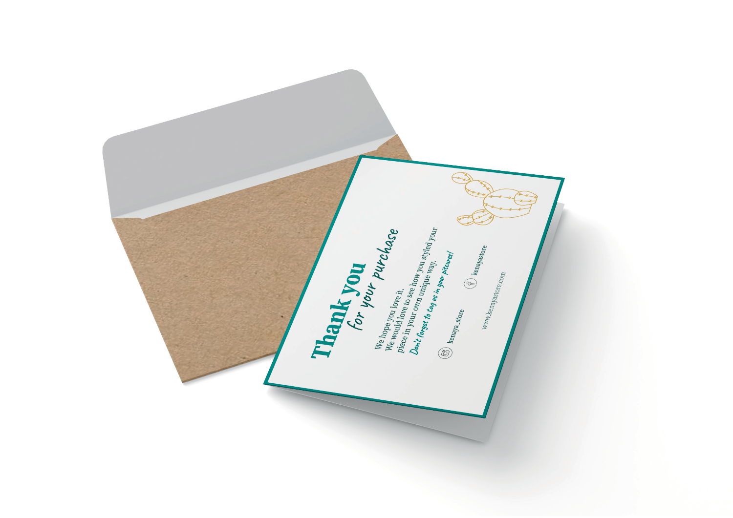
A warm, personal touch to each package. These notes expressed genuine appreciation while echoing the brand’s community-driven values.
Clear, uniform, and visually aligned with all other brand assets — ensuring consistency across touchpoints.
Produced using recycled materials, these bags served as portable brand ambassadors, with minimal design and a strong eco-message.
The brand identity successfully communicated Kenaya’s core values: sustainability, community empowerment, and expressive individuality.
From logo to packaging, every detail helped form a consistent and recognizable visual system.
By integrating story, symbolism, and sustainability, we gave Kenaya the tools to connect more deeply with its conscious audience — and turn every product experience into a brand moment.

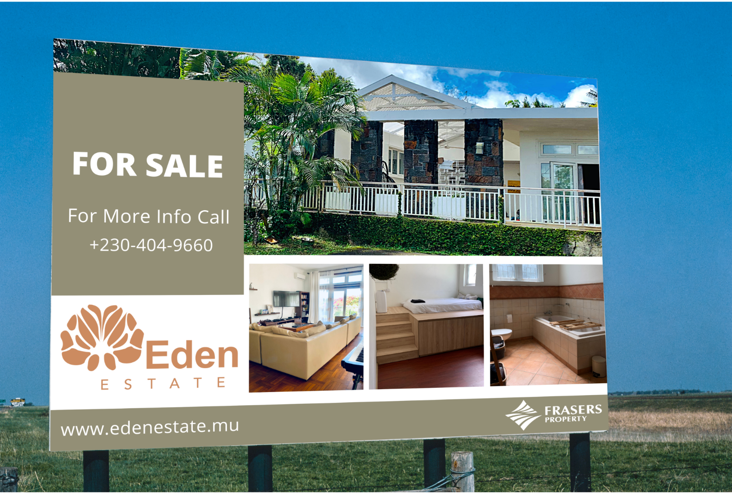
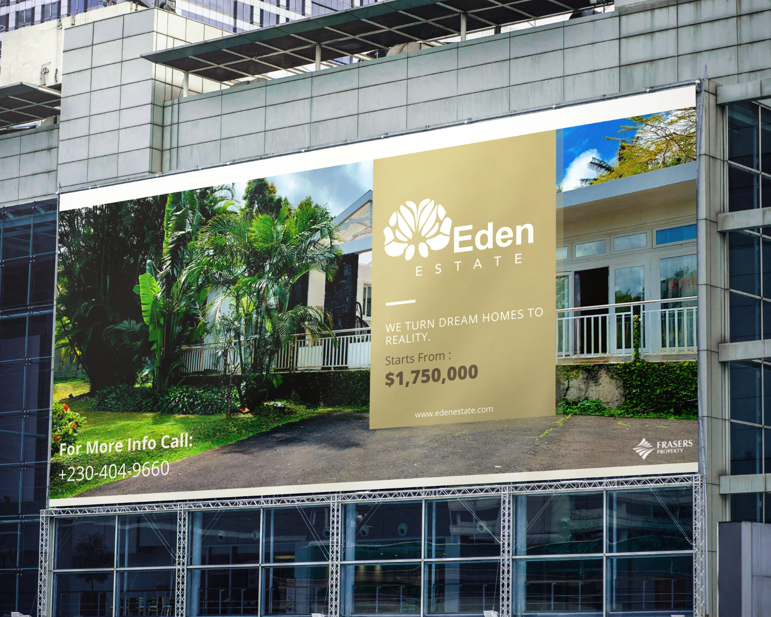
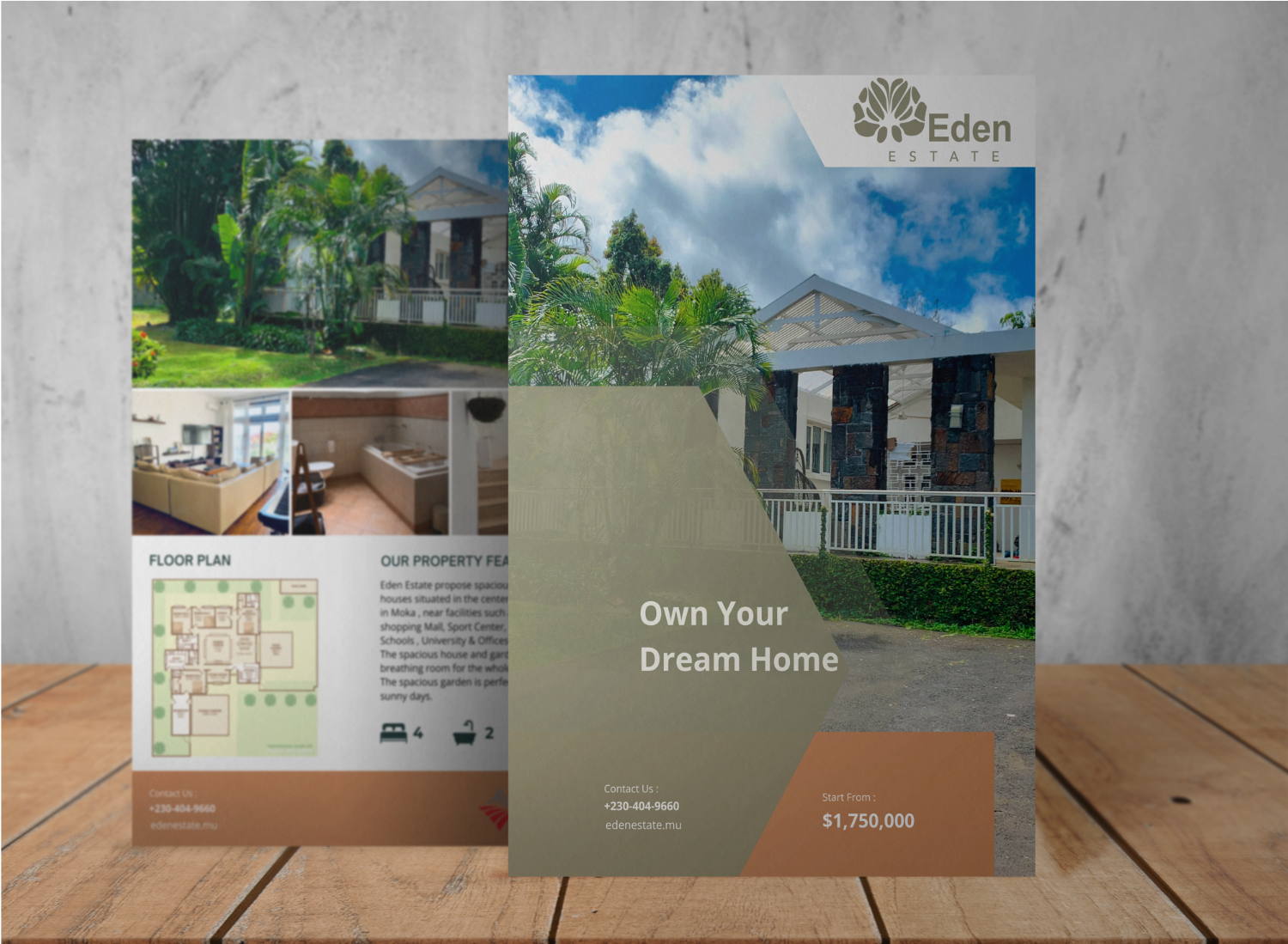
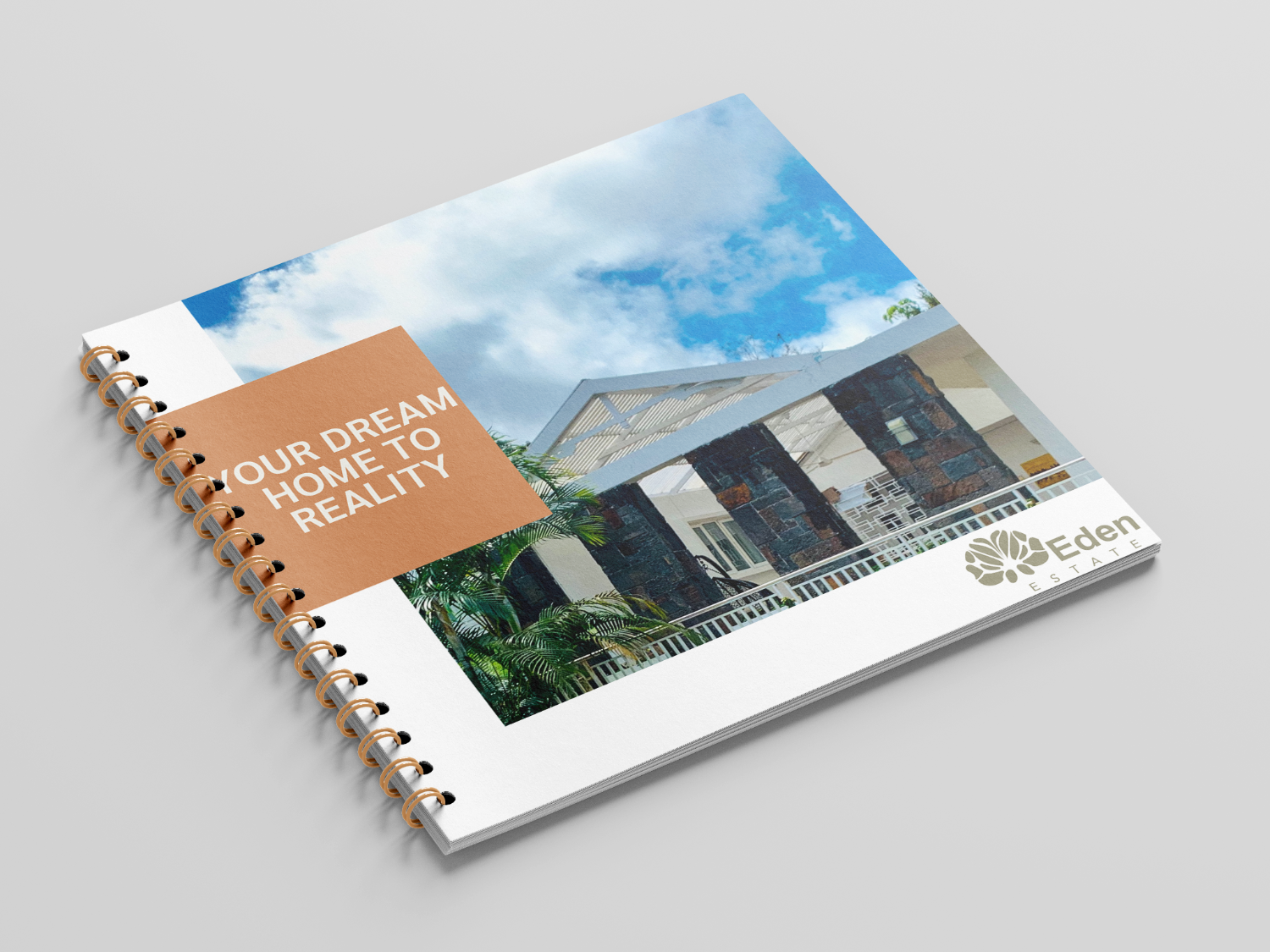
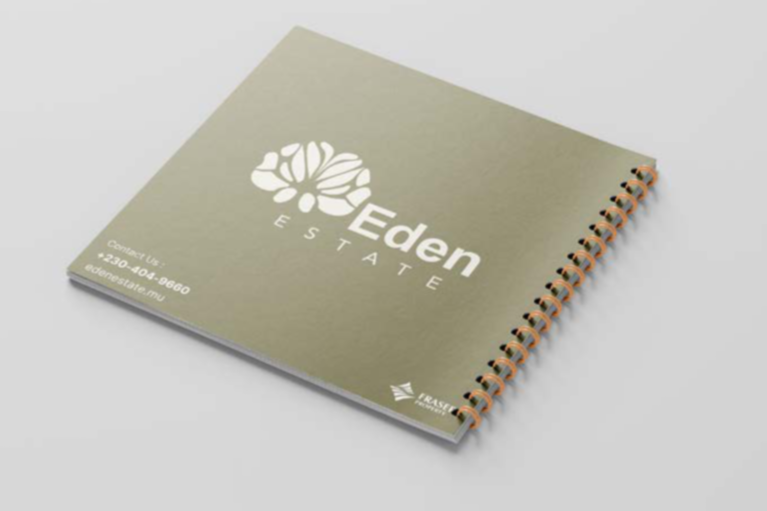
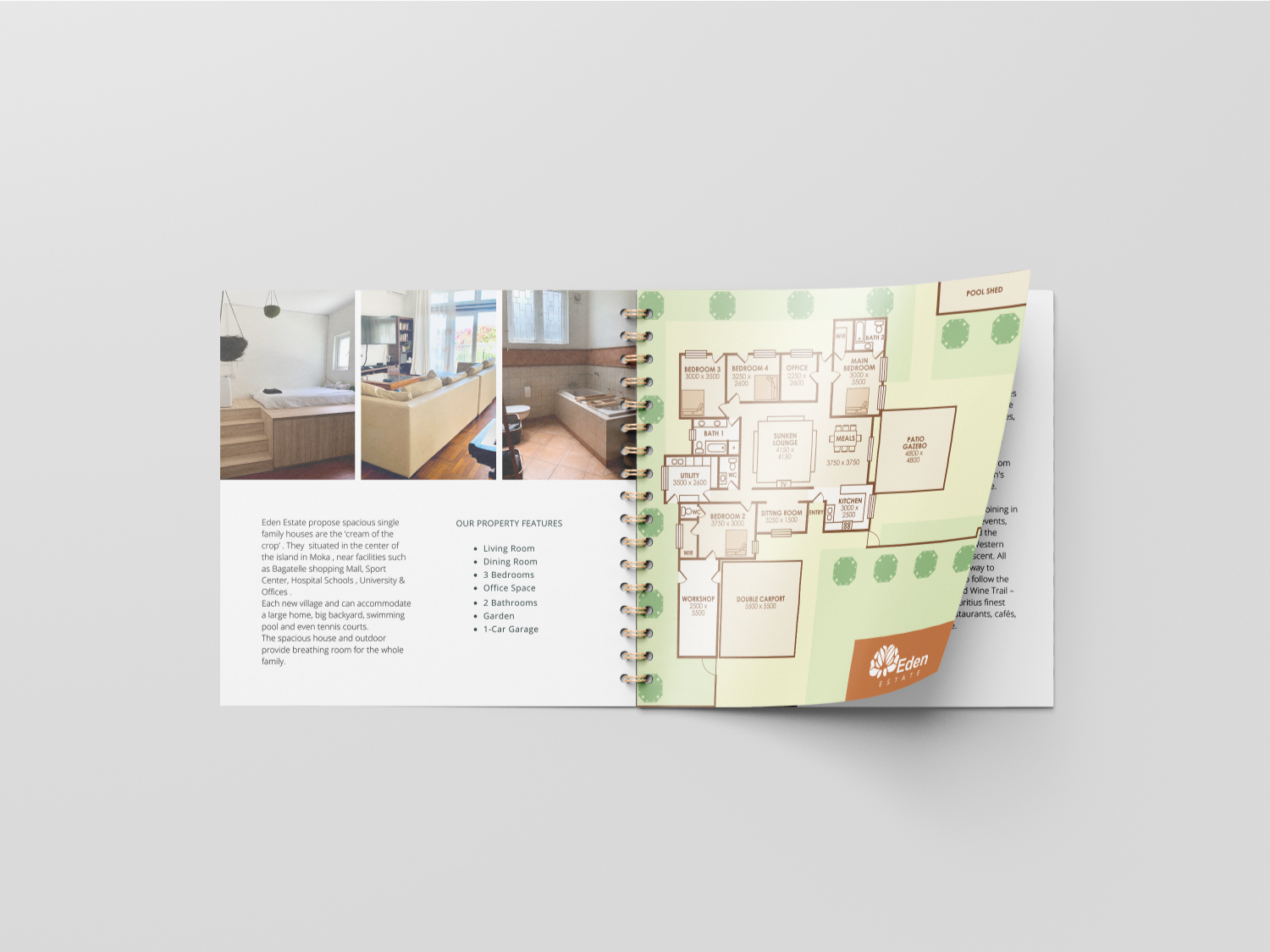
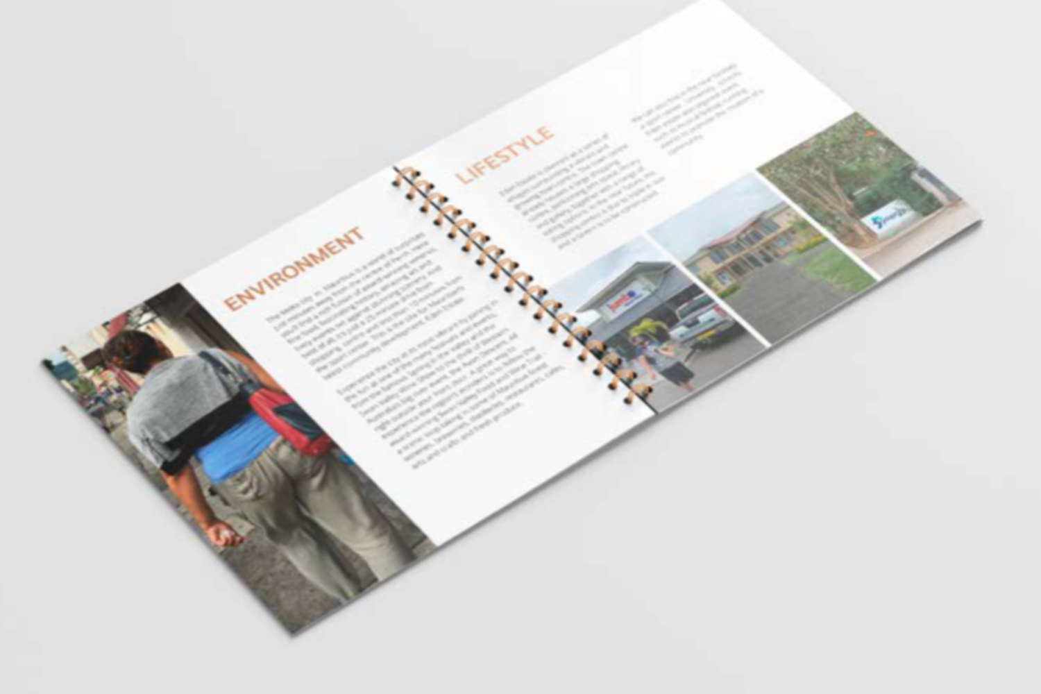
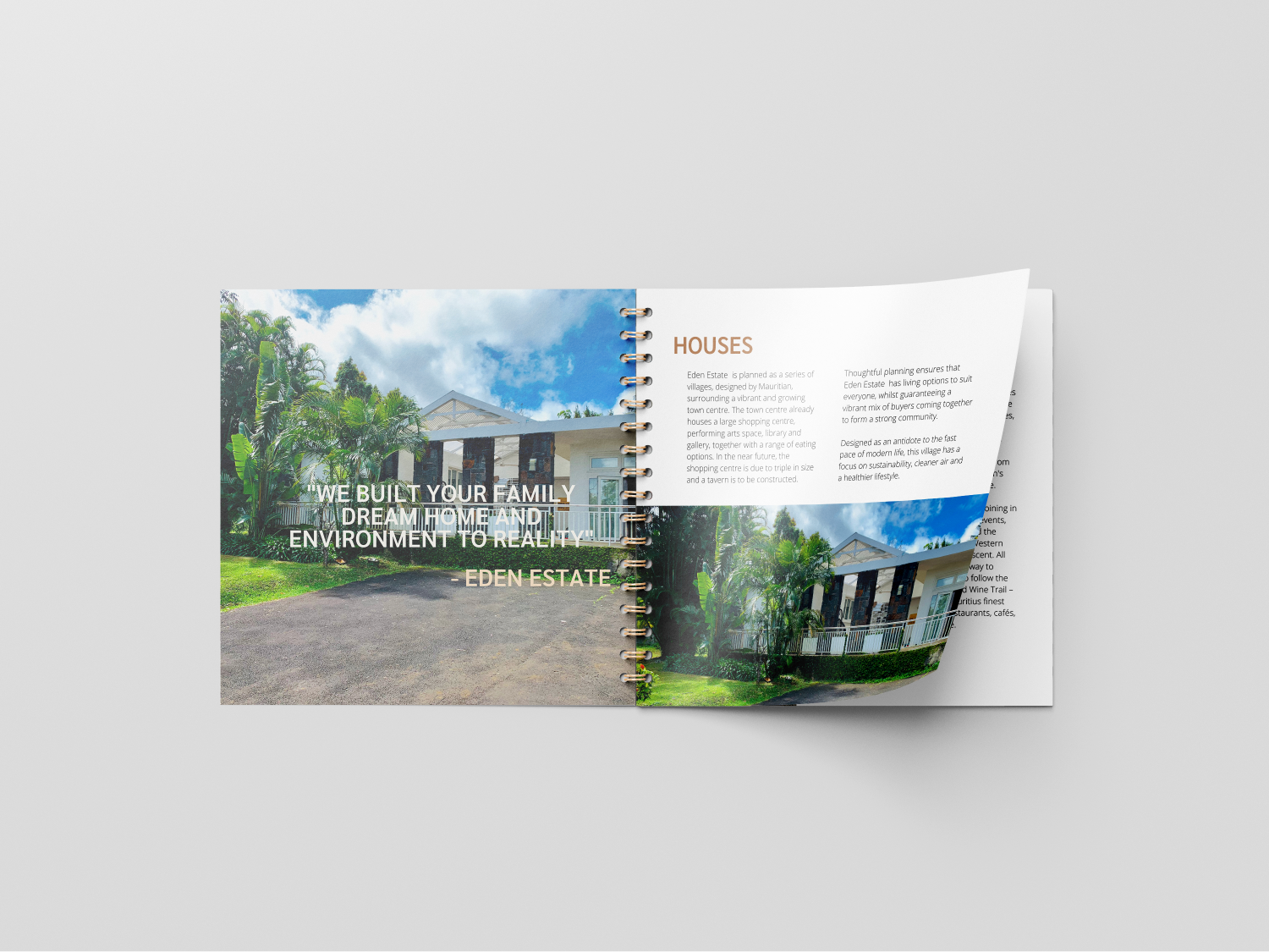
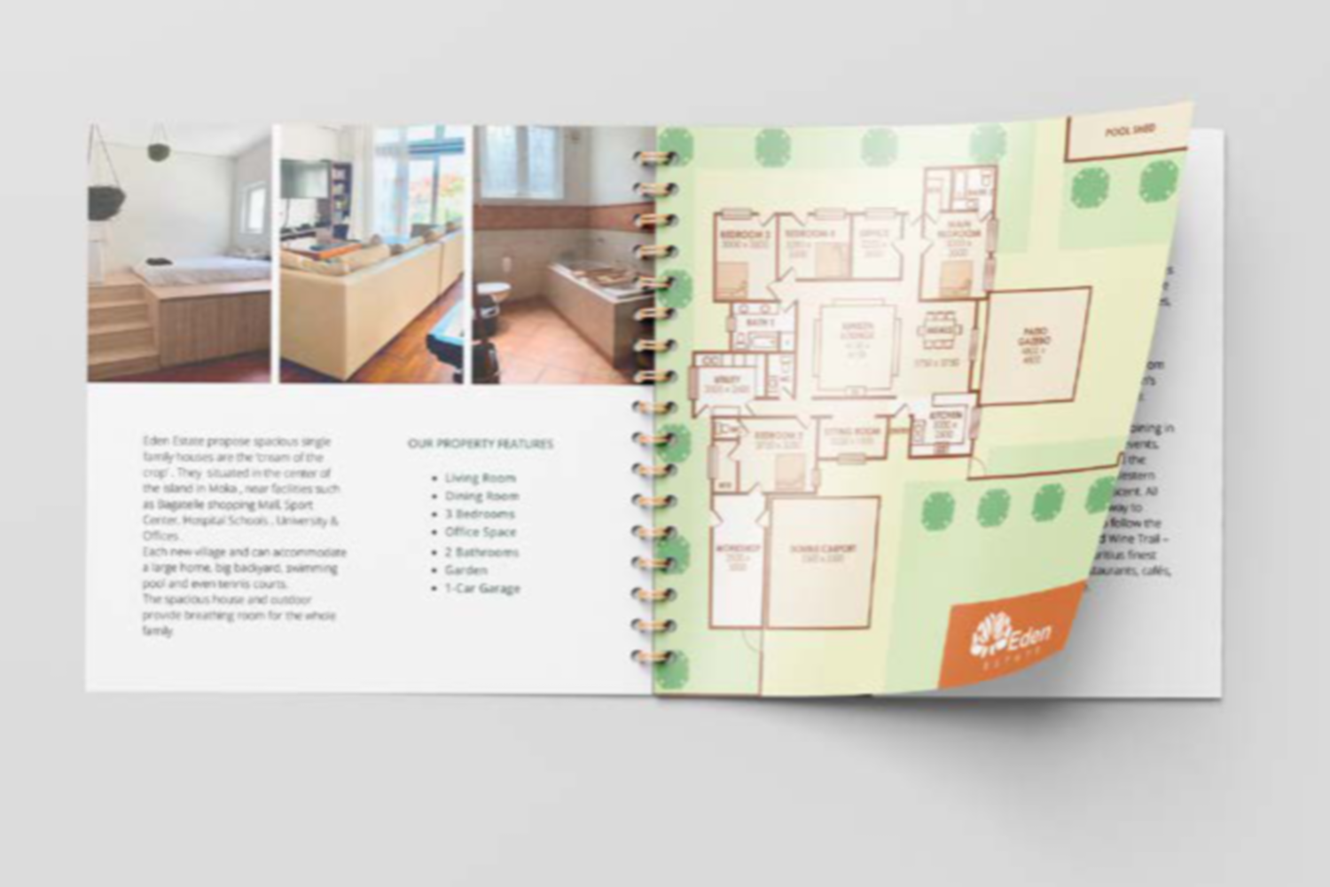
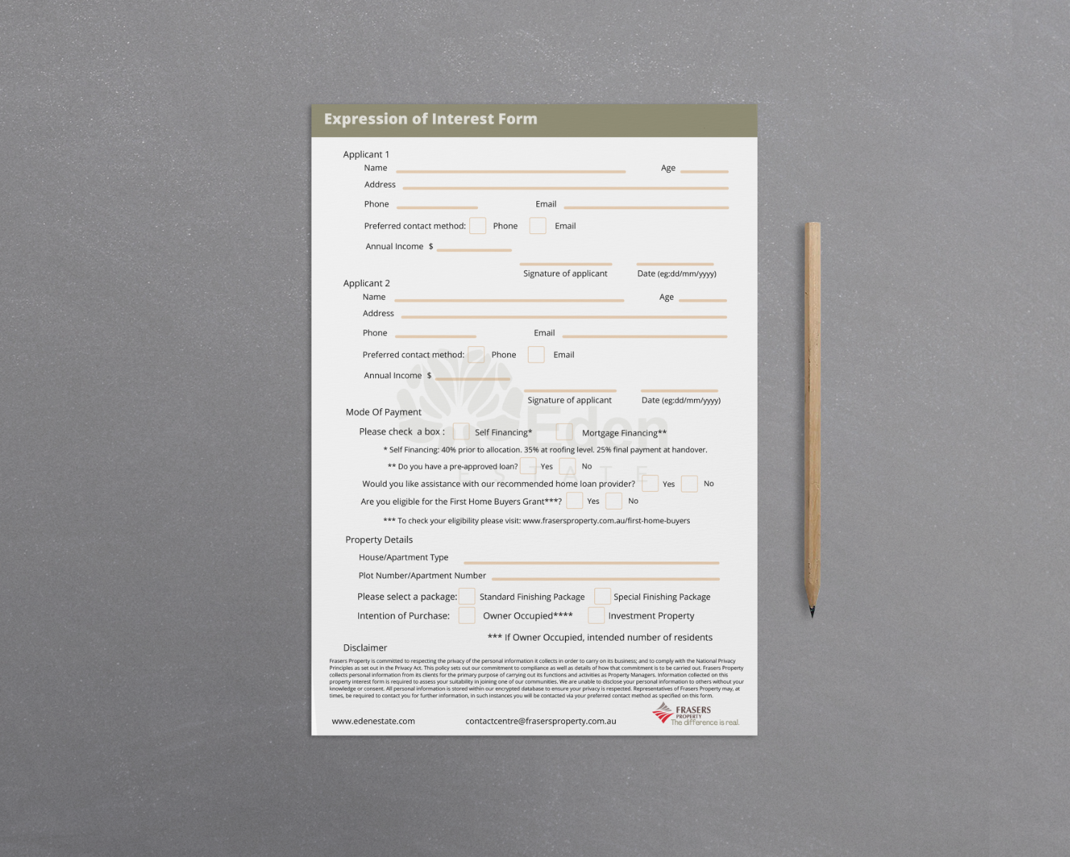
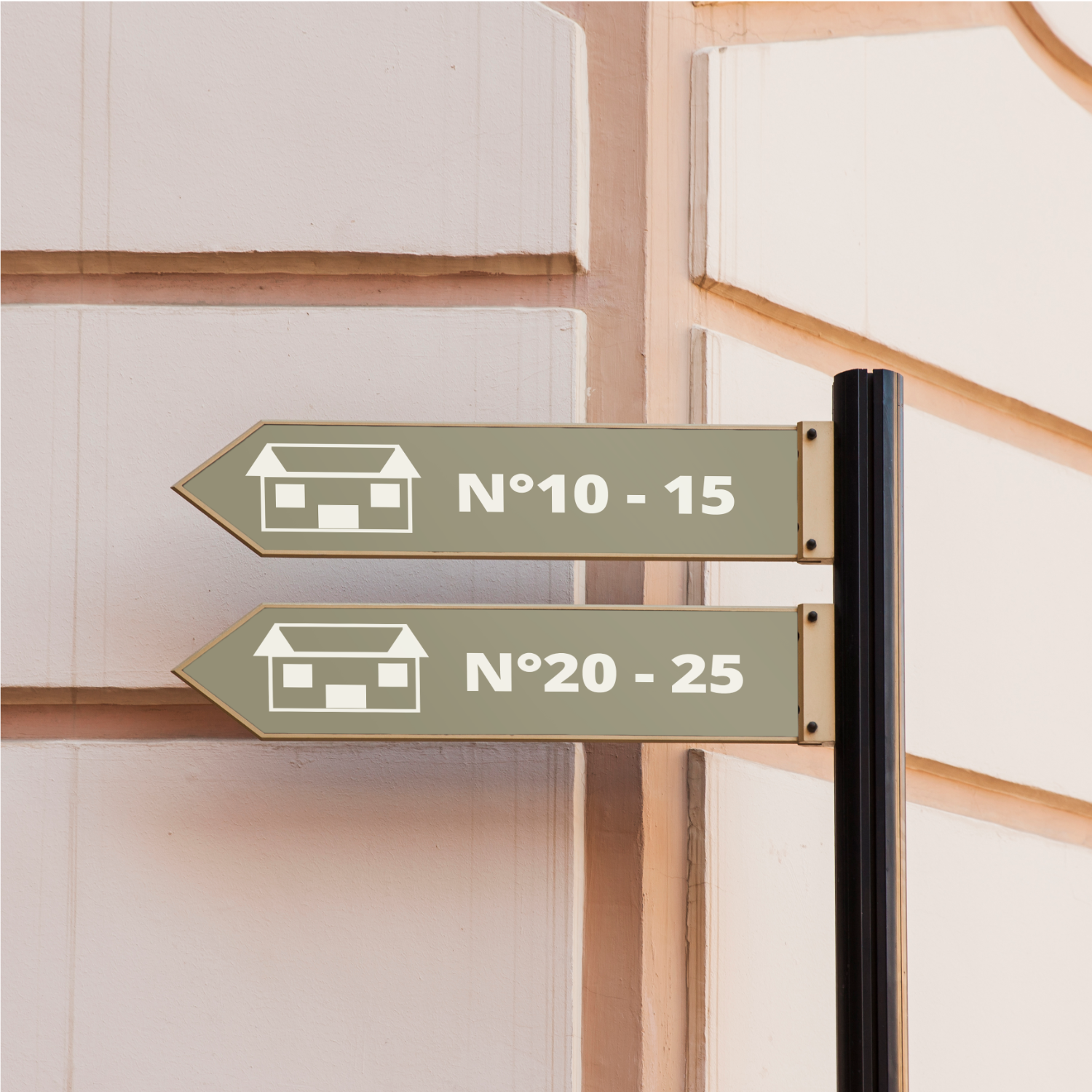
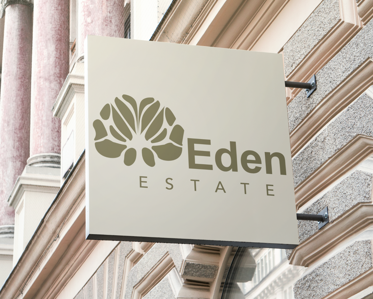
Eden Estate was the name of the housing complex for which I was responsible for creating the logo and other marketing materials.
The main goal was to create a unified brand identity that speaks to the intended audience by drawing attention to the physical structures, the interior atmosphere, the exterior environment, and cultural elements of the development.
As part of an all-encompassing branding strategy, a variety of promotional materials were developed:
The name "Eden" was chosen for its connotations of paradise and natural beauty, aligning perfectly with the estate's mission to offer a serene and family-oriented living environment. The logo, featuring an open flower, symbolizes beauty, refinement, and happiness, which are key attributes we wanted to convey.
The development's architectural structures, interior and outside environments, and cultural components were all beautifully depicted in the high-resolution images that were part of the deliverables. Potential buyers were enticed to delve more into the development because it successfully communicated the estate's promise of a safe, cozy, and community-focused living area.
All of the materials were aesthetically pleasing and easy to browse since concepts of design including balance, alignment, contrast, and hierarchy were consistently applied.
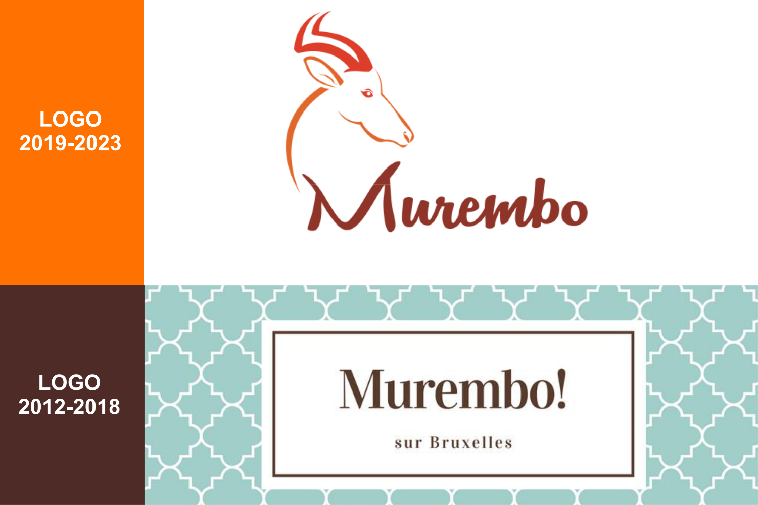
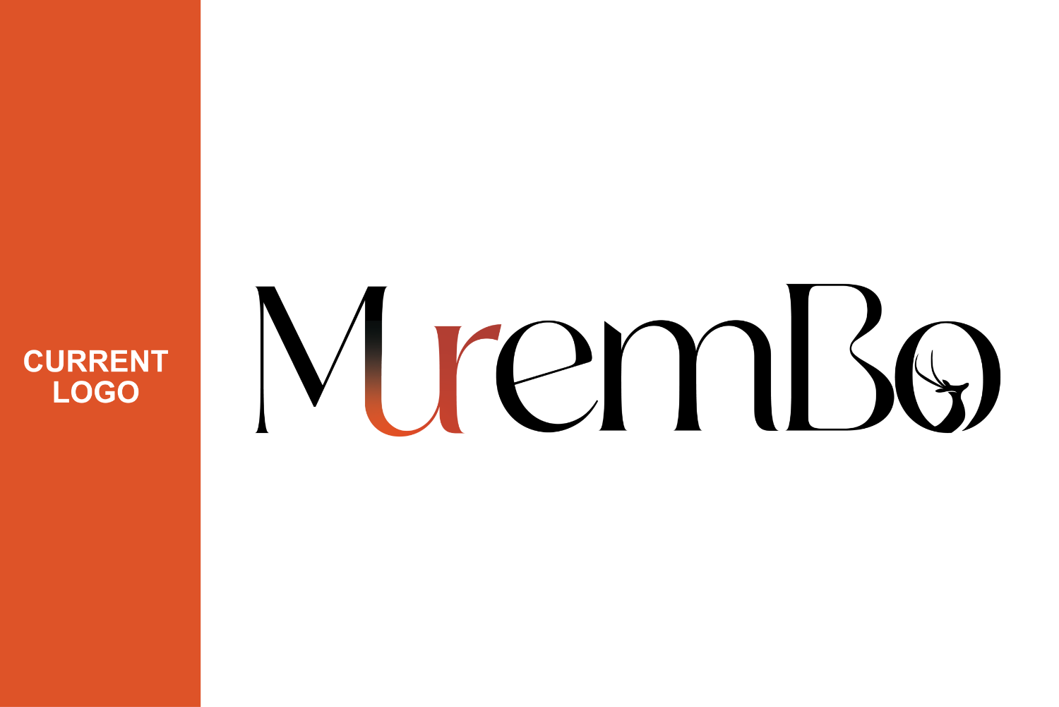
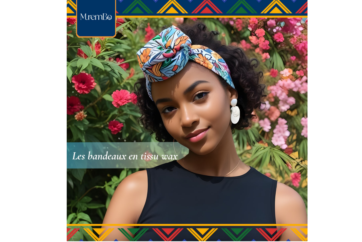
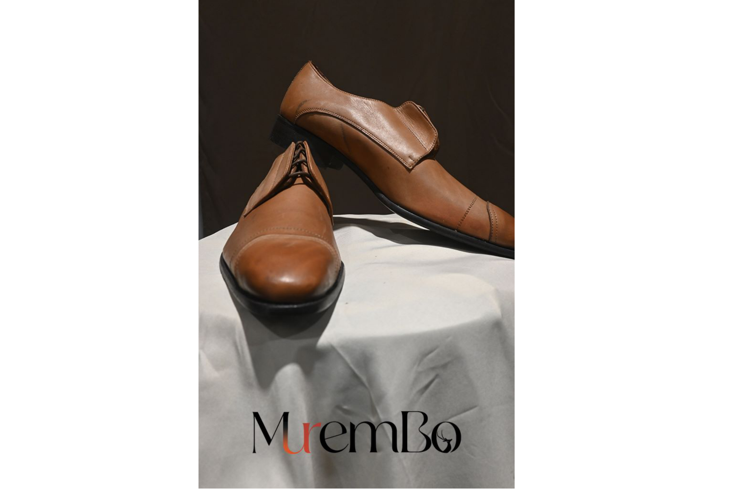
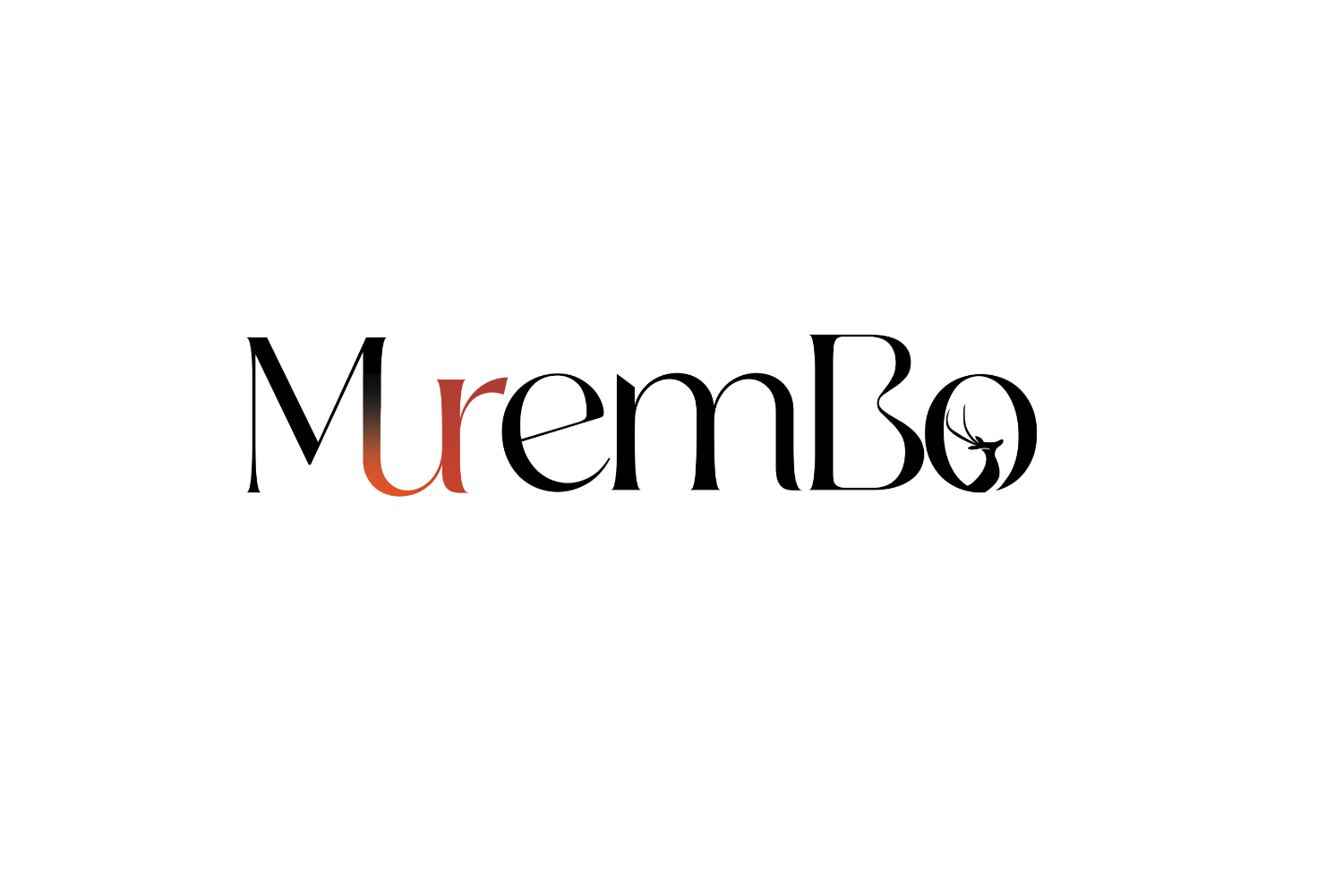
The current Murembo insignia has a deer, which is significant to the business, but the owners of the company believed it was too masculine and violent, so they contacted me to redesign it. In a perfect world, their logo would be classic, gender-neutral, and easily customizable for all sorts of print and digital media.
The updated logo maintained the deer motif from the previous version but made it more ladylike and balanced so that it could be worn by people of all ages.
Its versatility in matching Murembo's use of different fabric patterns and colors ensured that it would complement a wide range of products.
The revamped logo successfully met Murembo's needs, providing a versatile, elegant design that could be applied across various products and media.
The new logo maintained the essence of the original while enhancing its appeal and functionality.
Feedback from the client was positive, highlighting the logo’s ability to seamlessly integrate with any fabric pattern and color and its suitability for all target demographics.
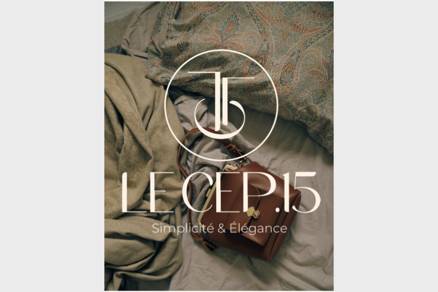
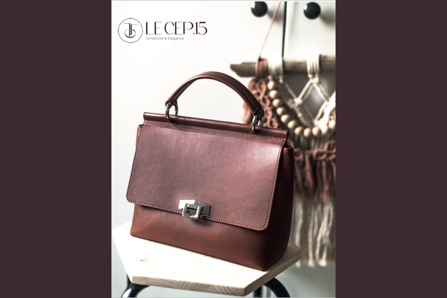
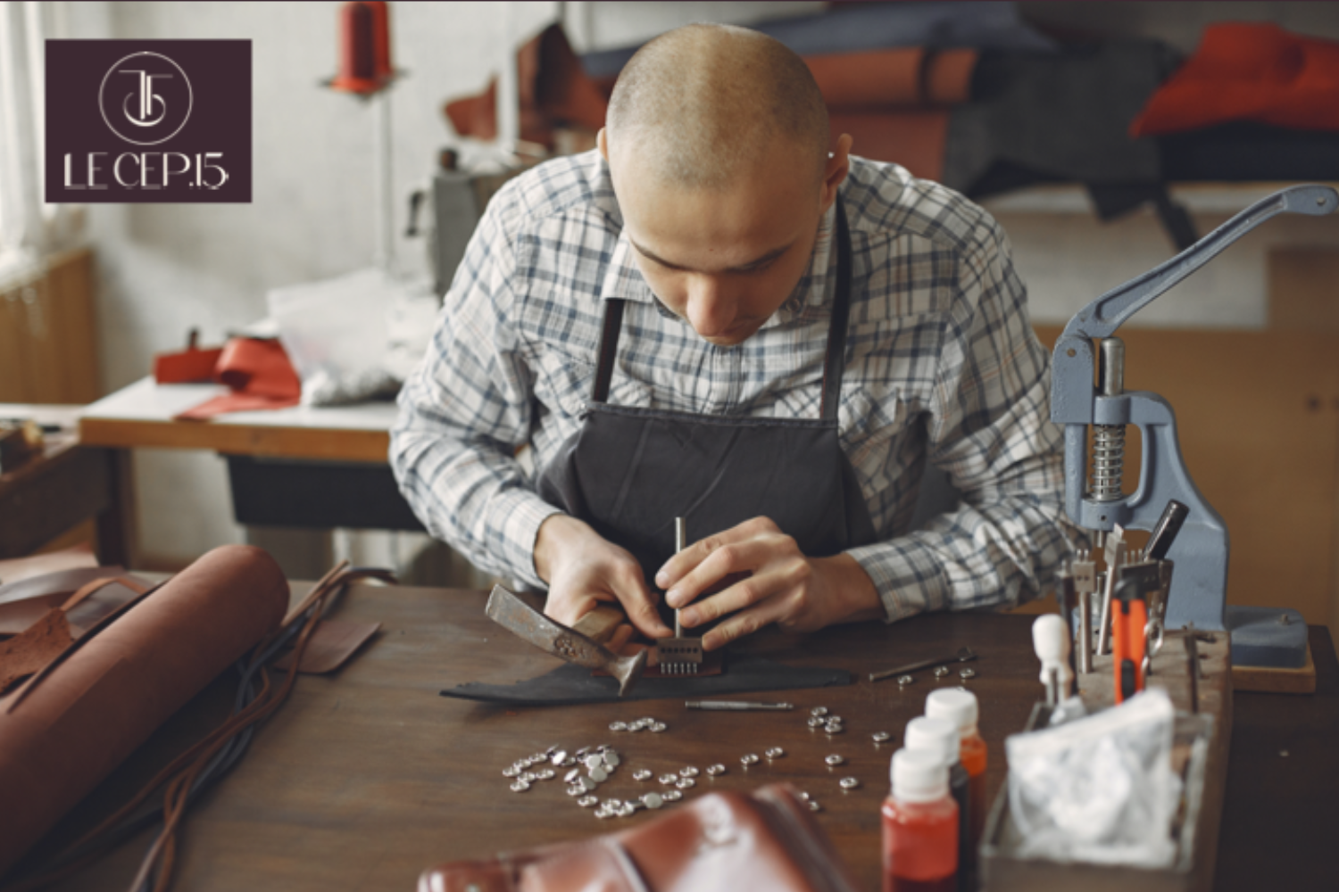
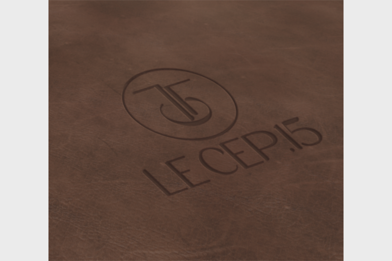
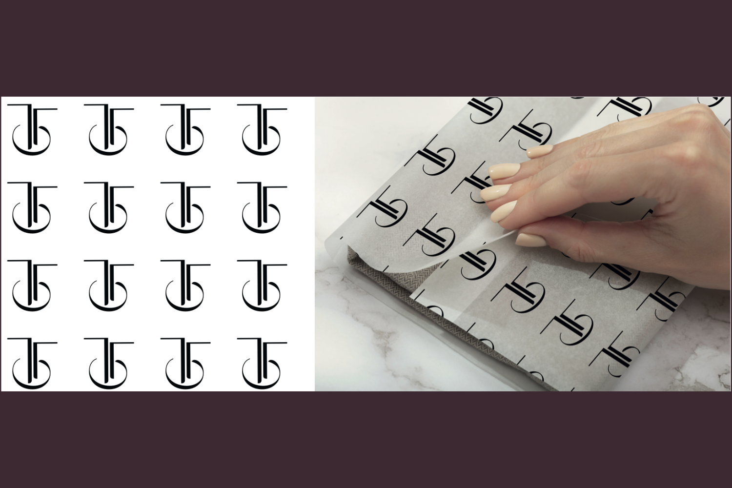
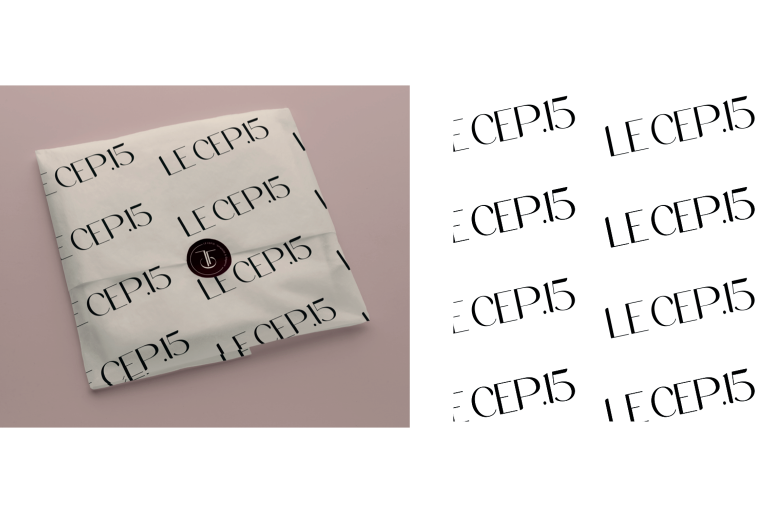
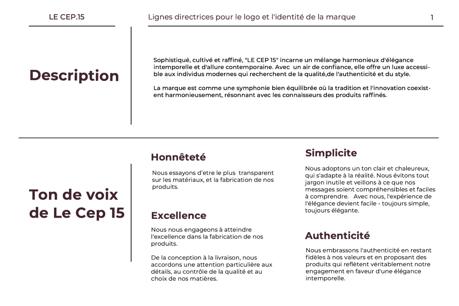
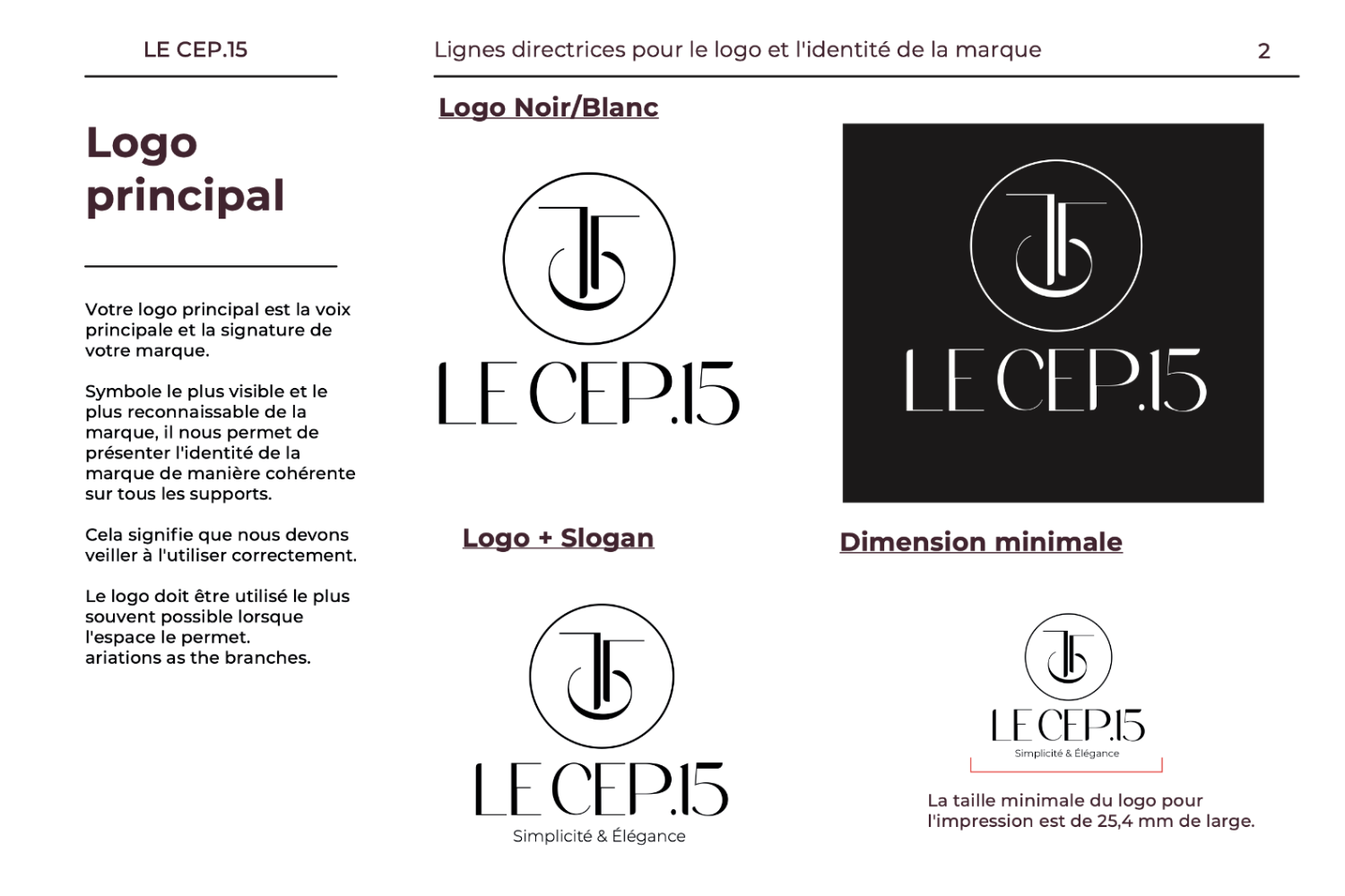
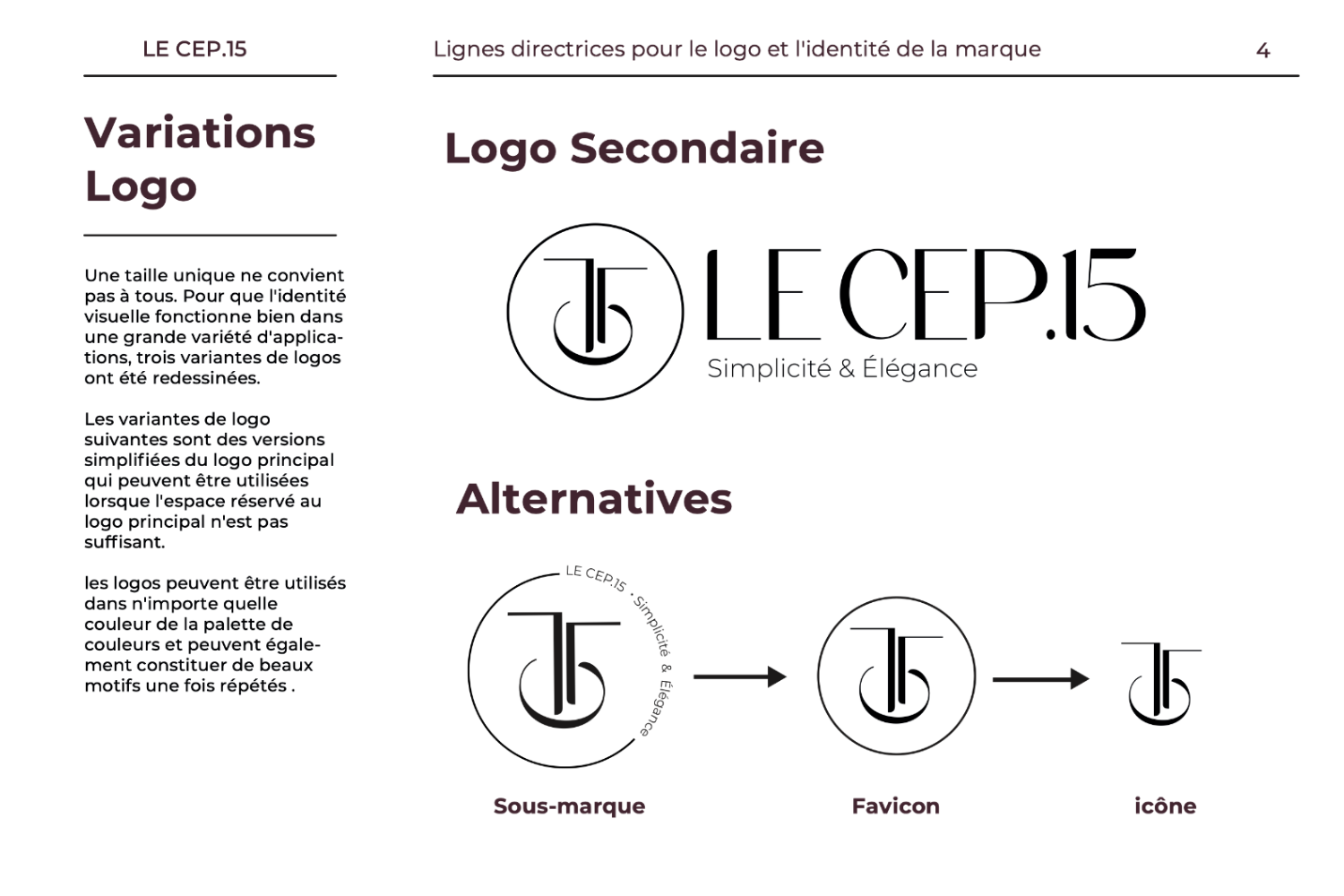
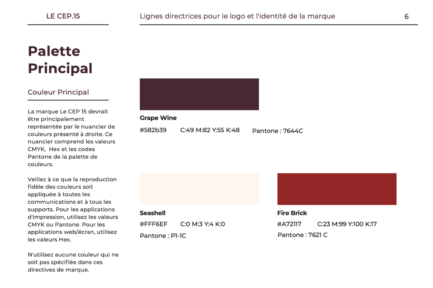
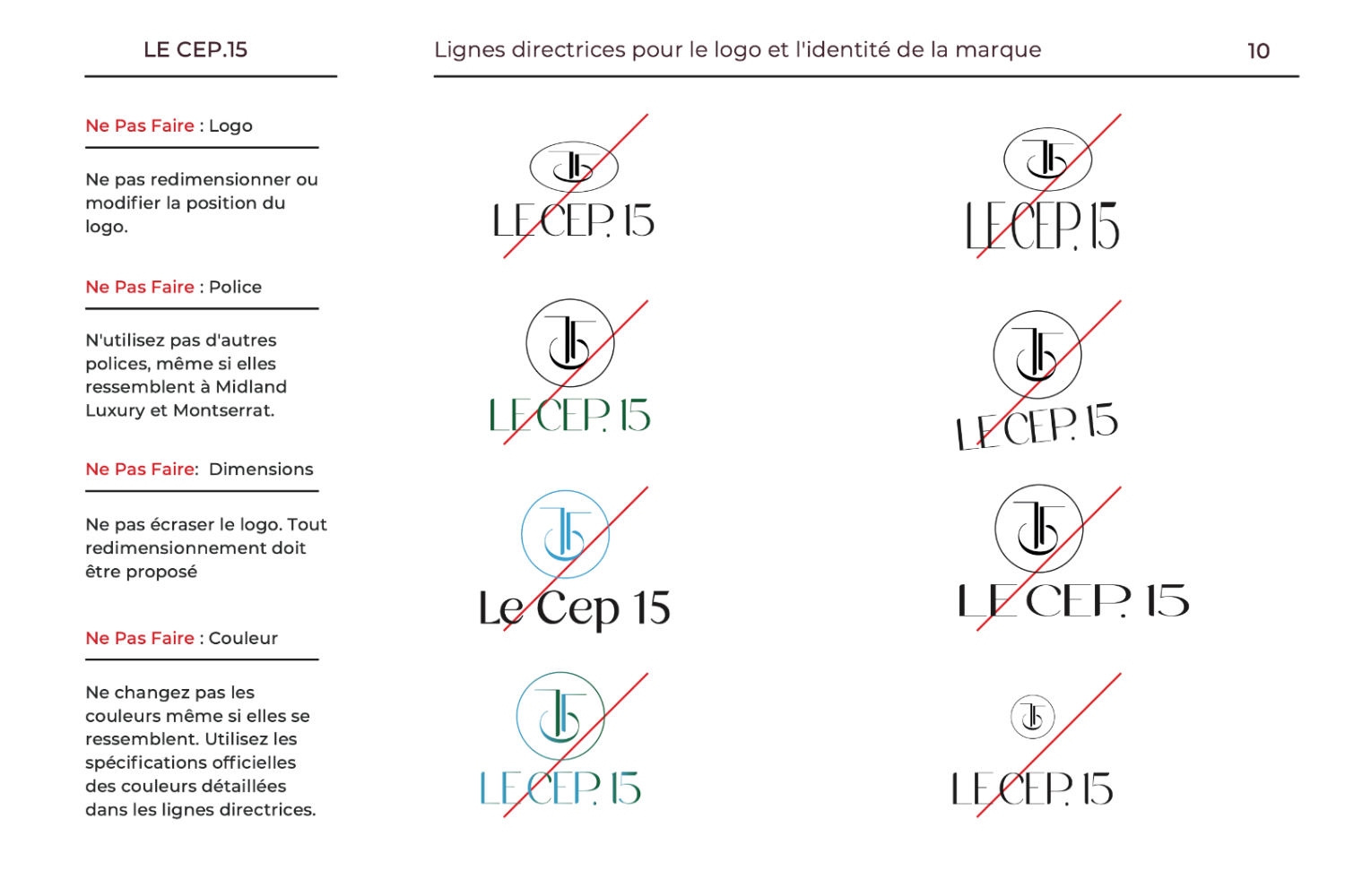
I was tasked with the creation of a comprehensive brand identity for LE CEP 15, which would reflect the company's commitment to high-end, refined, and elegant leather accessories.
This project comprises the design of logo variants (main and secondary logos, sub-brands, icons, and favicons), brand guidelines (primary and secondary color palettes, typeface, logo format best practices, and a kit of part and pattern creation).
In order to guarantee a comprehensive branding strategy, a variety of promotional materials were developed:
LE CEP 15's essence was effectively captured by the comprehensive brand identity, which established a recognizable and cohesive appearance that resonated with the target audience.
The brand's materials are kept consistent and professional due to the detailed brand guidelines and the minimalist and refined design of the logo.
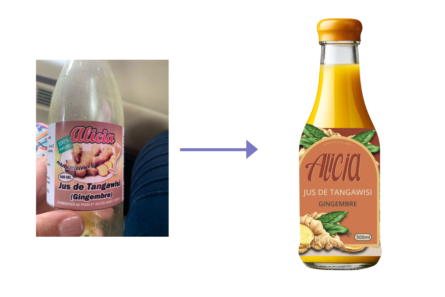
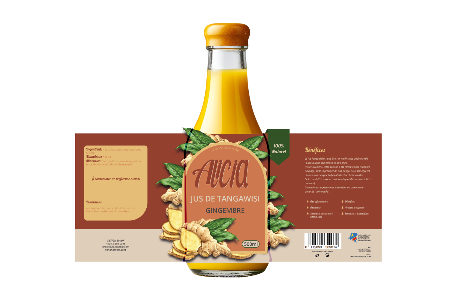
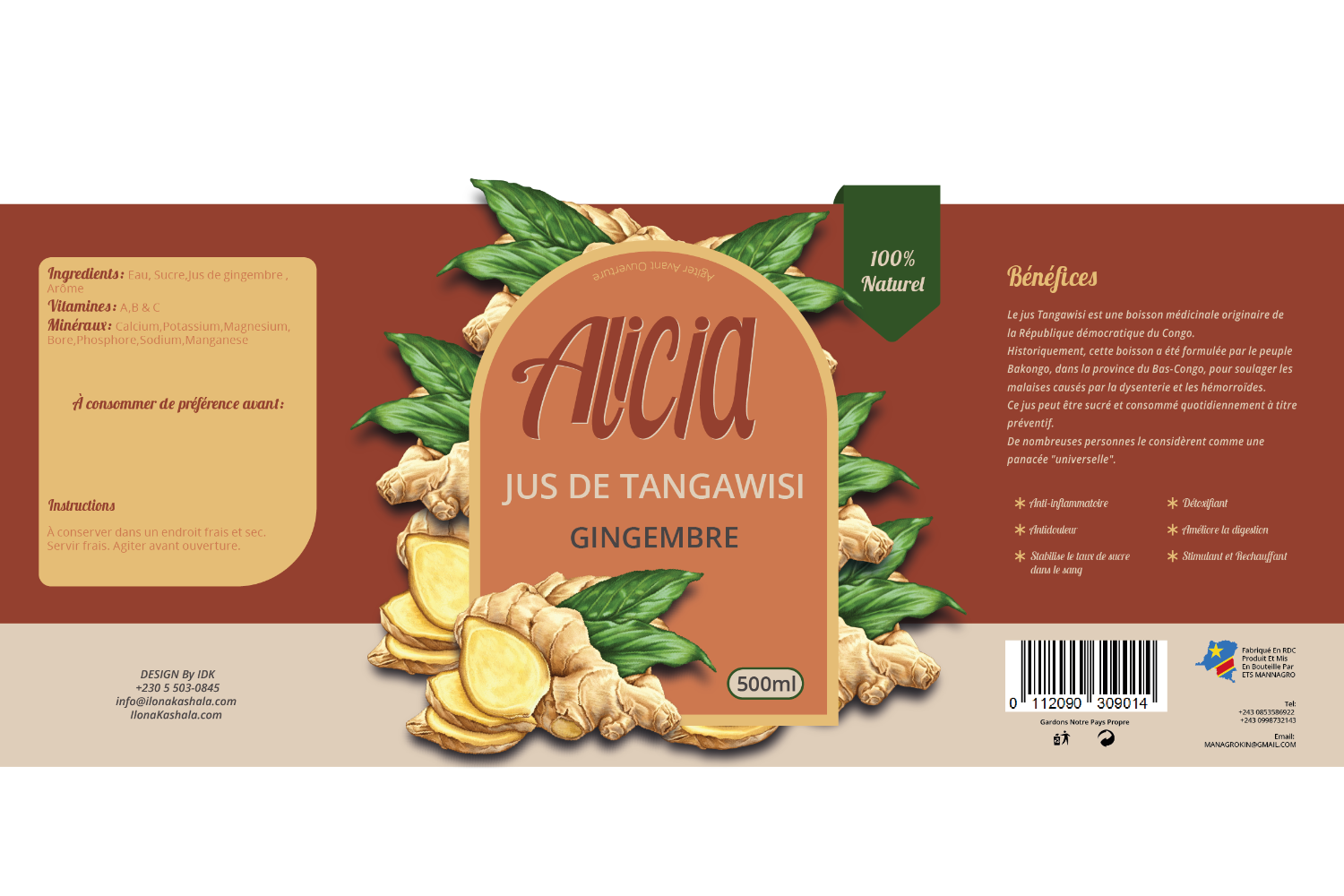
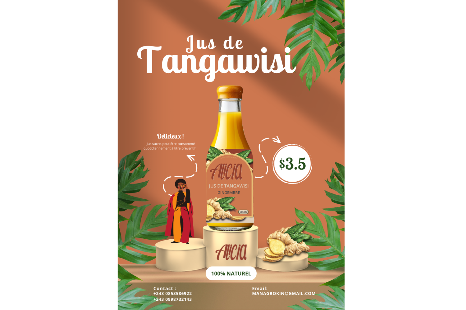
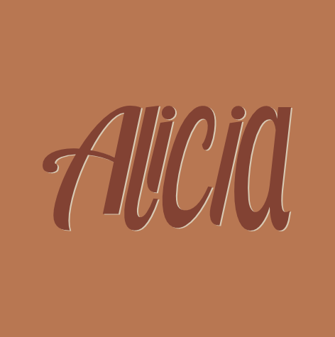
I was given the opportunity to work on a transformative project for the Alicia brand, focussing on their greatest property, Tangawisi juice, a delicious medicinal drink from the Democratic Republic of Congo.
This project aims to refresh Alicia's visual identity, ensuring that it captures the essence of Tangawisi juice in a modern design.
Our primary goal was to redefine Alicia's visual identity; we brought refinement and authenticity to the brand's overall appeal by expertly modifying the font and graphics.
The end result is a design that captivates with its contemporary appeal while emphasizing the natural ingredient of this popular beverage.
Alicia's Tangawisi juice's new visual identity has been a huge success. The new logo and style make the company appear more appealing and genuine, while the altered information structure improves the entire consumer experience by making critical information easier to find.
In addition, the eye-catching bottle sticker has come to symbolize Alicia's dedication to excellence and quality.
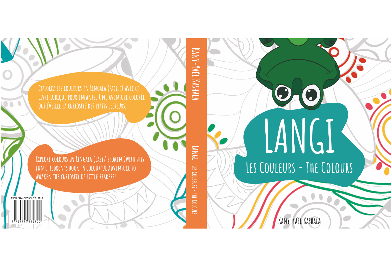
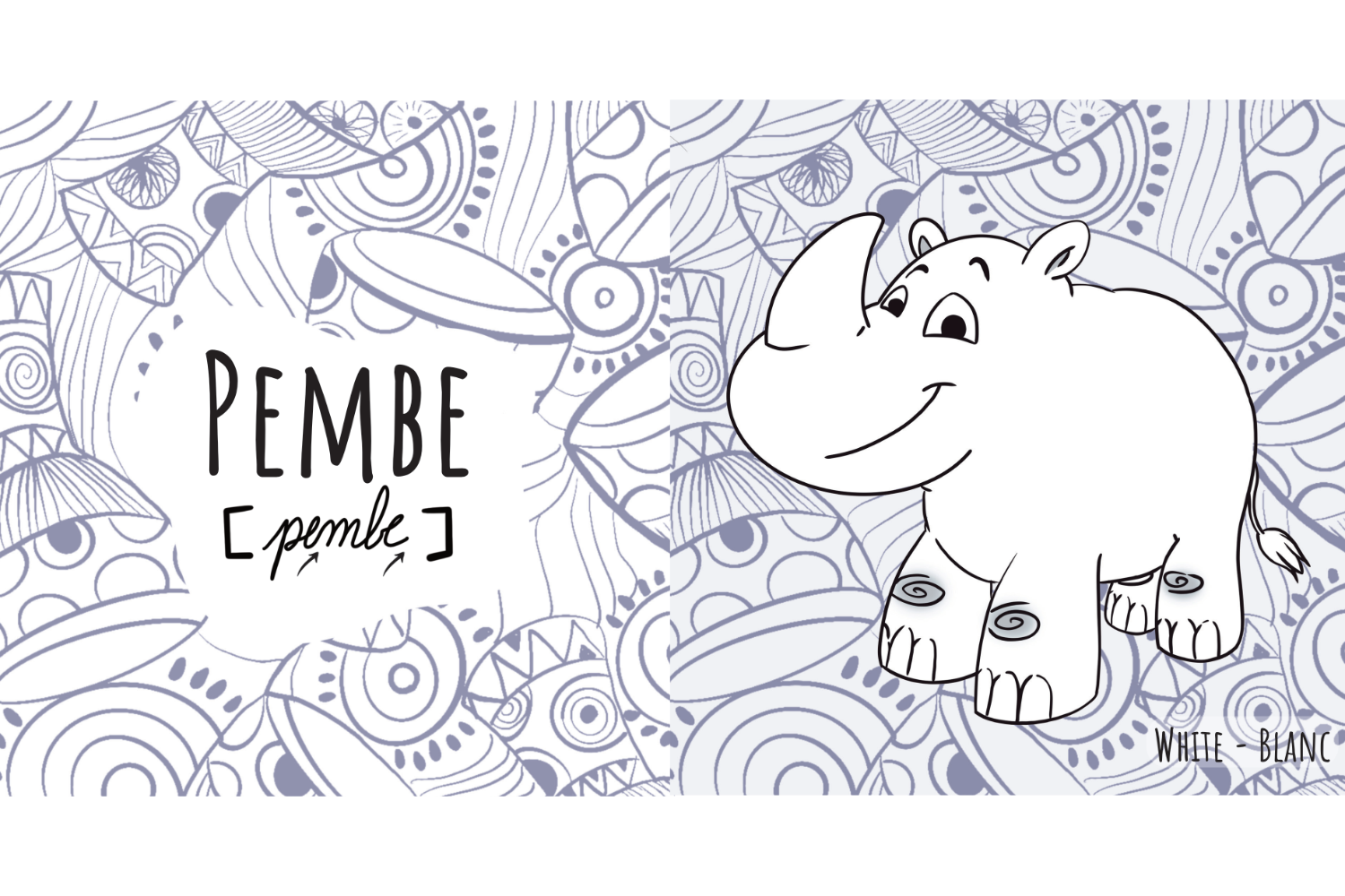
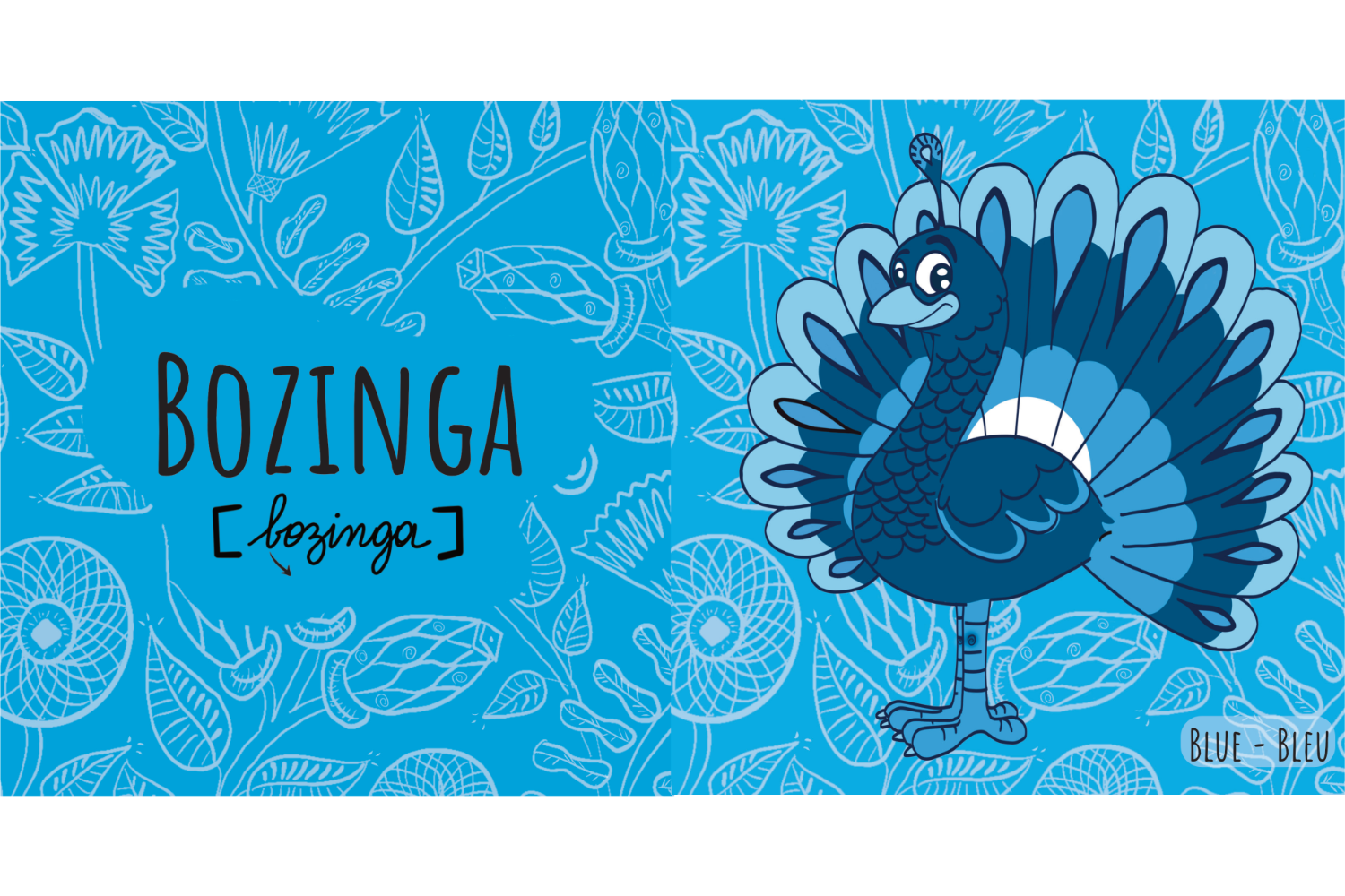
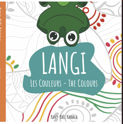
I went on a fun endeavour to develop a children's book called "Langi: Les couleurs - The colours " with the goal of teaching Lingala, the language spoken in the Democratic Republic of Congo.
This interactive and educational tour celebrates Congo's diverse biodiversity while also teaching youngsters to identify colours in Lingala.
"Langi: les couleurs - the colours" is more than a book; it is a celebration of language and culture.
The vivid pictures and amusing language have made learning Lingala a fun experience for kids.
The use of real wax fabric designs has improved the book's visual appeal, creating a strong connection to Congo's legacy.
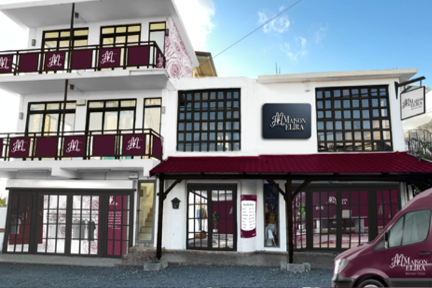
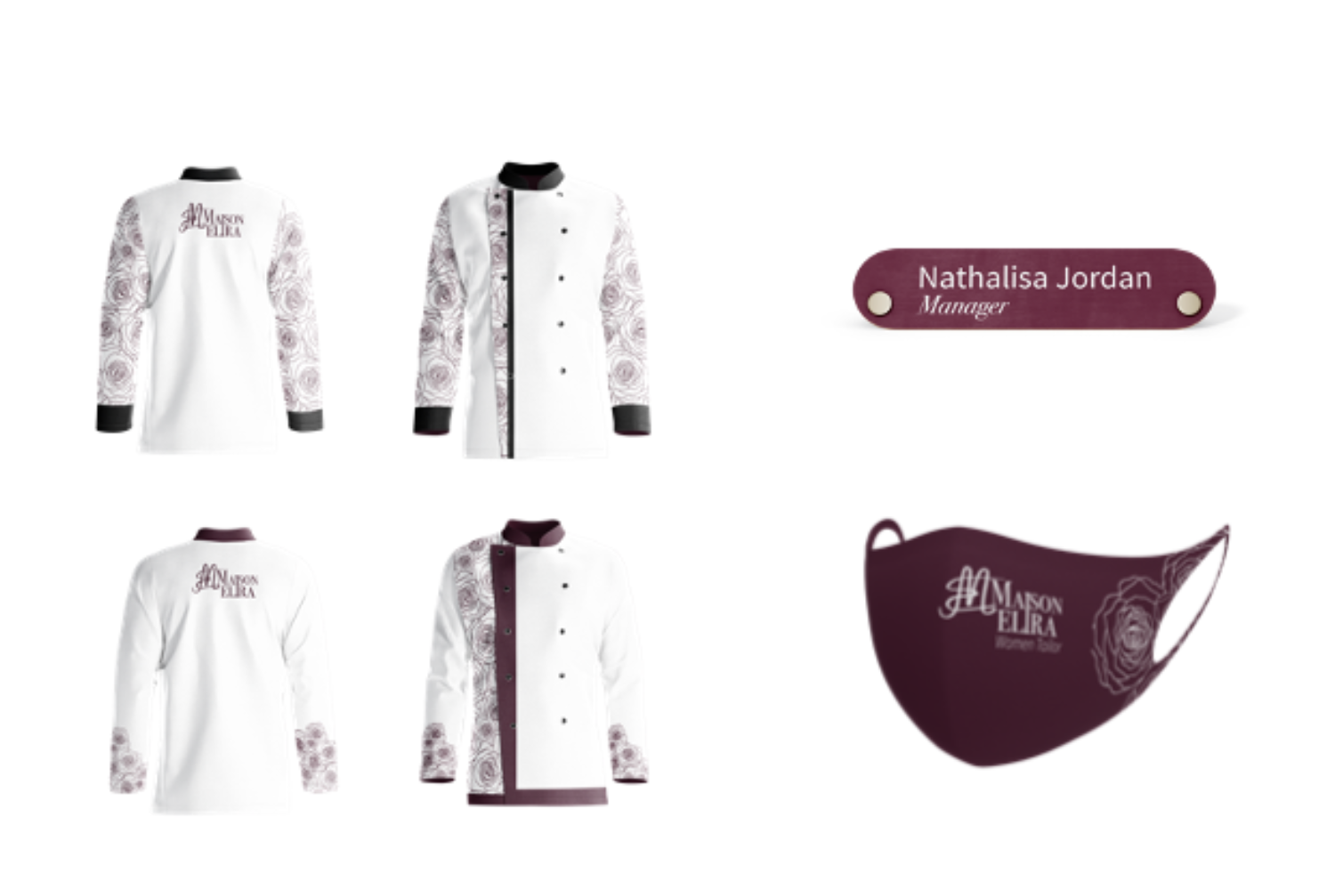
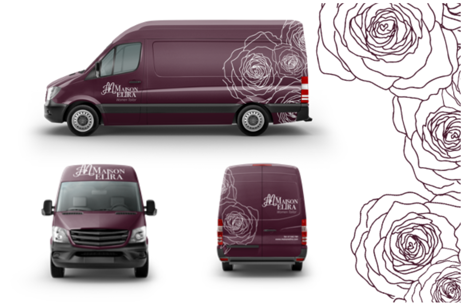
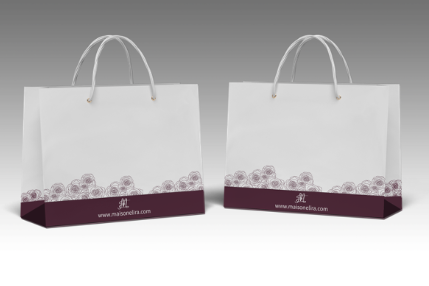
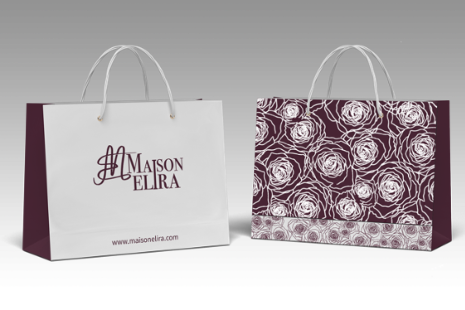
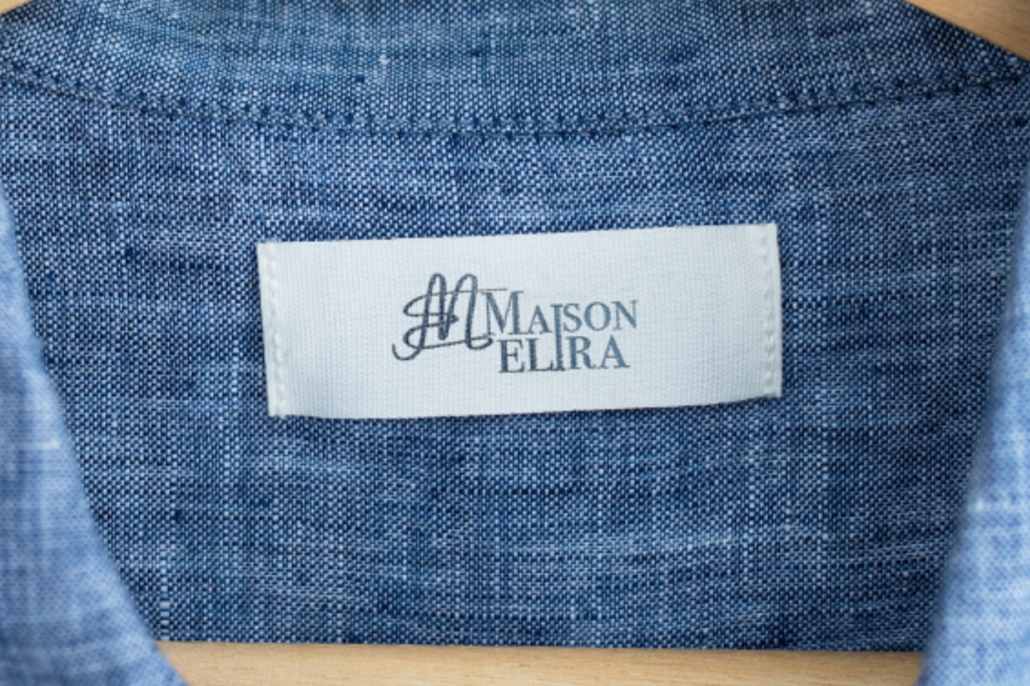
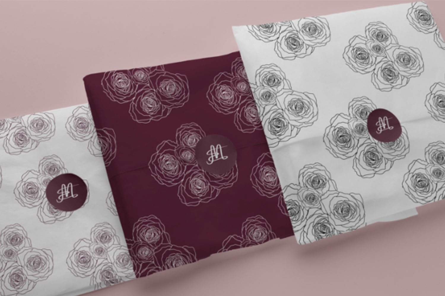
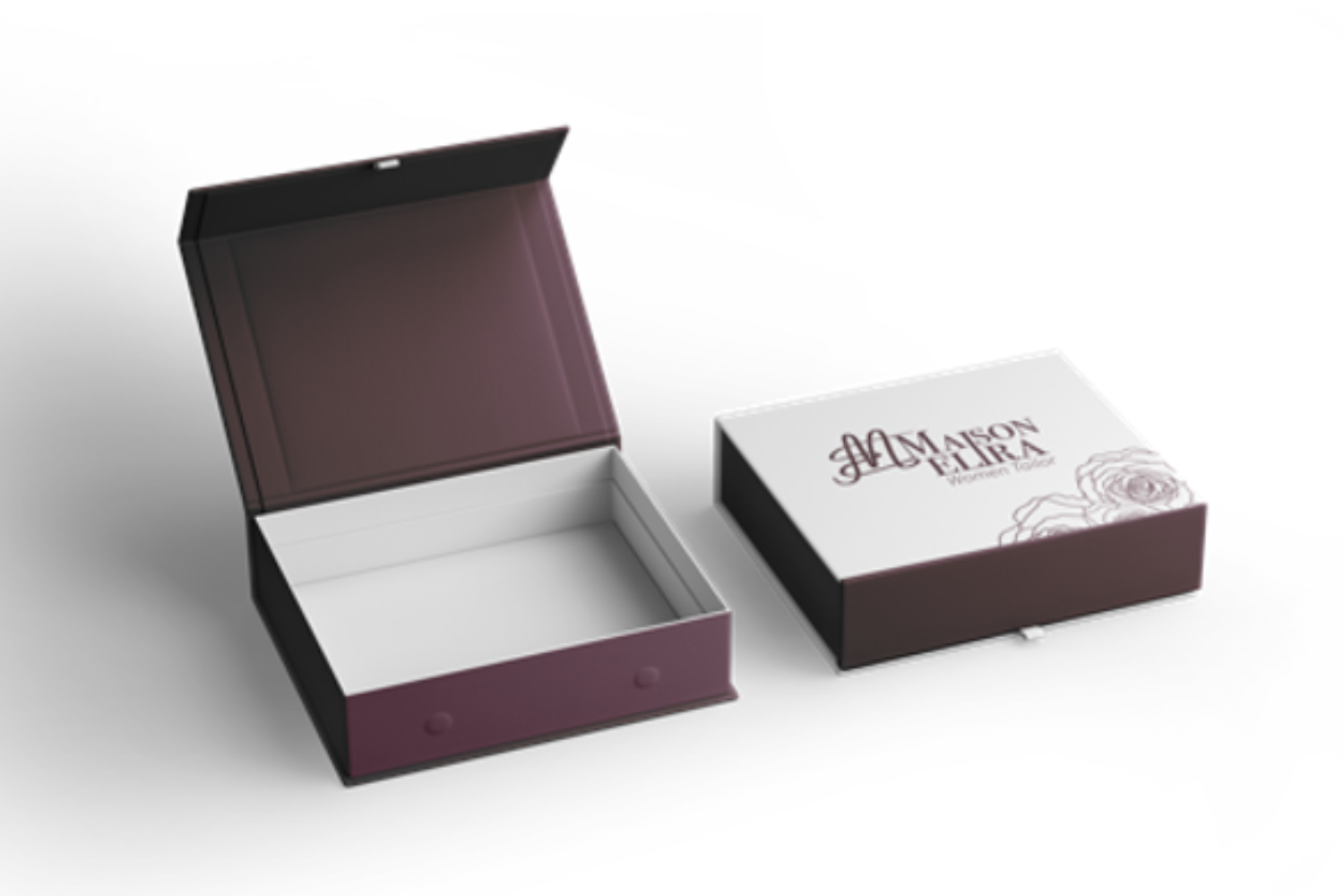
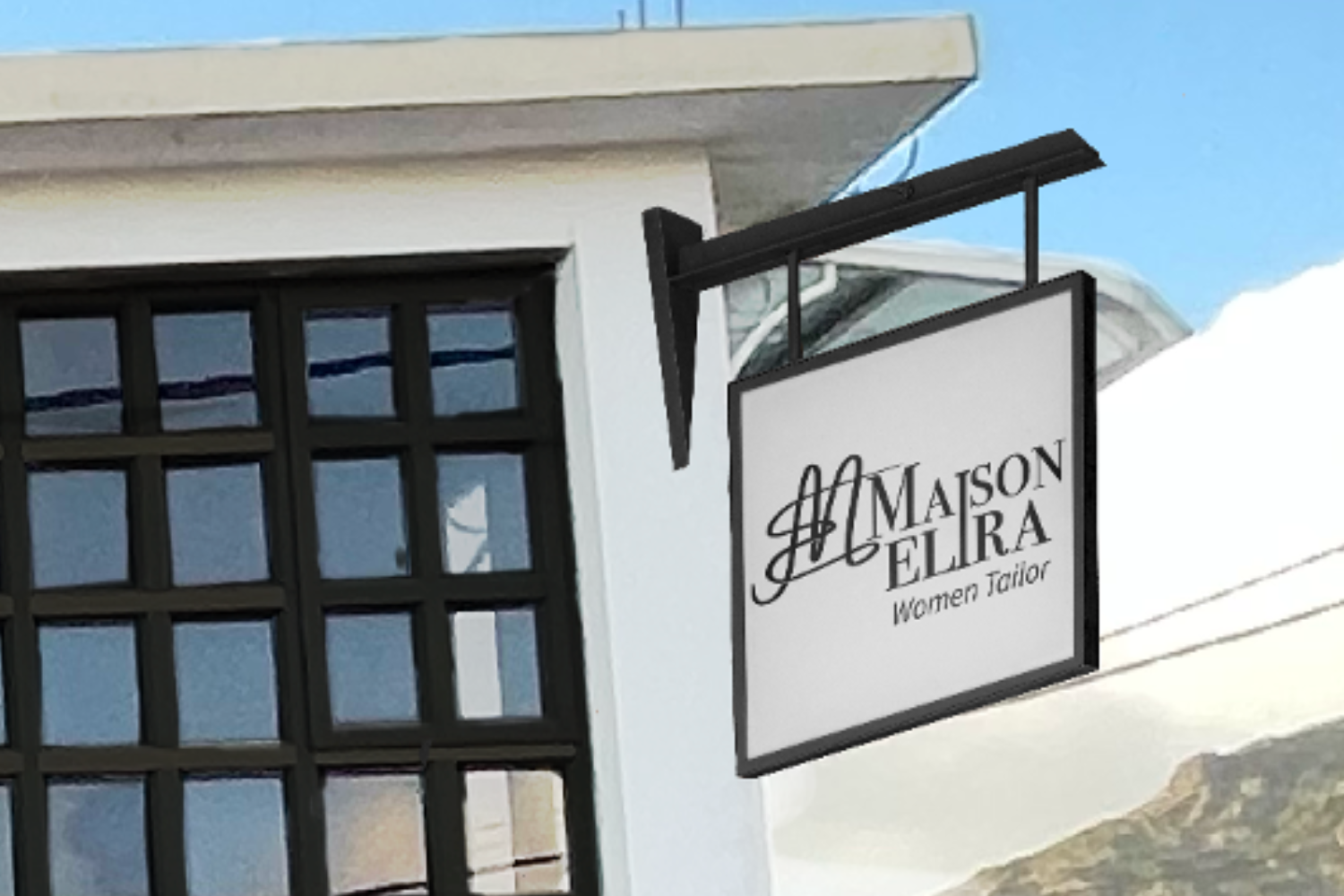
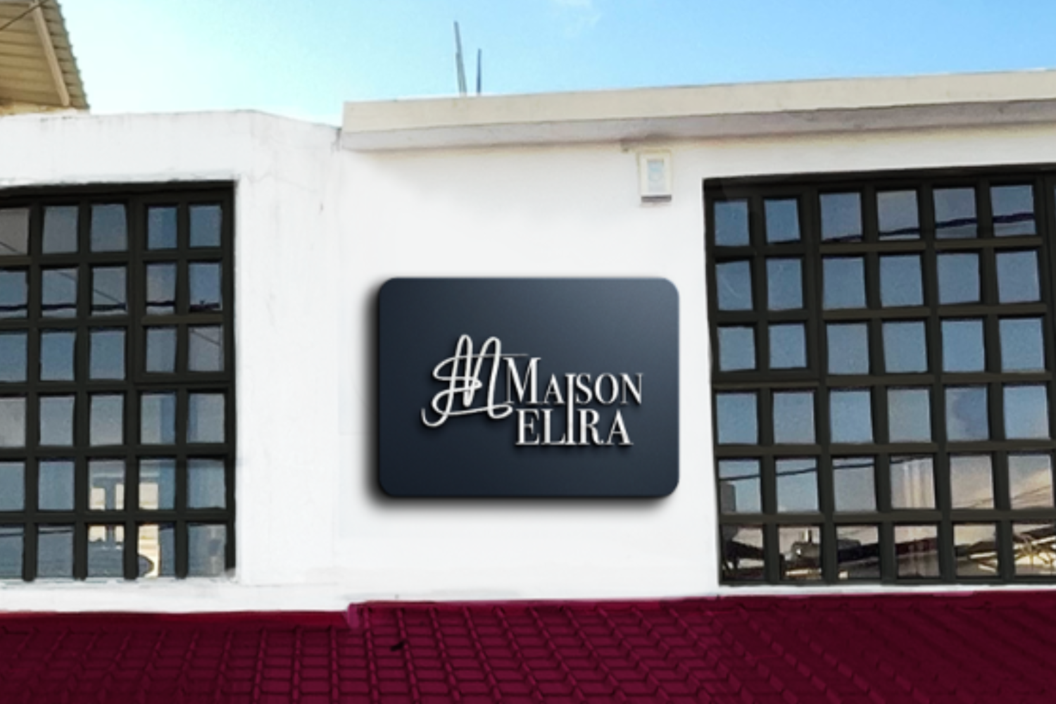
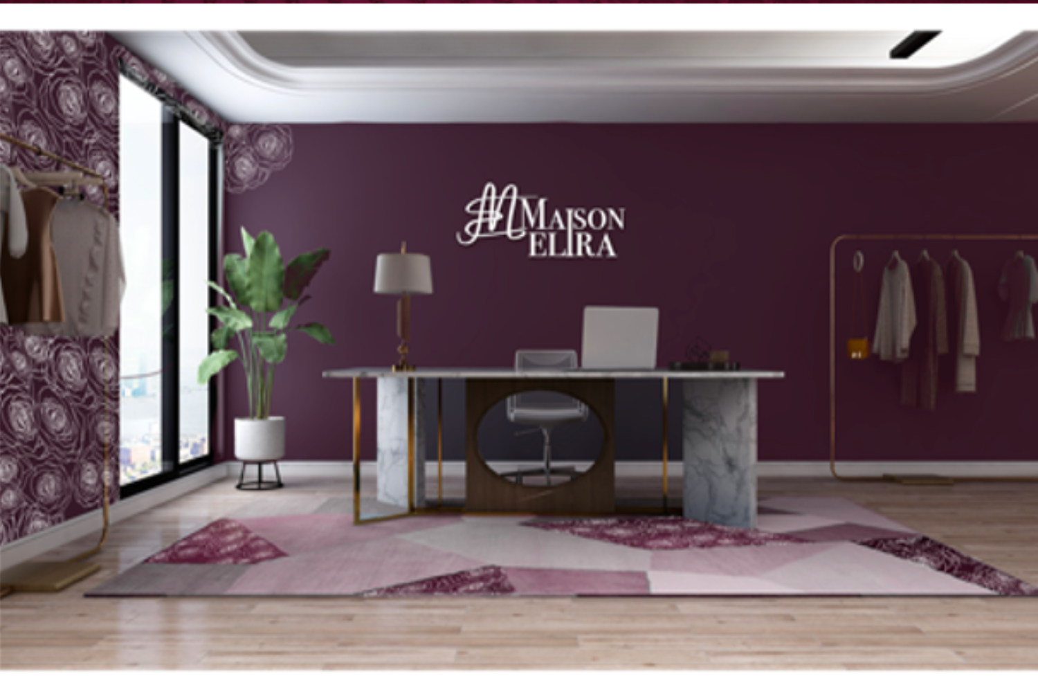
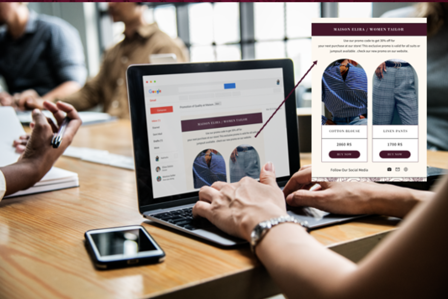
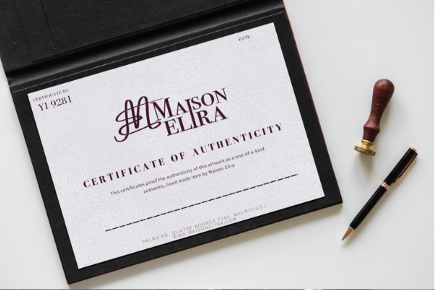
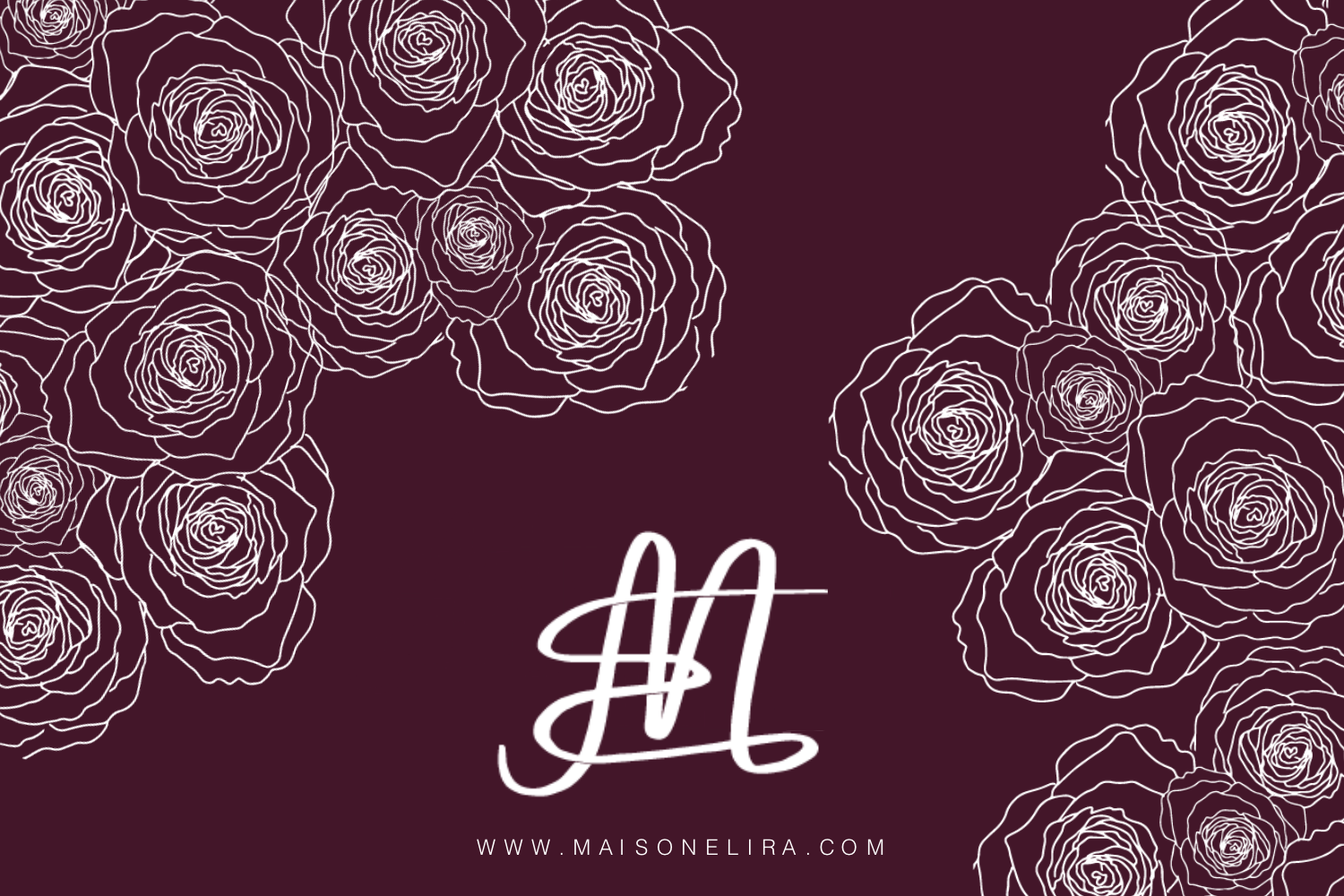
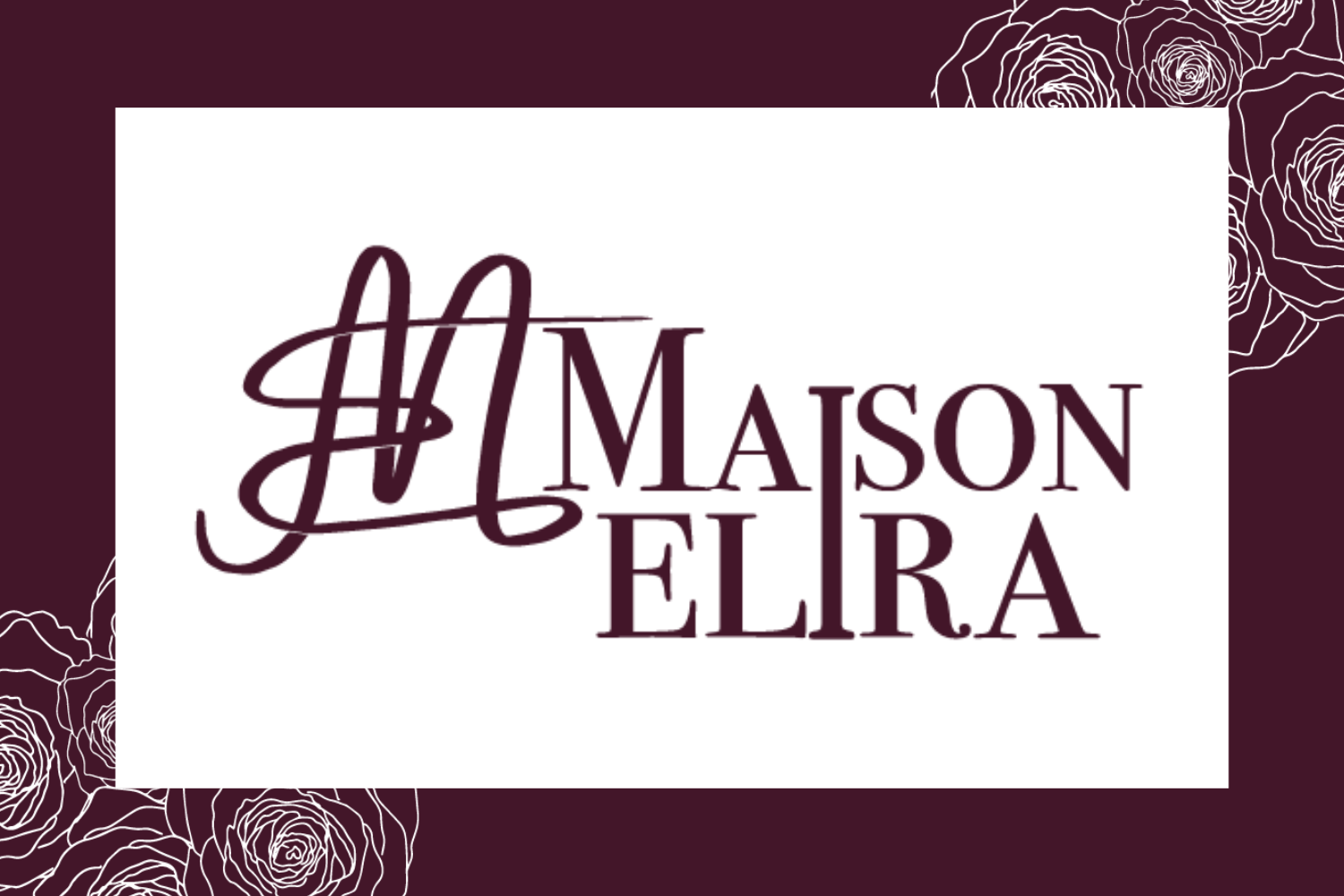
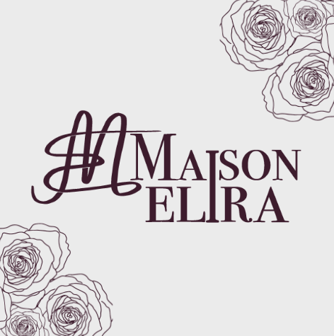
For this project, I had the distinct privilege of developing the brand identity for Maison élira, a prestigious Congolese clothing brand that provides tailor-made, high-quality clothing for mature women in an elegant and classy environment.
The client sought a feminine yet elegant brand image to attract clients and reflect the brand’s commitment to comfort and luxury.
The comprehensive branding package effectively communicated Maison Élira's idea of elegance and sophistication.
The feminine, basic yet elegant design approach appealed to mature ladies looking for high-quality, comfortable, and tailored apparel.
The brand's branding was consistent across all touchpoints, including retail signs, packaging, and customer communications.
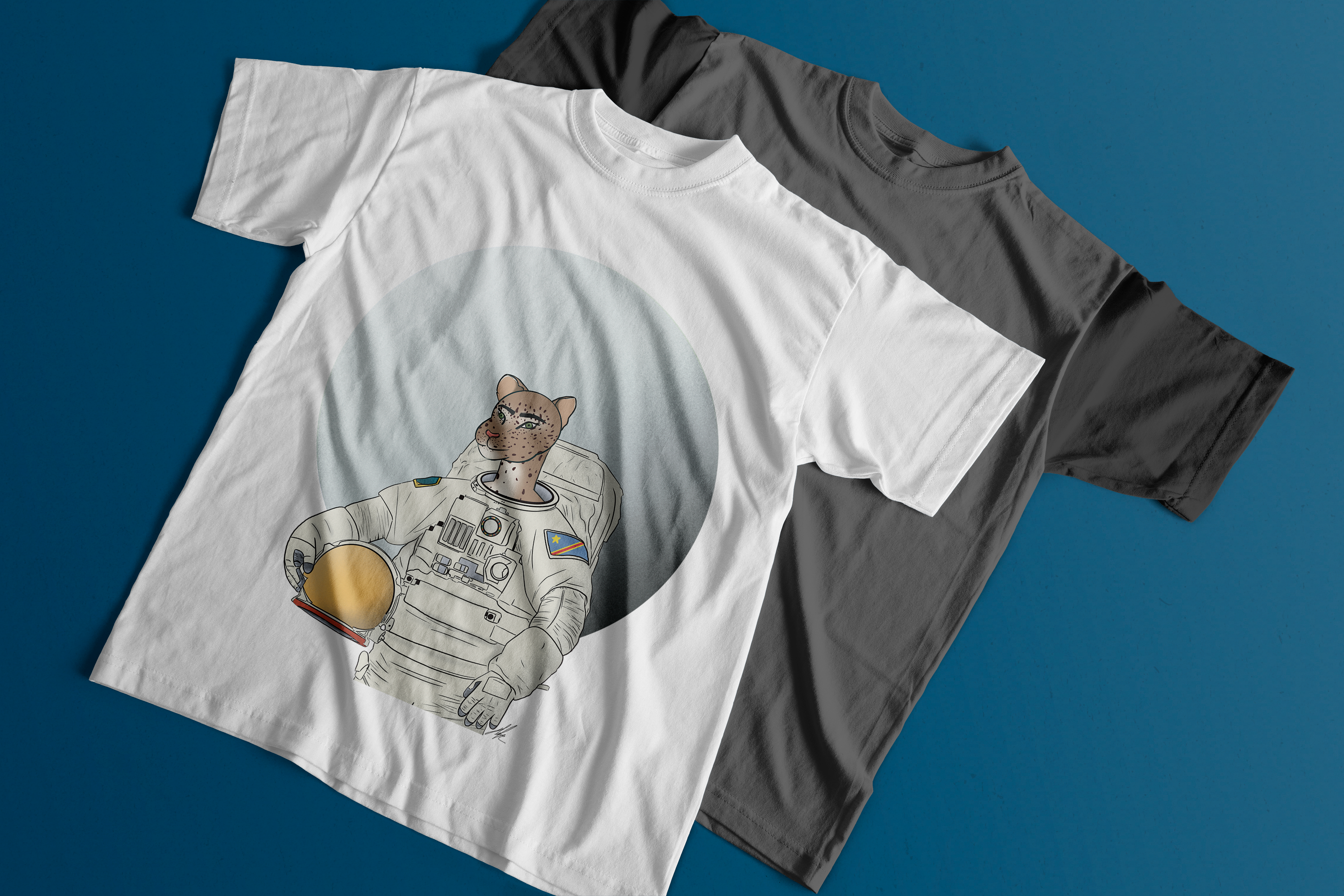
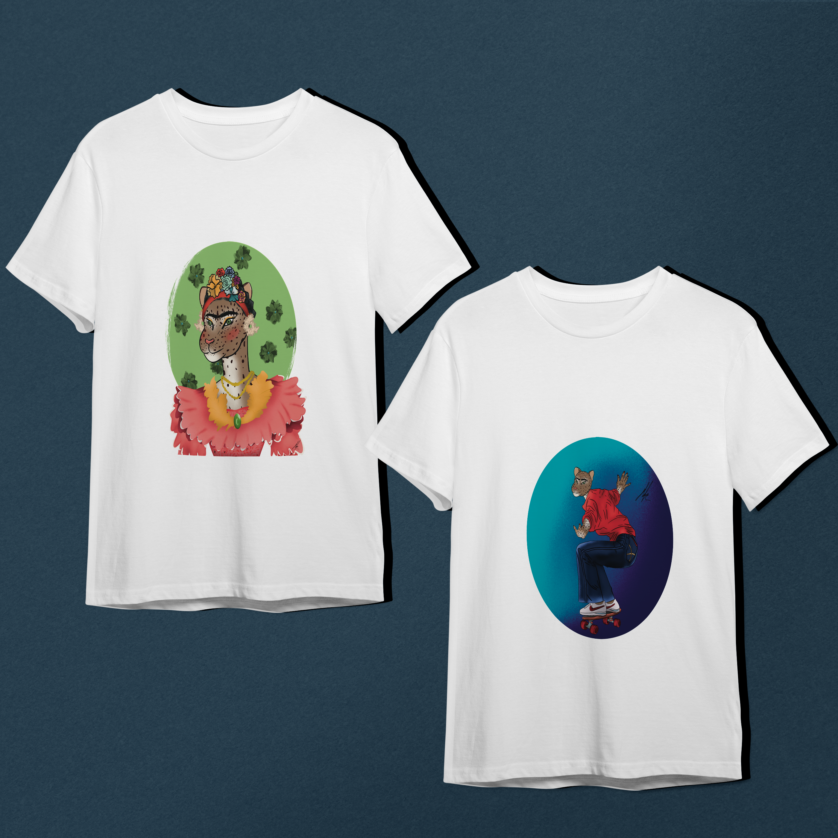
Nkoi T-Shirt Brand, a visionary concept, combines the majesty of the leopard, a renowned symbol of Congo's heritage, with great artwork and historical characters.
As a graphic designer and illustrator, I had the pleasure of creating intriguing graphics that personify Nkoi, the Lingala term for leopard, in the form of well-known characters and masterpieces.
Nkoi honours Congo's diverse character and close ties to the leopard, a beloved national symbol.
This initiative, which combines the force of art and wildlife, aims to reconcile cultural heritage with artistic expression, building a meaningful relationship with Congo
The illustrations I created for the Nkoi T-Shirt Brand were well-received, blending cultural significance with artistic flair. The designs successfully captured the essence of the leopard while paying homage to historical figures and iconic artworks.
The T-shirts became a popular choice, resonating with those who wear them and sparking conversations about Congo's heritage and artistic spirit.
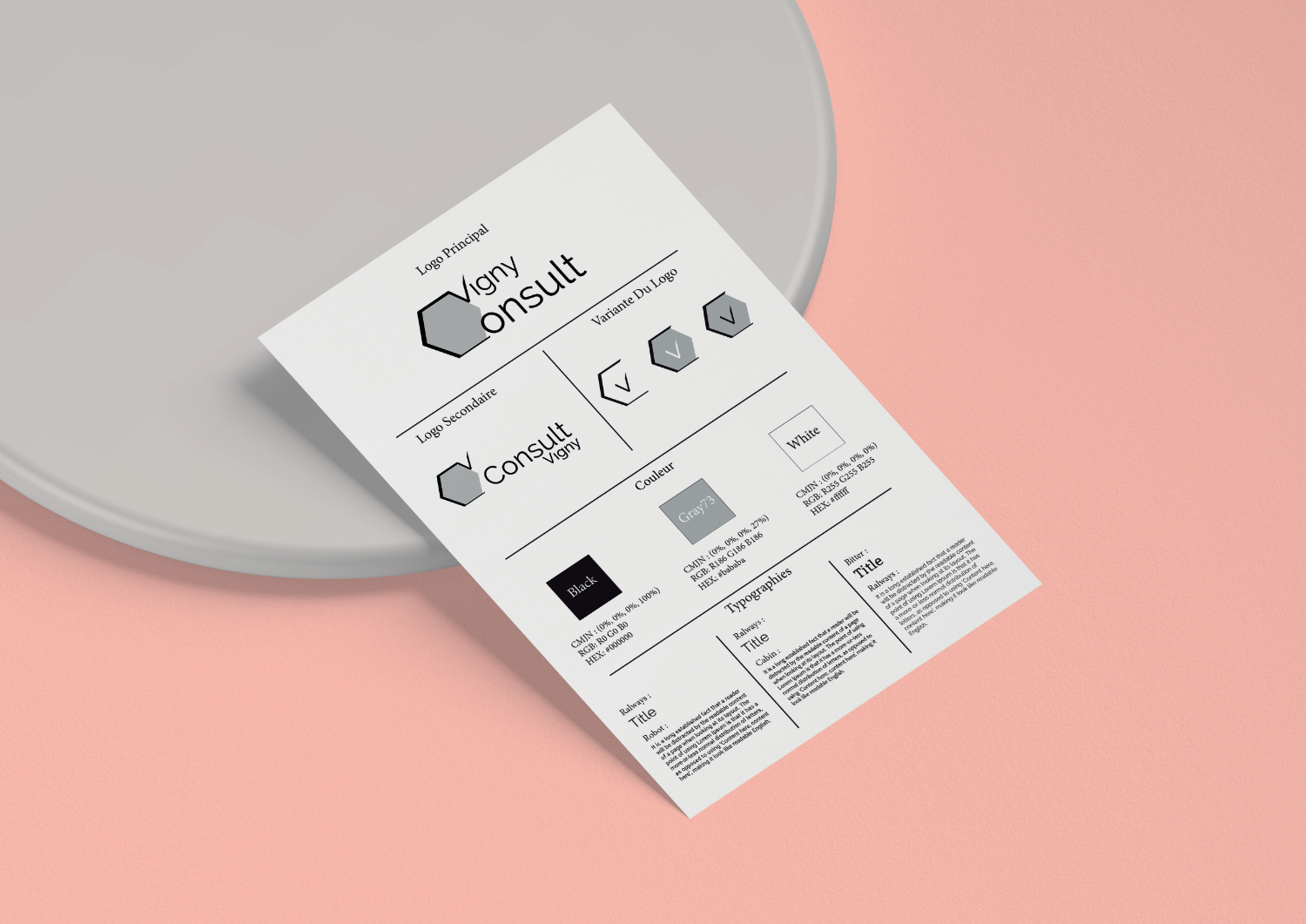
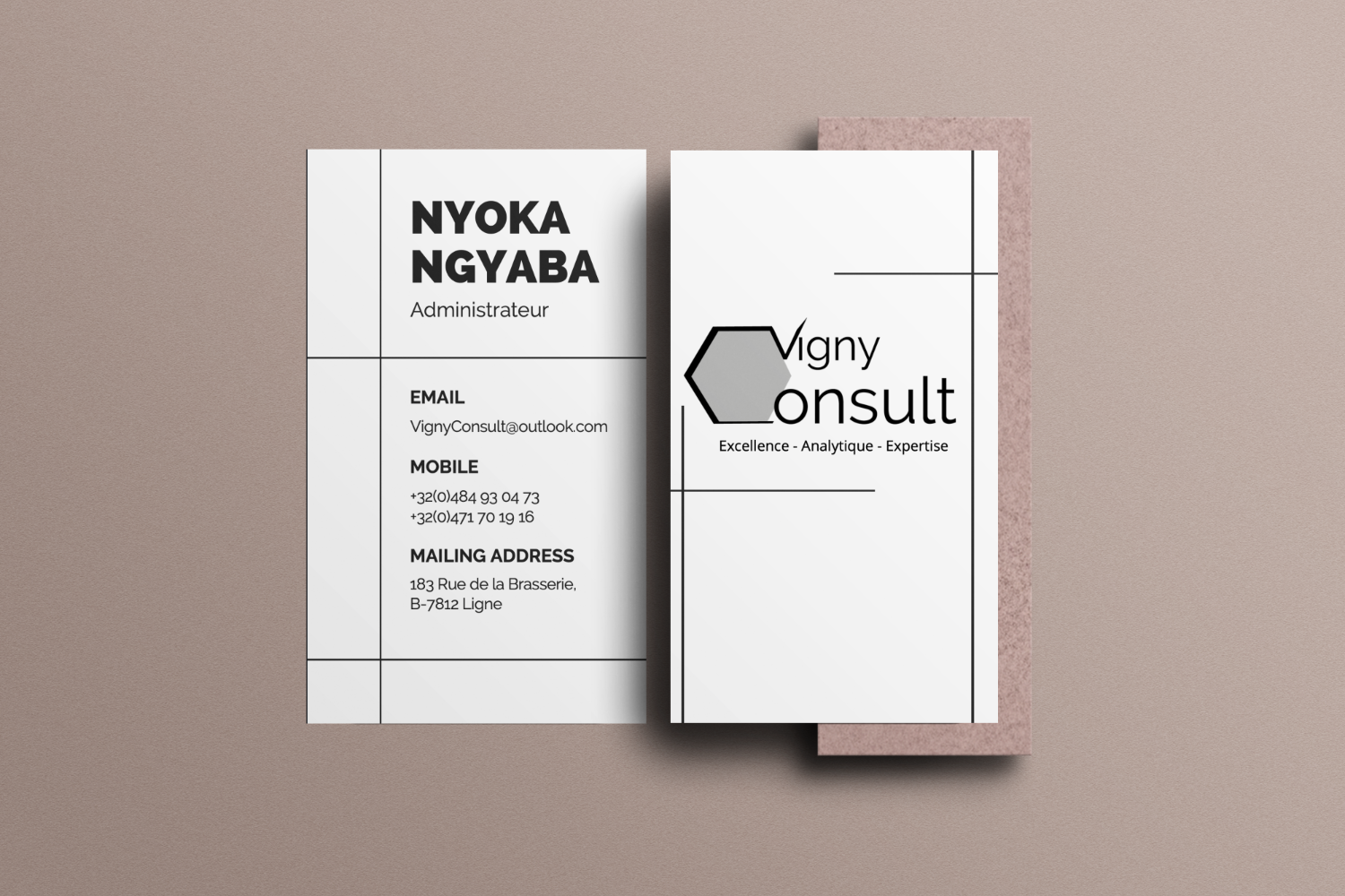
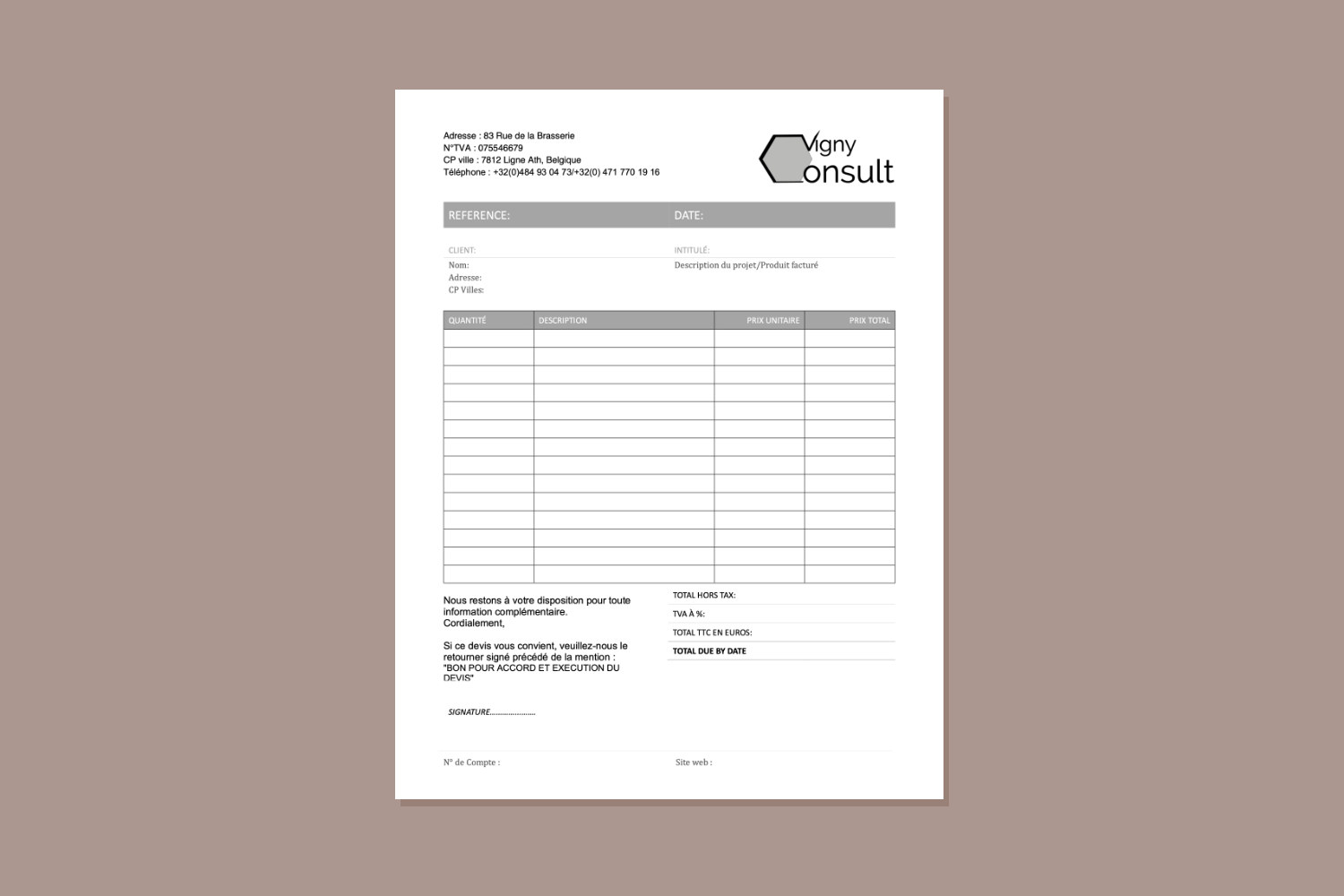
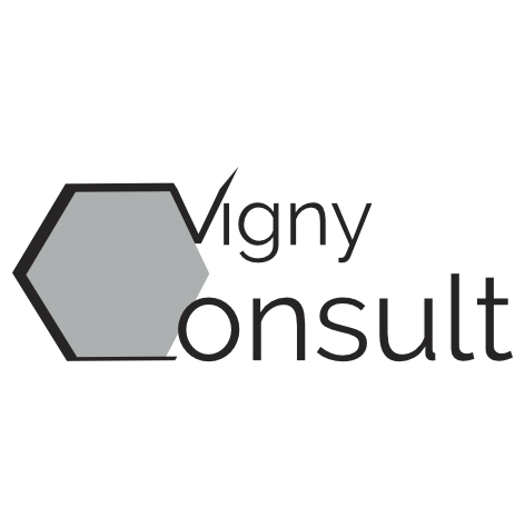
Vigny Consult, a Belgium-based engineering consulting firm, wanted a visual identity that felt as confident, rigorous, and elegant as their work. The challenge was to craft something timeless and unique, yet grounded in their values: respect, calm, and excellence.
I designed a full brand identity from scratch—logo, color system, typography, business templates, and a symbolic design language. My goal was to ensure their brand reflected their high standards and helped them stand out in a competitive market.
The new brand identity positioned Vigny Consult as a serious and sophisticated player in the engineering consulting world. It instilled trust and stood out in a market where most brands looked generic or outdated.
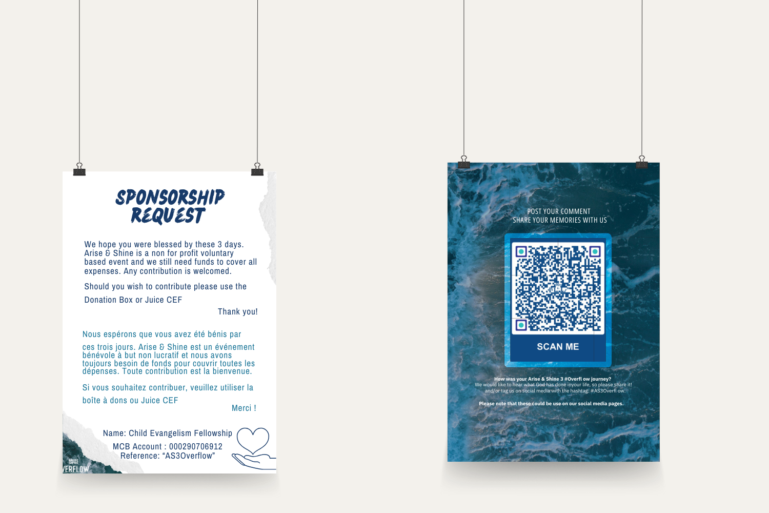
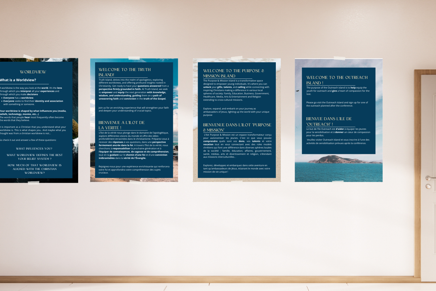
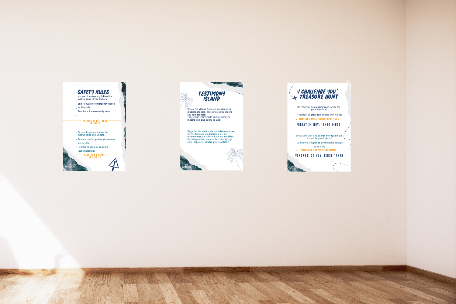
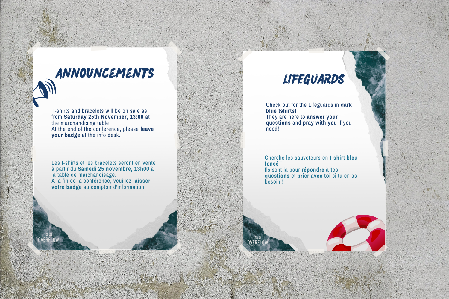
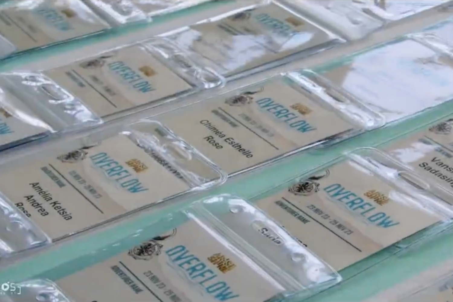
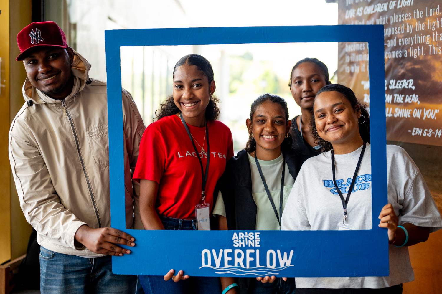
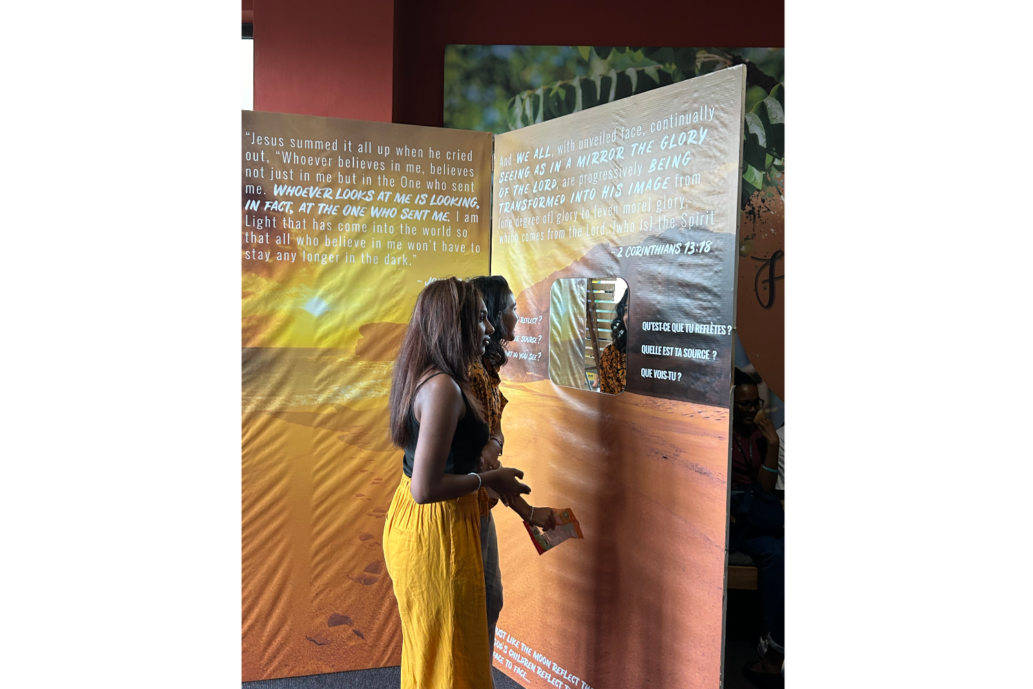
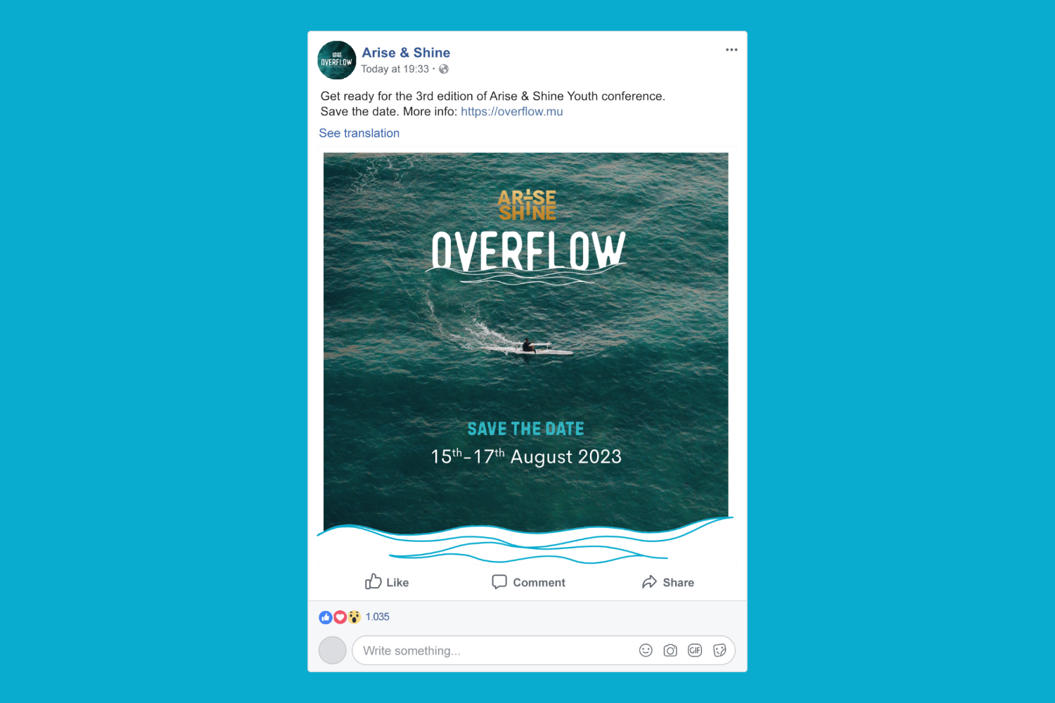
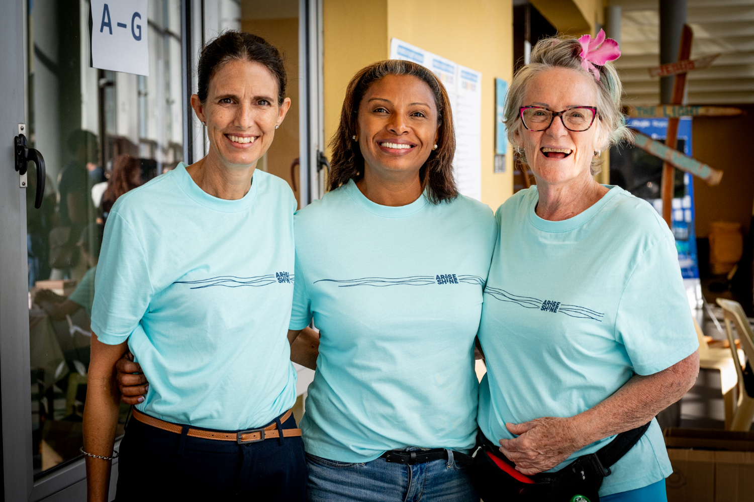
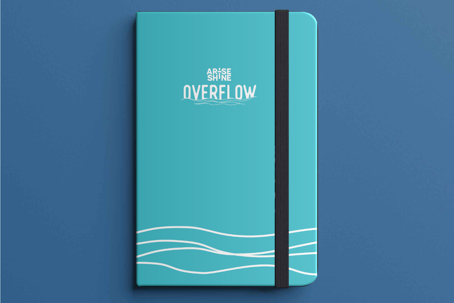
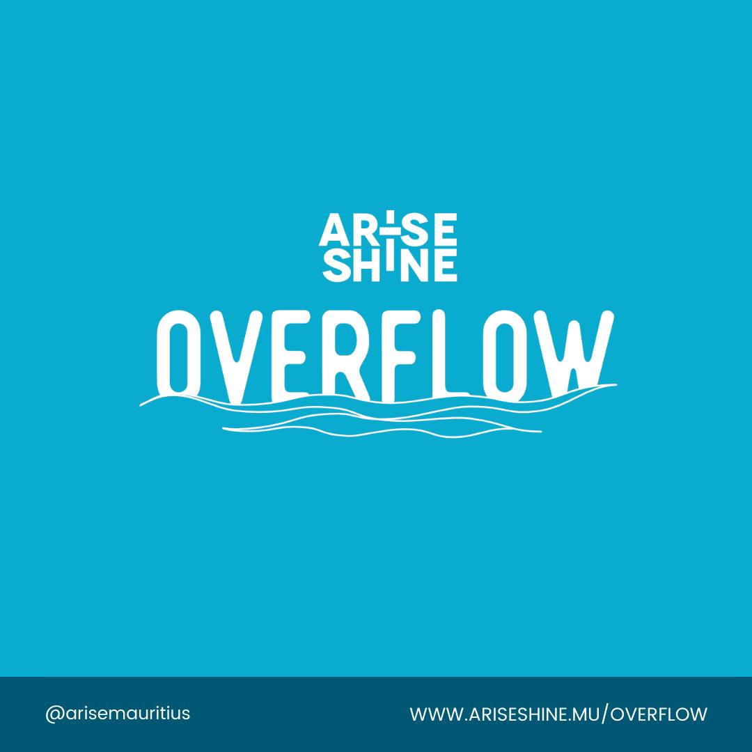
Arise and Shine is an organisation that is committed to the development of a new generation of leaders who will have a positive impact and transform their communities. Mini-games and "TED Talks" in small groups provide participants with tools and strong values over the course of a three-day conference. This framework enables them to interact with mentors from a variety of disciplines, thereby illustrating that they can also have a significant impact through their interests or professions.
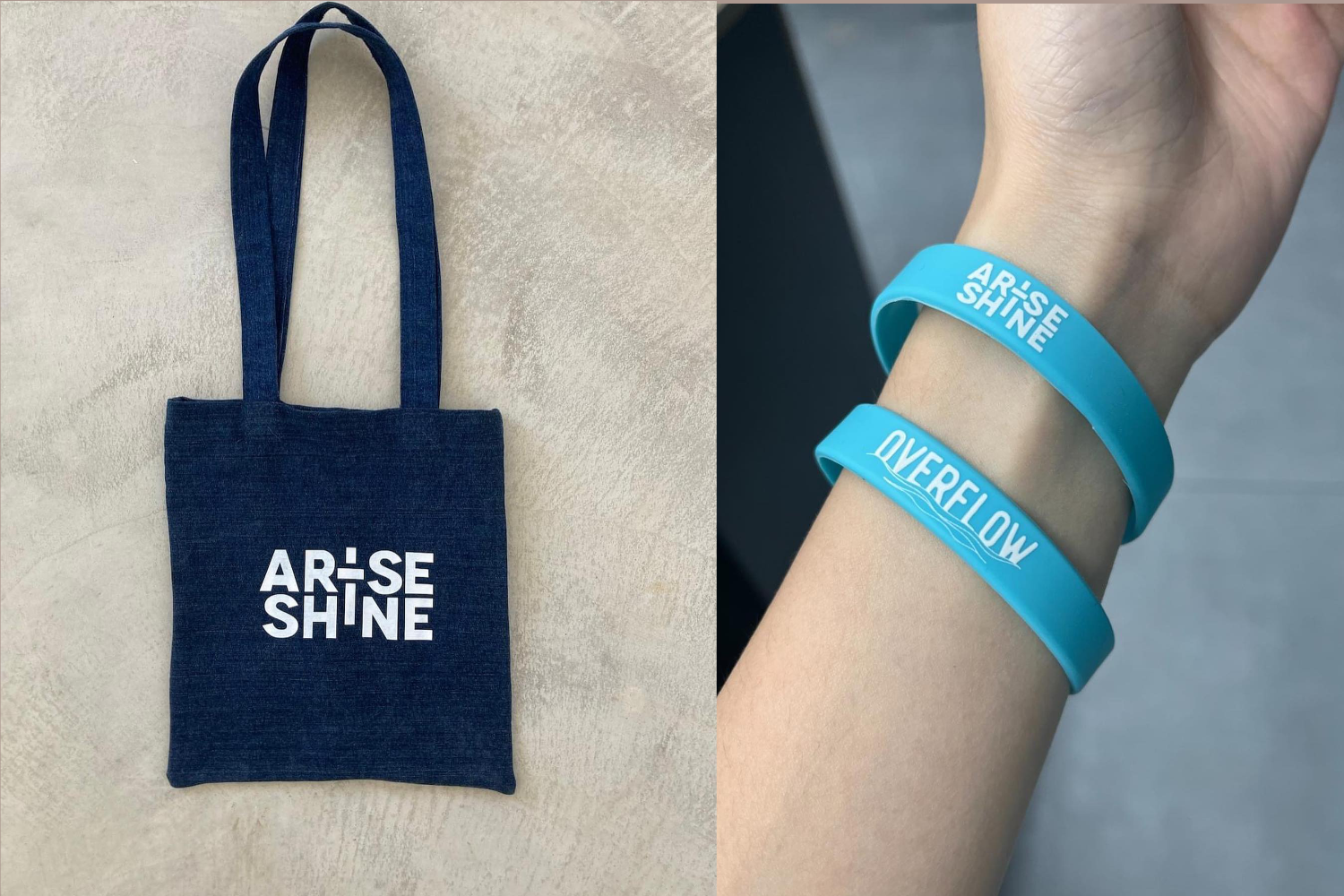
For Arise and Shine, the challenge wasn’t just to design materials—it was to spark connection, transformation, and purpose. As a designer, I was entrusted with creating both print and digital resources for their annual "Overflow" event, aimed at equipping young adults to become leaders in their communities.
Through design, I translated their vision into visual language. From posters to interactive installations, every element was built to inform, engage, and inspire. We wanted participants to feel seen, valued, and empowered—even before they walked through the door.
The combination of thoughtfully designed materials and interactive experiences made the event truly unforgettable. Attendees felt more connected, informed, and ready to take action in their lives and communities.
I was granted the opportunity to collaborate on a website design for DRC Impact Angels, a foundation that is committed to the promotion and encouragement of the growth of SMEs, businesses, and entrepreneurs in the Democratic Republic of the Congo.
The objective was to establish an official website that would highlight their mission, team, projects, and services.
Additionally, a website was developed to maintain an online presence and collect emails until the official site was completed.
UX Designer / UI Designer
DRC Impact Angels needed a trustworthy online face to support its mission of nurturing entrepreneurship in the DRC. The challenge? Speak to diverse audiences, build instant credibility, and communicate their mission with clarity—even before their full platform was ready.
I designed a compelling one-page website that doesn’t just inform—it tells a story. The goal was to humanize the organization and make it easy for visitors to understand who they are, what they do, and how to engage.
The launch-ready site served as both a brand touchpoint and lead-generation tool, demonstrating how design can make abstract missions tangible. It now acts as a gateway for investors, collaborators, and entrepreneurs to connect with purpose.
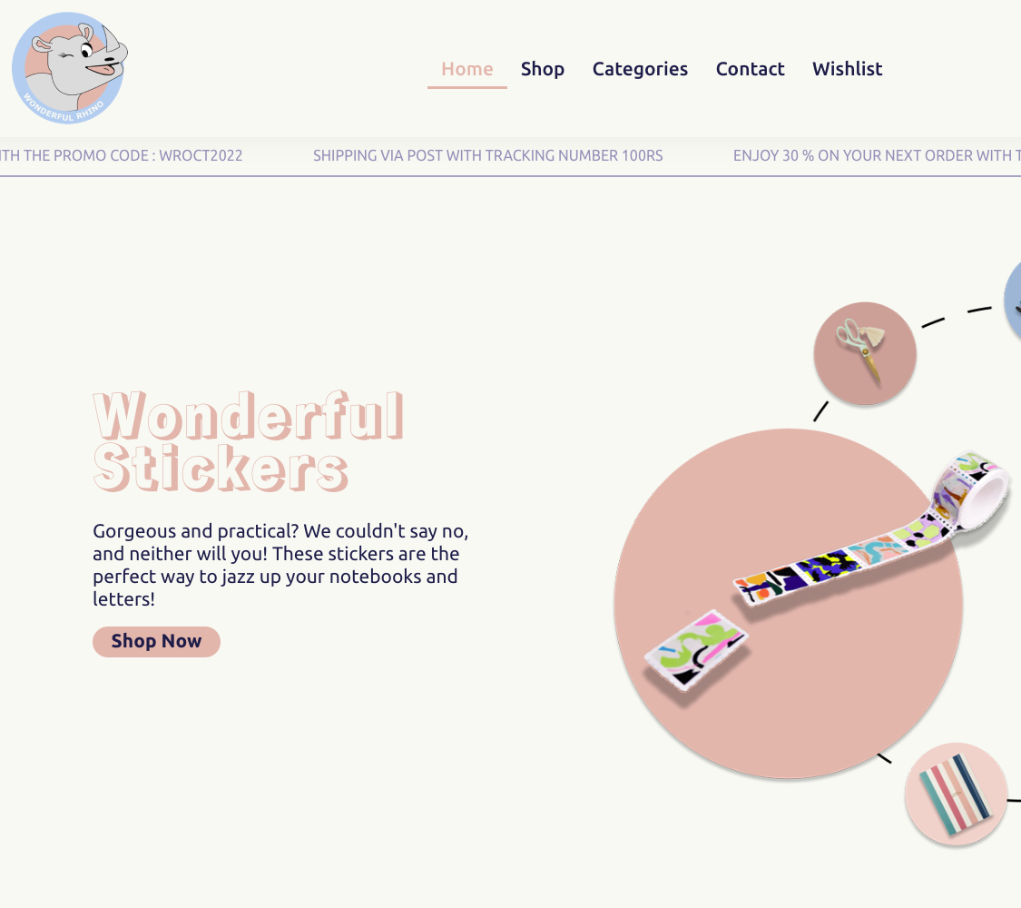
Wonderful Rhino, a vibrant stationery store with Gen-Z/K-style branding, needed more than just an online shop—it needed an immersive brand experience.
The goal was to design a seamless e-commerce platform that felt as bold, fresh, and playful as its identity, while making product discovery, purchase, and management intuitive for both users and staff.
UX Designer / UI Designer
I crafted a digital storefront that merges style and strategy. From visual storytelling to effortless navigation, every page was designed to elevate the brand and convert visitors into loyal fans.
Here are some significant aspects that demonstrate a blend of aesthetics and functionality to improve the website's consumer purchase experience, easy navigation, visibility of Wonderful Rhino products to their target demographic, and customer retention.
The final platform wasn’t just a shop—it became an experience. Interactive features boosted engagement, while streamlined layouts enhanced conversion. The system also empowered the brand team to manage updates and promotions independently. This digital makeover strengthened Wonderful Rhino’s presence and aligned it with the expectations of its Gen-Z audience.
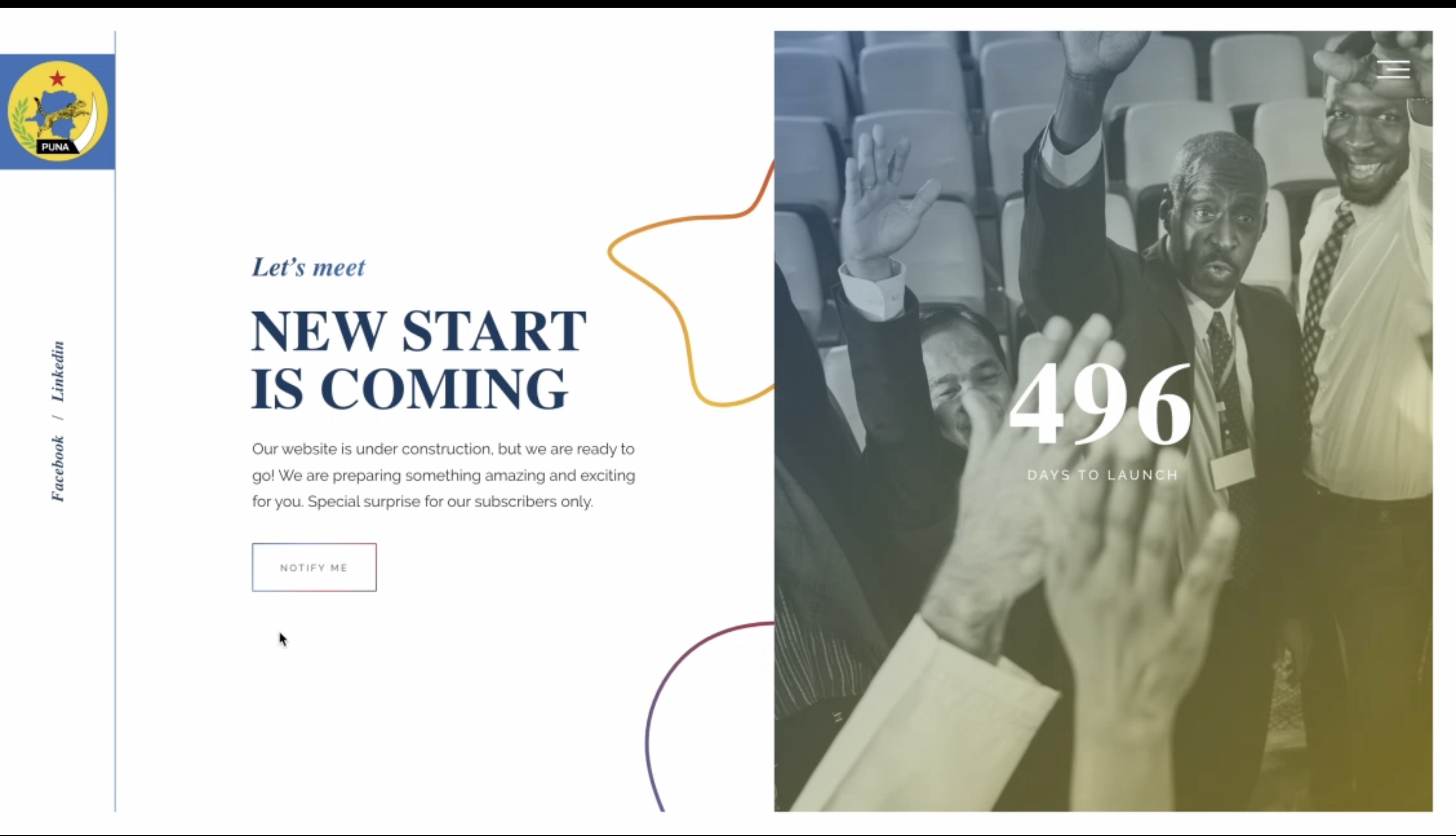
PUNA, a patriotic, progressive, and reformist Congolese political entity, required an engaging "under construction" website to inform visitors about their upcoming launch and gather information from potential collaborators.
The goal wasn’t just to hold space—it was to start a conversation, introduce values, and allow potential collaborators to reach out early on.
UX/UI Designer / Developer
A sleek countdown timer on the homepage builds anticipation and signals a professional, timely launch.
Humanised the organisation by showcasing individual members, their roles, and commitments—helping build trust from the very first scroll.
A clear, engaging section introduced PUNA’s origins and purpose—helping visitors quickly understand what the movement stands for.
A clean, intuitive form allowed visitors to express interest or get in touch without friction.
Full content availability in French and English widened accessibility and helped connect with a diverse, multilingual audience.
Easy access to all sections, regardless of device, ensured smooth browsing.
The “under construction” website was more than a placeholder. It positioned PUNA as credible, transparent, and ready to engage with the public. Within days, potential supporters and collaborators began reaching out through the contact form—proof that thoughtful design sparks real-world interaction.
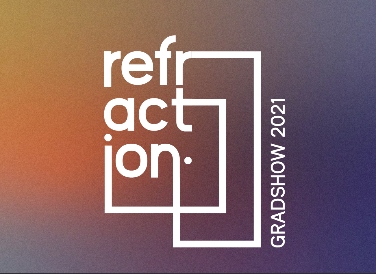
For their 2021 Graduation Show, Curtin University Mauritius needed more than a simple website. This event was a defining moment for third-year design students—a bridge between the academic world and the professional one. Our mission: create a strong, unified brand identity that would showcase their talent and capture the attention of future employers
UX Designer / UI Designer / Developer
The concept had to do more than look good—it needed to be meaningful. It had to embody the idea of transformation: students stepping confidently into the professional world. The digital experience needed to reflect that journey with depth and creativity.
We drew inspiration from the phenomenon of light refraction. Just as light separates into vibrant colours through a prism, so do students evolve through diverse paths during their education. A simple dot—symbolising a doorknob—became the visual metaphor for ".an ending for a new beginning."
This project brought to life a cohesive digital identity that connected students’ individual visions under one powerful story. It impressed employers, elevated the student work showcased, and proved that thoughtful design can turn a university event into a professional opportunity.
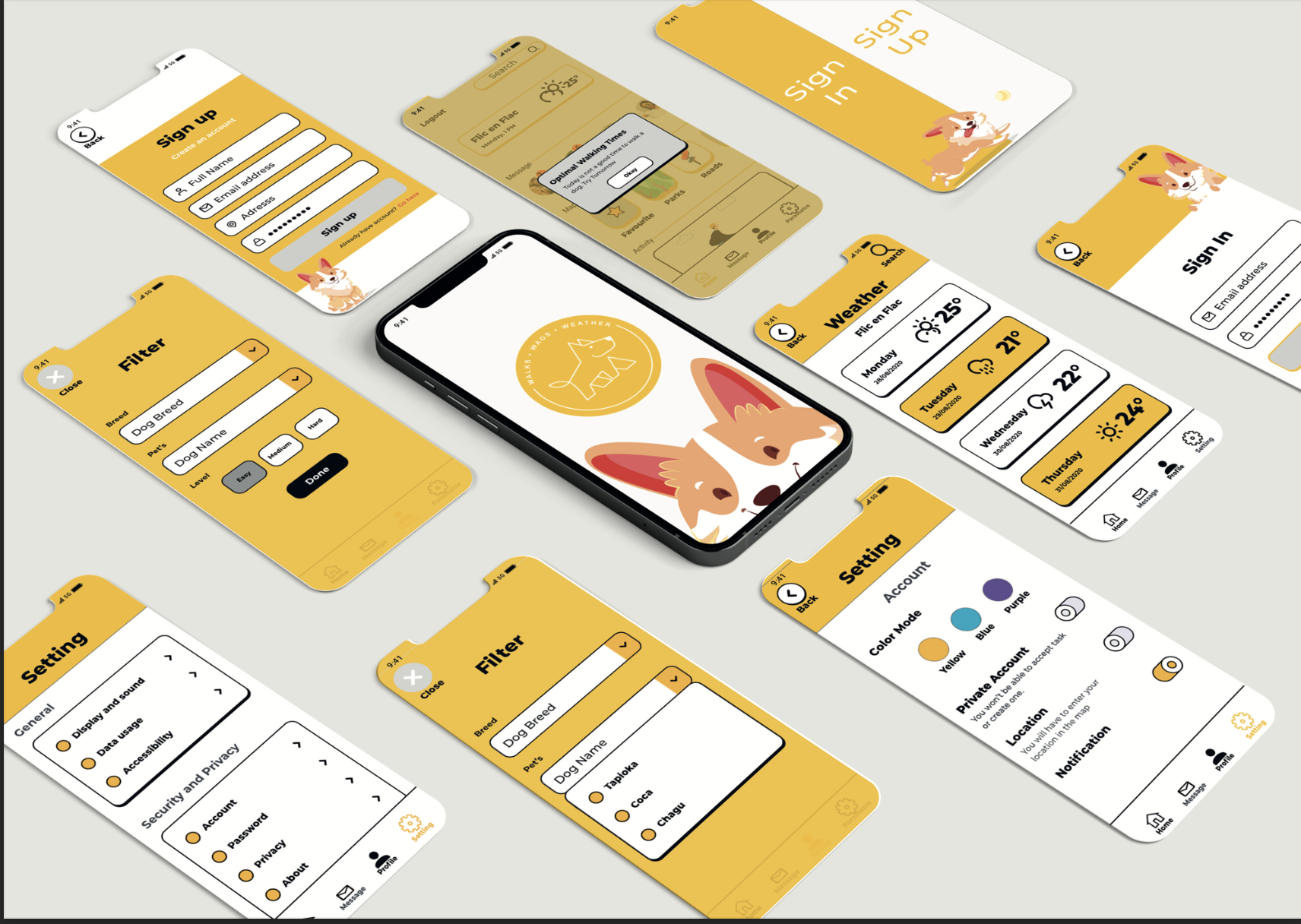
I designed an app to help dog owners and walkers discover new routes tailored to their pet’s needs — complete with maps, weather integration, and a community hub.
UX/UI Designer
Users wanted customized walking paths, ways to communicate with other dog lovers, and route recommendations based on weather. Through surveys and interviews, I identified the needs of three core users: dog owners, walkers, and service providers.
The app improves planning, community connection, and walking satisfaction for pet owners and professionals alike.
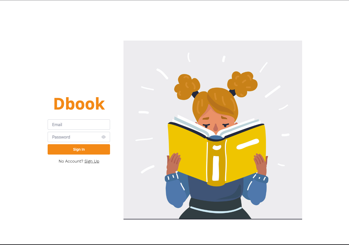
Dbook is a reading app tailored to busy professionals and students who want to stay connected to books without the time commitment of full reads. More than summaries, Dbook offers challenges, lists, audio, and purchases — creating a personalized literary ecosystem.
UX/UI Designer / Developer
Busy users often abandon their reading goals due to time constraints. I designed Dbook to integrate literature into their lives in a manageable and inspiring way.
Using a full stack of HTML, CSS, JavaScript, Node.js, MongoDB, and Shoelace, I built:
Filterable, dark-mode friendly interface to explore curated titles by genre.
Detailed summaries, recommendations, and collection-building tools in a sleek carousel layout.
Admins can manage users and book entries through a secure, streamlined dashboard.
An intro sequence helped new users set up preferences for a richer experience.
Dbook reimagines digital reading by turning it into a lifestyle. It helps users engage with books even on tight schedules — blending efficiency, beauty, and inspiration.
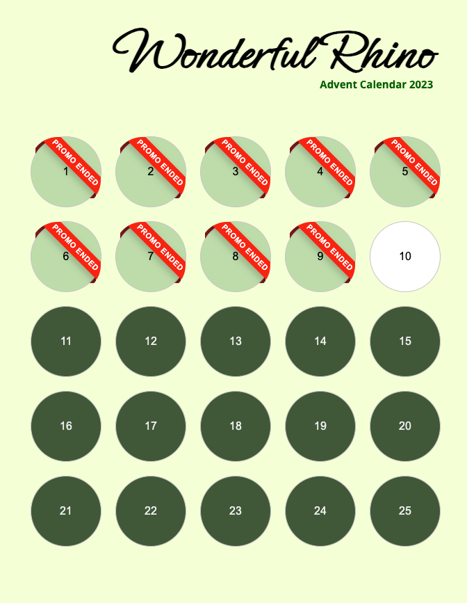
To spark holiday joy and increase visibility for Wonderful Rhino, a charming stationery boutique in Mauritius, I created a playful, interactive digital advent calendar — combining web development with animation and user experience design.
UX/UI Designer / Developer
Each day featured a unique, styled box using CSS grid layout and smooth animations.
JavaScript-powered interactivity allowed users to unlock daily surprises with countdown timers and festive effects.
Time-sensitive offers generated urgency while visually marking expired ones with a "Promo Ended" badge.
Optimized for all devices, the calendar maintained visual integrity across desktops, tablets, and phones.
The Advent Calendar boosted customer engagement and sales during the holiday season, while also collecting valuable emails for future campaigns.
ASBL Petits et Grands is dedicated to fostering an inclusive society by supporting families with children with disabilities, homeschoolers, and anyone aligned with their values of kindness, respect, and authenticity. I was tasked with developing a welcoming, accessible website to support their mission and centralize their communication and activities.
Developer
After conducting audience research and analyzing similar platforms, I developed petitsetgrands.be, a digital hub that helps families feel connected and supported.
Clear, intuitive layout ensuring accessibility for all users, including those with visual or cognitive impairments.
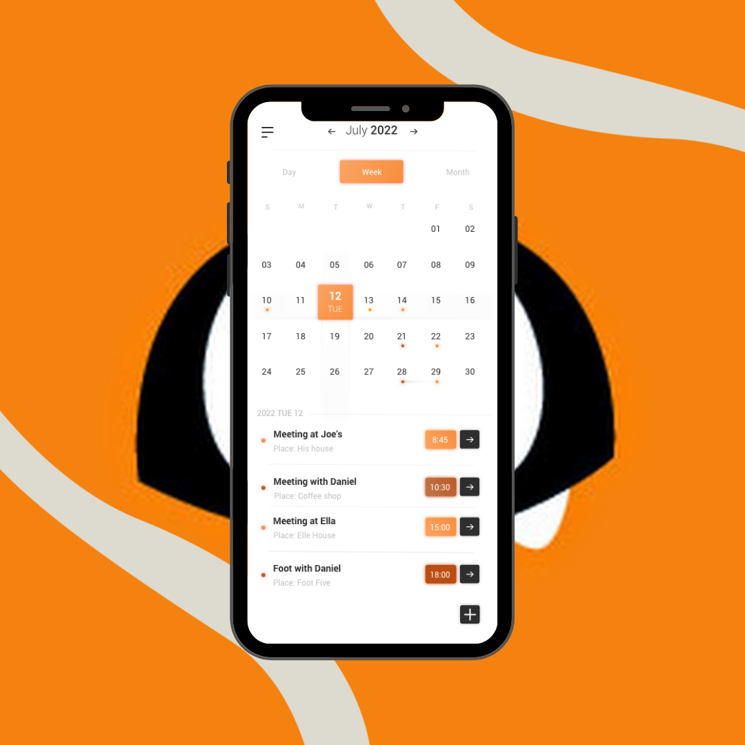
A dynamic calendar highlighting cultural, educational, and recreational events with direct registration options.
Dedicated space for academic support, creative workshops, and after-school activities.
A curated section showcasing family-friendly outings that foster bonding and community.
Easy-to-use forms to stay informed and reach the organization directly.
The site is now a crucial resource for families, making it easier to engage, connect, and participate:
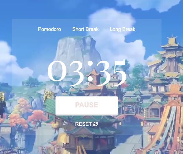
This project began as a personal response to a global problem. During the COVID-19 pandemic, many students (myself included) struggled with productivity, mental fatigue, and the isolation of remote learning. I designed a digital tool based on the Pomodoro technique — an approach that breaks work into timed sessions — and added calming experiences like ASMR and customization to make it more effective and emotionally supportive.
UX Designer / UI Designer / Developer
The pandemic blurred the boundaries between home and school, making it harder for students to stay focused. Lack of structure, increased screen time, and absence of peer interaction led to procrastination and burnout. Through interviews with classmates, I discovered a strong need for a productivity tool that wasn't just functional, but emotionally supportive and easy to use.
Following my peer interviews, the research process, wireframe construction, and prototype feedback, I was able to include the following website features to deliver the greatest answer to my peers:
A core feature with flexible intervals to match different concentration rhythms. Visual progress cues helped students stay motivated.
Users could choose between Spotify, Apple Music, or calming ASMR sounds. Curated audio experiences enhanced focus and minimized distractions.
Soothing video loops (like waterfalls or nature scenes) supported a calm, immersive workspace.
Tasks were visualized, tracked, and prioritized. Students could see their accomplishments, encouraging momentum.
From color themes to personalized layouts, students were empowered to adapt the app to their style, boosting ownership and productivity.
Options like high-contrast themes and font adjustments ensured accessibility for users with visual sensitivities or neurodivergent needs.
The app successfully addressed key issues of remote learning. By blending structure, calmness, and personalization, students reported increased engagement, improved focus, and a more enjoyable workflow.
The Animation Mentor Calendar was a hybrid creative project combining digital and physical design. Animation Mentor — a globally recognized online animation school — calendar needed to be more than just a tool for tracking dates.
The goal was to design a captivating, informative piece that embodied their brand identity and values, while inspiring creativity throughout the animation community.
Graphic Designer / Illustrator
This calendar wasn’t just about aesthetics — it had to communicate Animation Mentor’s mission and be educational, fun, and functional. My challenge was to create a strong visual system that worked across formats (print and app) while remaining informative and aligned with animation principles like rhythm, timing, and storytelling.
Inspired by the 12 Principles of Animation, the calendar’s name and custom typography ensured brand alignment and readability in both digital and printed formats.
I chose warm tones — orange, brown, black, and white — to reflect values like creativity, trust, and authenticity, rooted in the brand's visual identity.
A universal cartoon style was selected to evoke nostalgia without referencing any existing franchises.
The cover was minimalist, focusing on clarity and brand cues. Each monthly spread formed part of a flipbook-style narrative, turning time-tracking into a story-driven experience.
Clear layouts, smart margins, and optimized font sizes enhanced legibility and engagement on digital screens.
A clean, recognizable icon was created to extend the experience digitally. The preview page featured a well-structured layout using the same visual codes as the print edition.
The final calendar successfully delivered a multi-platform experience that was not only visually inspiring, but also educational, interactive, and aligned with Animation Mentor’s storytelling spirit.
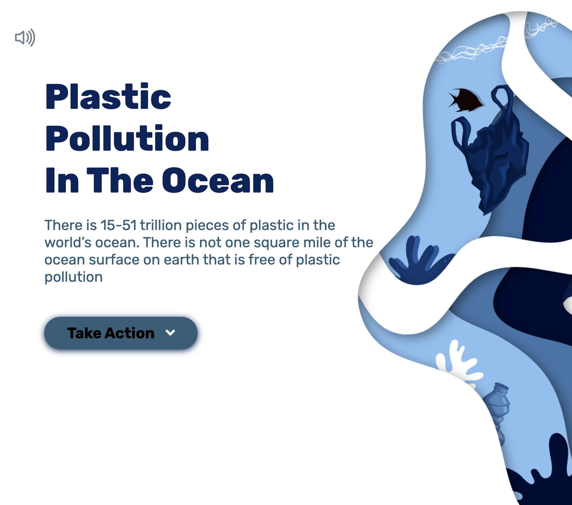
Save the Ocean is a personal project I initiated during university to raise awareness about plastic pollution and its effects on ocean ecosystems, climate change, and human health. It was designed to be immersive, interactive, and emotionally compelling.
UX Designer / UI Designer / Developer
I began by interviewing 20+ individuals to understand their disconnection from environmental action. The insights revealed the need for:
1.Clear, engaging information delivery.
2.Simple calls to action.
3.An immersive experience that encourages return visits.
I also identified critical user types for whom the website attempted to solve problems based on my research:
1.Individuals who are interested in the issue of ocean pollution and wish to engage in a genuine non-governmental organization either financially or actively.
2. Individuals who find value in obtaining precise information regarding the effects of environmental pollution.
I was able to design the Save The Ocean Website after going through the following stages: interviews, research, wireframe creation, and feedback.
The website offers the following features:
Custom scroll behavior, micro-animations, and ambient music created a multi-sensory user journey.
Sticky navigation bar, intuitive structure, and interactive carousels helped users navigate easily and stay engaged.
SVG animations and thoughtful layout choices made the content feel human and accessible — not overwhelming.
Opportunities for users to join clean-up efforts or donate were made clear and inviting.
The project helped demonstrate how design can educate and activate people. It also pushed my technical and creative limits by incorporating custom animation, sound, and user-centered strategy.
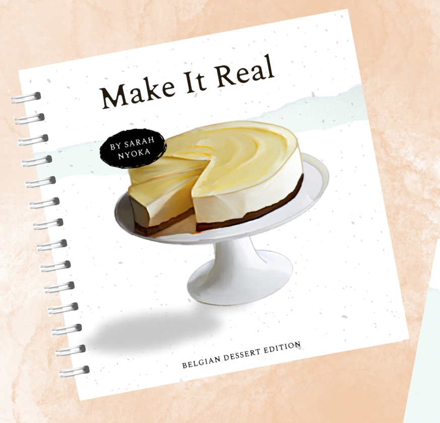
I designed Make It Real, an illustrated cookbook introducing Belgian desserts to a Mauritian audience — including both locals and expats.
The goal was to make the recipes feel accessible, fun, and culturally rich.
illustrator /Print Designer
This wasn’t just a cookbook — it was a way to bring people closer to home through food. I needed to balance visual charm with practicality, ensuring readers could easily follow recipes while enjoying a uniquely artistic experience.
The title "Make It Real" effectively communicates the idea of recreating original Belgian delicacies, making it memorable and successful for the intended demographic.
Bold headings and legible body text (10–14 pt) for ease of use in kitchen settings.
Soft pastel tones (baby blue, peach, yellow) for warmth and joy, with darker accents for clarity.
The final cookbook was both beautiful and user-friendly — a pleasure to cook with and a celebration of Belgian culinary heritage.
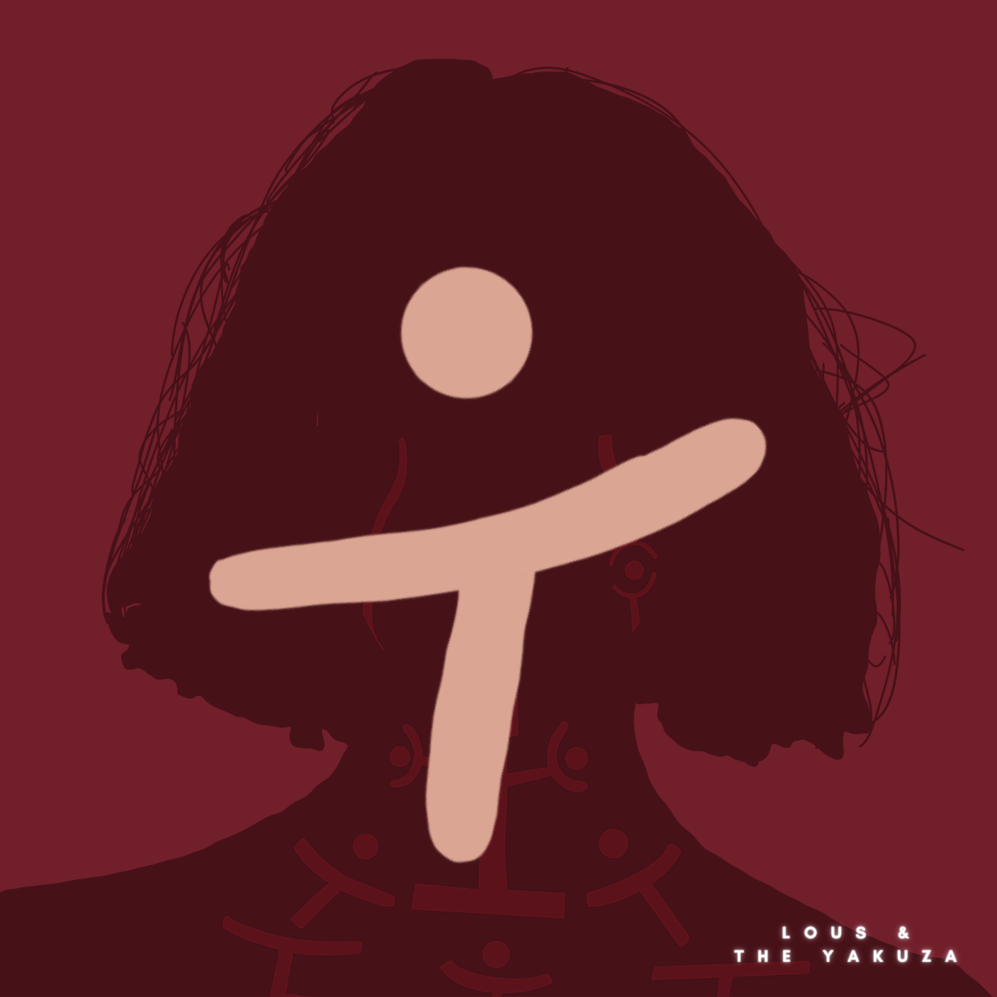
I had the pleasure of reworking the visual design for Gore, the debut album by Lous and the Yakuza.
The artist described the album as a journey through pain transformed into strength — using “Gore” as a metaphor for resilience.
The goal was to visually express this emotional depth across the album cover, single cover, and promotional materials.
Graphic Designer / Illustrator
My task was to unify the visual identity across formats, while remaining faithful to Lous’ unique personality and musical message.
I researched visual cues from artists like Stromae, Nekfeu, and Orelsan to ground the art direction. I opted for minimalist vector illustrations and a bold red palette — evoking power, vulnerability, and identity without relying on cliché imagery.
The use of minimalism and intense color amplified the album’s message and helped distinguish the artist visually.
A faceless portrait set the emotional tone, inviting listeners to project their own experiences while connecting with the artist’s journey.
he artist’s symbol and color palette were carried through to maintain cohesion. Hierarchical typography ensured clarity and elegance.
Posters and digital assets followed the same visual system. QR integration and carefully placed copy elevated discoverability and emotional impact.
The entire campaign successfully conveyed the album's emotional core. Every design element was tied to the music’s story, creating a rich, immersive experience for the audience and a distinct brand for the artist.
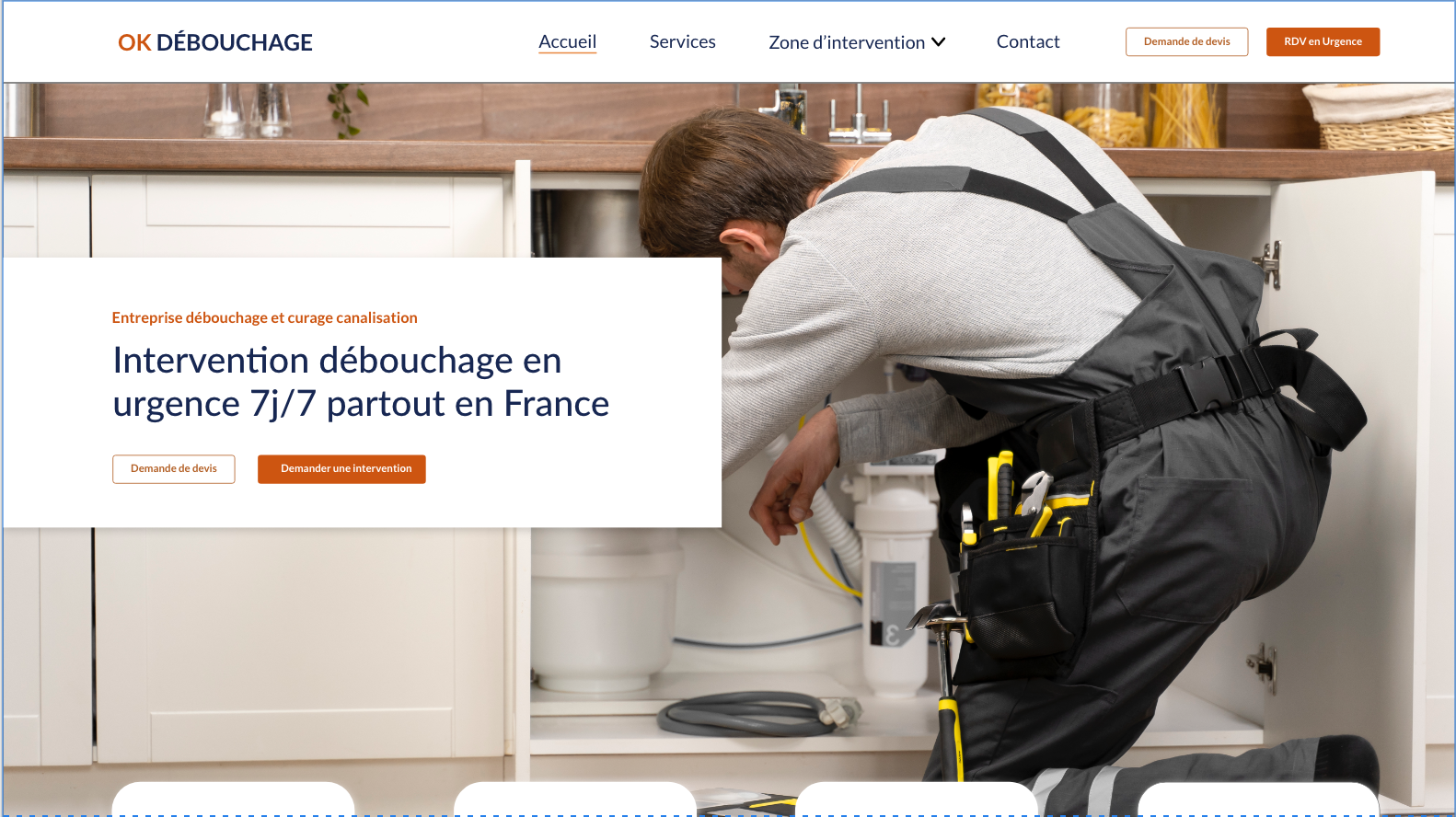
As part of a design test, I was tasked with creating a website for OK DEBOUCHAGE — a company connecting individuals with reliable plumbing and unclogging services across France.
The main challenge was balancing tradition and modernity. The client wanted the platform to feel like a trusted, long-established business — not just another flashy tech startup. I had to craft a digital space that conveyed professionalism, warmth, and credibility while remaining intuitive and visually appealing.
UX/UI Designer
I built a clean visual system using shades of blue — often associated with trust — paired with warm accents like orange and yellow to create an inviting, dependable vibe.
The interface was designed around the user’s needs. Clear intervention zones, simple flows, and prominent call-to-action buttons made it easy for users to book emergency services or request quotes in just a few clicks.
Instead of cold stock photos, I used relatable and realistic imagery. This helped build trust and made the service feel personal — like something you could actually rely on in a moment of stress.
This project reinforced the power of combining timeless design values with smart digital practices. The result was a user-friendly platform that felt both established and modern — helping users feel confident and supported from the very first click.